Last week, I talked about finding a printer I could work with — in my case, a local print shop recommended by my housemates. This week, I’d like to talk about some of the details of getting my prints to look just right. But a word of caution: your situation will likely be quite different! But I hope that what I have to share can give you some idea of the issues you need to think about.
Of course the primary issue is color. Unless you’re very lucky, the first time you print a digital image will be somewhat disappointing. Shops will have different printers, and different brands and quality of ink and paper. It’s almost impossible to predict what an image will look like, even if you’re aware of some of these differences.
I did decide to buy a subscription to Photoshop — many shops use it, and for a few dollars a month, well, I decided that was one variable I could control. At least we’d be working with the same software….
I made sure my image was in CMYK mode (Image > Mode > CMYK Color in Photoshop), since printing with ink involves subtractive color. Some trial and error revealed that if I added +80 on the Magenta–Green scale and +40 on the Yellow–Blue scale (Image > Adjustments > Color Balance) and then printed, the colors came pretty close.
I’m learning that pretty close is good enough…it’s almost impossible to match colors exactly. When I write code I can be as precise as I like — but I have learned to be more flexible when it comes to printing. There’s no other sane choice….
And sometimes, well, there’s a pleasant surprise. I was printing out my favorite spiral for an Art Exhibition at a mathematics conference,
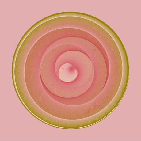
and it was pretty far off — but to my real surprise, good. The colors were a bit muted, giving a more naturalistic, organic feel, and the contrast with the greenish background was more intense. I liked it, and decided to use it.
I was beginning to realize that not only is it impossible to exactly duplicate the colors on your screen in print, but it might very well be the case that you want the colors of the printed image to be different. A computer screen is backlit, while a print isn’t — and this impacts the way you see an image on your computer screen vs. the way you see a printed copy. You interact with the image differently, because the media are different.
So there’s definitly a give-and-take with color. Resolution is the next big issue. Your computer screen is essentially a rectangular grid of pixels — possibly a very large number of them (my computer screen has about 1.3 million) — but still, any image is just an array of colored dots on a grid.
This issue was significant in printing out the following image for the same Art Exhibition.
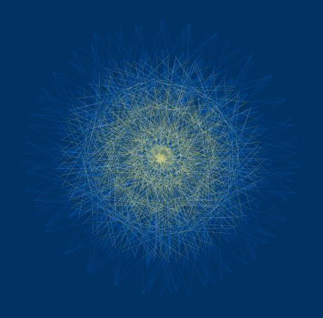
The first attempt was just dark, with very little yellow or white visible. In fact, I almost thought it good enough — I even purchased it and brought it home with me — but as I kept looking at it, well, I knew it wasn’t right.
I looked at the code which produced the star, and found a possible suspect — the line width. I had set it to 0.002 inches — very thin. Because one color of ink bleeds a little into the next color, there was too little of the lines left to be clearly visible.
So I decided to try doubling the line width to 0.004 inches. It was perfect! I have to admit, it was the easiest fix I’ve ever made — seems it’s never that easy. But the real point I want to make is that when I doubled the line width, the image on my computer screen did not change. There were no visual clues to tell me that my lines were too thin — after all, you can never get a line thinner than a pixel.
When I first starting programming computer graphics, I would frequently set the line width to zero, meaning the printer would print the thinnest line possible. With the resolution of printers at the time, this was just perfectly adequate. No longer. I did some experimenting and found that for producing nets for polyhedra (such as the rhombic dodecahedron above), a line width of 0.006 is good. Easily visible, but not too thick. And as mentioned earlier, when working in thousandths of an inch, one or two can make a big difference in what the final image looks like.
I have to admit I haven’t really dealt much with the issue of paper — but there are definitely things to think about here. Thickness, gloss, etc. For my immediate needs, a fairly thick, semi-glossy paper was fine — I didn’t need to make a museum-quality print. But soon I’ll be branching out into making greeting cards, and then, I’ll need to confront the paper issue head on. Working in small batches on expensive paper means it’s a lot harder to make any money….
So these are the main issues I’ve had to deal with so far as a digital artist. I’m sure they won’t be the last — and if (when!) I learn anything else that’s really significant, I’ll write a Joy of Ink III.
I’m really hesitant to give advice — but having said that, here goes. Be patient and flexible. There are a lot of details to consider, and it’s very difficult to get a project done perfectly and quickly. There is definitly a learning curve — and I think there will always be a learning curve, since technological progress will continue to increase the number of affordable options for the digital artist. But rather than be frustrated by this, I think it’s saner to be excited by it. What we take for granted today was almost unthinkable ten years ago — so who can predict what will be possible ten years from now? Certainly not me. But that’s half the fun of it….

One thought on “The Joy of Ink II”