In the last installment of On Coding, I talked about my love for Postscript. In the next few installments, I’ll talk about my favorite markup languages, HTML (which stands for Hypertext Markup Language) and LaTeX.
Technically speaking, using a markup language isn’t really coding. There isn’t any sort of algorithmic thinking going on when you type
<b>make this text bold!</b>
to make text bold in HTML. But it is easy to use coding constructs in both HTML and LaTeX, for example when embedding JavaScript in HTML or by writing macros or using the graphics package TikZ in LaTeX.
I do think, though, having students learn a markup language is a great introduction to programming. It gets students in the mindset that a particular set of instructions has a predictable, well-defined effect. Perhaps more importantly, getting the syntax correct when using a markup language is just as important as it is when coding.
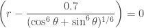
I started using HTML in the early 90’s, when I made my first web pages. I don’t have those older designs any more — but they were still based on geometry, like my current website. I do have a copy of the version just before this, though.
Of course I have always loved pentominoes, polyominoes, and puzzles. But one reason I went with this theme was I could essentially build my home page by using a table in HTML.
Tables are currently out of fashion, though — the thought is that with all the new capabilities in CSS (cascading style sheets), tables shouldn’t be used for layout purposes. That may be so. But it took some effort to get everything to work initially, and creating new pages with similar functionality is easy now that I have a template created. So I am content to be out of fasion….
Being a programmer, though, made be decide to use HTML itself, rather than some web-designing software. The reason is simple. If I write my own HTML, I can do whatever I want. If I use some canned software, I can only do what the software lets me. And since I’m pretty particular about what my web pages look like, I don’t want to be in the position of having a design idea in my mind, but not being able to implement it because of the limitations of the software.
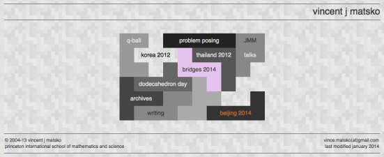
One of my favorite designs was a website I created when I did some educational consulting in Thailand.
The polyomino theme is pretty clear — in this case, I used all 35 hexominoes plus six 1 x 1 squares. If you look closely, you’ll see the six places where a square of the tiled background peeps through. I included these six squares so I could tile a 12 x 18 rectangle.
And why did I want to be so specific? Actually, the flag of Thailand has proportions of 2 : 3. Moreover, the stripes alternate red, white, blue, white, and red, with the blue stripe twice a wide as the others.

So I decided to design a web page for my trip based precisely on the dimensions of the Thai flag.
It was difficult. What made it so hard was that I wanted each hexomino to be a different color — but all the squares in any given hexomino had to be the same color. And I had to make the five colored stripes.
So I actually cut out the 35 hexominoes and set down to work — but was constrained by the fact that I basically had to use all the pieces lengthwise since the stripes needed to be horizontal. If you want a real polyomino challenge, try it yourself! You’ll see it isn’t all that easy.
Two overriding principles guide my use of HTML: functionality and minimalism. My websites are essentially a professional portfolio. So they have to be easy to navigate. The polyomino theme allows me to include all important links on one page — and they’re all easily visible. Moreover, it’s easy to add or take away a link without disturbing the overall design. Here’s a snapshot of my current homepage.
I also use websites when I teach, rather than an online platform like Moodle, for example. This is because I can archive them — and again, I have complete control over content. Further, when teaching a course like my Mathematics and Digital Art course, I can share all my course content with colleagues, who otherwise wouldn’t have access to it on a school content management platform.
Within each course web page, I also strive for ease of use. For example, links are always in bold face, so they’re easy to spot. I find that making them a different color is too distracting, so I alter the typeface instead. And I use an anchor
<a name=”currentweek”>
when I update course content — so when a student clicks on the course website, they don’t have to scroll down the page to find the new stuff. It’s automatically at the top. Students have commented that they like this feature of my course web pages.
I’m a minimalist when it comes to design. The difficulty with web design is because you can do so much, some web designers think they should. The challenge is to select design elements that work together, achieve the web pages’ purpose, and have a strong aesthetic appeal. Less is often more, to use a cliche.
I feel especially strongly about this when it comes to using color. Yes, you typically have 16,777,216 possible color choices when designing web pages. But that doesn’t mean you have to use them all! When I look at some sites, I get the feeling that the web designers were trying to….
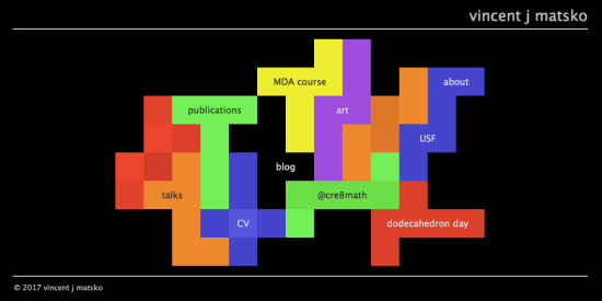
In fact, another favorite design — my digital art website — is entirely in gray scale.
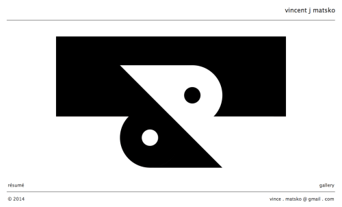
I use a bold, black-and-white variant of the yin-yang symbol to attract attention. No need to splash countless colors indiscriminately across the page….
I have enjoyed designing my own web pages, and I’ll continue to do so — every so many years, I get tired of the existing design and need to create a new one. And if you already code, it’s easy to pick up a markup language like HTML. You can always view the source code of any website, and you can just look up anything else you need online. Give it a try!


![T(s)\rightarrow F(s)\, [\, +\, T (r s)] \, [ \,-\, T(r s)].](https://s0.wp.com/latex.php?latex=T%28s%29%5Crightarrow+F%28s%29%5C%2C%C2%A0+%5B%5C%2C%C2%A0+%2B%5C%2C%C2%A0+T+%28r+s%29%5D+%5C%2C+%5B+%5C%2C-%5C%2C+T%28r+s%29%5D.+&bg=ffffff&fg=333333&s=2&c=20201002)
 and HTML. Until then!


 you get an ordinary ellipse, but for different n, you get other curves.
 so that the superellipse equation looks like


 moves around the circle. Also notice how the coefficient of


![[-1,1]](https://s0.wp.com/latex.php?latex=%5B-1%2C1%5D&bg=ffffff&fg=333333&s=2&c=20201002) and the range to be
and the range to be ![[0,\pi].](https://s0.wp.com/latex.php?latex=%5B0%2C%5Cpi%5D.&bg=ffffff&fg=333333&s=2&c=20201002) In this case, the graph
In this case, the graph
 on the interval
 ![[0,4\pi],](https://s0.wp.com/latex.php?latex=%5B0%2C4%5Cpi%5D%2C&bg=ffffff&fg=333333&s=2&c=20201002) the function
the function 
 But what is happening on the interval
 ![[\pi,2\pi]](https://s0.wp.com/latex.php?latex=%5B%5Cpi%2C2%5Cpi%5D&bg=ffffff&fg=333333&s=2&c=20201002) ? In this case, x is in quadrants III and IV. Since the range of
? In this case, x is in quadrants III and IV. Since the range of  is
is ![[0,\pi],](https://s0.wp.com/latex.php?latex=%5B0%2C%5Cpi%5D%2C&bg=ffffff&fg=333333&s=2&c=20201002) we’ve got to flip x over the x-axis — in other words,
we’ve got to flip x over the x-axis — in other words,
![[\pi,2\pi].](https://s0.wp.com/latex.php?latex=%5B%5Cpi%2C2%5Cpi%5D.&bg=ffffff&fg=333333&s=2&c=20201002) Add in the periodicity, and there you have it!
Add in the periodicity, and there you have it! and
and  we simply graph the equation