Color II: Opacity and Josef Albers

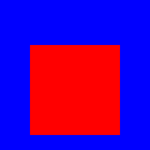
Remember from last week we were discussing the following image:

AlbersSquares1

What colors are the squares?  Recall that when we allowed one or both squares to be transparent to some degree, there were many possible answers to this question.  Last week, we found out all possible color/opacity combinations for the purple square alone.

First, we’ll examine the case that the pink square is transparent and on top of the purple square.  Whether the purple square is transparent actually doesn’t matter, so we’ll be perfectly fine if we assume the purple square has RGB values (0.6,0.5,1) with opacity 1.

To begin, we need to establish the apparent color of the pink square.  If I load this image into Photoshop and use the eyedropper tool, I get integer RGB values of  (229, 51, 255).  Dividing these by 255 to convert to values between 0 and 1, I get (0.898039, 0.2, 1).  I actually used RGB values of (0.9,0.2,1) to create the image, so the eyedropper tool did its job….

Now let’s call the color of the pink square (R,G,B), and the opacity a.  Recall the formula from last week for the result of looking through a transparent color:

a\, C_1+(1-a)\,C_2.

In our case, C_1 is the color of the pink square, and C_2 is the color of the purple square.  So we get the equation

(0.9,0.2,1)=a\,(R,G,B)+(1-a)\,(0.6,0.5,1).

As before, we need to break this down into three separate equations, one for each component.  For exactly the same reasons as last week, we must have B=1 (go back and reread this argument if you forgot).  The equations for the Red and Green components are

0.9=a\,R+(1-a)\,0.6,\qquad 0.2=a\,G+(1-a)\,0.5,

which may be rearranged to yield

R=0.6+\dfrac{0.3}a,\qquad G=0.5-\dfrac{0.3}a.

Since color values lie between 0 and 1, we see from the Red equation that we must have

0\le\dfrac{0.3}a\le0.4.

Note that when this is true, the Green value also lies between 0 and 1, so this is all we need to check.  A little simplification shows that this implies 0.75\le a, so the pink square can be transparent as long as

0.75\le a\le1.

We can then use the formulas above to fing the Red and Green values (remembering that Blue is always 1).  Below are the possibilities in RG space:

RGSpace2

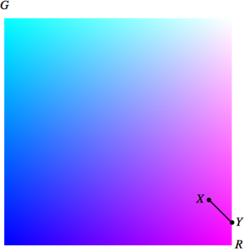
The point X corresponds to the value a=1, while the point Y corresponds to a=0.75.  Note that while the possible points in RG space lie on a line segment (it is easy to see from the above formulas that R+G=1.1), the points on the line segment do not vary linearly with a since the a occurs in the denominator in the above formulas.

So now we’ve looked at all the possibilities when the pink square is transparent and on top of the purple square.  What if the purple square is transparent and on top of the pink square?

We first note that half the work is already done, since we worked out the possibilities for a transparent purple square last week.  Here is what we obtained, where again the opacity of the purple square is denoted by a:

R=\dfrac{a-0.4}a,\quad G=\dfrac{a-0.5}a,\quad B=1.

This corresponds to the color C_1 in the formula for opacity.  Now let (R,G,B) denote the color of the pink square underneath, which will be C_2.  Using the opacity formula, we obtain the equation

(0.9,0.2,1)=a\,\left(\dfrac{a-0.4}a,\dfrac{a-0.5}a,1\right)+(1-a)\,(R,G,B).

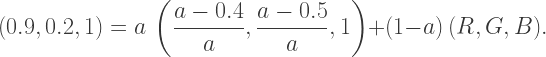
This may look a little complicated, but it turns out we only need to look at the Red component.  Looking at the Red color value, we get

0.9=a\left(\dfrac{a-0.4}a\right)+(1-a)\,R,

which after multiplying out and rearranging results in

R=\dfrac{1.3-a}{1-a}.

Can you see any problem with this formula for R?  Since the opacity must be between 0 and 1 — in other words, 0\le a\le1 — the numerator of this expression will always be greater than the denominator.  This means that the Red color value would have to be greater than 1, which we know is not possible!

Our conclusion?  It is not possible that the two squares can be obtained by a pinkish square beneath a transparent purple square.  Essentially, the pink is “too red.”  In order to make the pink show through the purple, the opacity of the purple would have to be too close to 0, which would then mean that we’re not seeing enough blue.

In general, this is not easy to just see by quickly glancing at an image.  But if we use the formula for opacity and are careful with our calculations, we can prove that certain color/transparency combinations are impossible.

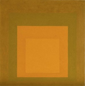
And what about a more complex figure?

Josef_Albers's_painting_'Homage_to_the_Square',_1965

Well, there are four different squares to consider, and several different possible layerings.  But it’s even more complicated than that.

What you’re seeing is an image on your color monitor or phone, which is on my website.  I got the image from the Wikipedia commons.  Someone uploaded a digital file of the image, which was either taken of the original piece, or digitized from a photograph of the piece.  Which might have been from a book, published long enough after Albers finished the piece that the photo was actually of a faded original.

So what we’re actually seeing is only an approximation to Albers’ original painting.  To make the analysis more realistic, we’d have to assume that the apparent color we’re seeing is within a certain tolerance of the original.  Meaning each color doesn’t have just one value, but a range of possible values.

We won’t go into this more complicated issue today.  But I hope you now appreciate that an image of just a few squares may be much more intriguing than you might originally think!

Color I: Opacity and Josef Albers

What do you see?AlbersSquares1

Looks like a pink square on top of a purple square.  But after hearing a talk about Josef Albers’ work at Bridges 2016 a few weeks ago, I realized there is more than one way to look at this image.

Maybe the square is actually more red, but transparent — so that the purple showing through makes it pink.  Or maybe the pink square is behind the purple square, and it’s the purple square which is transparent.  Or maybe the purple square isn’t a square at all, but a frame — that is, a square with a hole in it!

This first post in a series on color will explore this apparently simple figure.  The ultimately goal will be to analyze images in Josef Albers’ series Homage to the Square. But as mentioned last week, James Mai found that there are 171 possible combinations of opaqueness, transparency, frames, and squares in this series!  So we’ll start with a basic example.

But first, we have to understand how opacity works in computer graphics.  We’ve used RGB colors in several posts so far, but rarely mentioned opacity.  When this is included, the color system is referred to as RGBA, where the “A” represents the opacity (or alternatively, the transparency), which is also sometimes called the alpha.  A value of a=0 means that the color is completely transparent, so it doesn’t affect the image at all, while a value of a=1 means the color is completely opaque, meaning you can’t see through it at all.

As an example, in the series below, the squares have RGB values of (0.2, 0, 1.0), and A values of 0.25, 0.5, 0.75, and 1.0 (going from left to right).

OpacityExample

But these squares could also have been created without any transparency at all!  What this means is that if you include transparency/opacity, there are many different ways to specify a color that appears on your screen, not just one.  So in an Albers’ piece with four squares, where all of them may have some degree of transparency, the analysis can be quite difficult.

Josef_Albers's_painting_'Homage_to_the_Square',_1965

Next, we have to understand how the opacity is used to create the colors you see.  If color C_1 has opacity a and is on top of a color C_2, the apparent or observed color is then

a\,C_1+(1-a)\,C_2.

If you thought to yourself, “Oh, it’s linear interpolation again!”, you’d be right!  In other words, the observed color is a linear combination of the transparent color and the background color.

Keep in mind that is an idealized situation.  It is very difficult to make a correspondence with how we “actually” see.  If you were looking at an object throught a square of colored glass — maybe sunglasses — there would be concerns about the distance between the glass and the object, multiple lighting sources, etc.  For now, we just want to understand the mathematics of using opacity in computer graphics.

Another complication arises in considering the following two squares — a pure red square on top of a pure blue square.

AlbersSquares2

In this case, it is impossible that the red square has any degree of transparency.  If it did, some of the blue would show through.  If the red square had a transparency of a, our linear interpolation formula would give an apparent color of

a,(1,0,0)+(1-a)\,(0,0,1)=(a,0,1-a).

This means if there were any transparency at all, there would be a Blue component of the observed color, which is not possible since Red has RGB values of (1,0,0).  So before you go about calculating opacity, you’ve got to decide if it’s even possible!

Let’s start with the purple square.

PurpleSquare

What color could this square be, with what transparency?  Let’s call the color C_1 and the opacity a.  Since the background (screen color) is white, we use C_2=(1,1,1).

To assess what the color “looks like,” you’d go to PhotoShop and use the eyedropper tool, for example — or another other application which allows you to point to a color and get the RGB values.  In this case, you’d get (0.6, 0.5, 1.0).  Basically, what you get with such tools are RGB values, assuming an opacity of a=1.

But of course we’re wondering what is possible if the opacity is not 1.  If we denote C_1 by (R,G,B),, we get

(0.6, 0.5, 1.0) = a\,(R,G,B)+(1-a)\,(1,1,1),

which simplifes to

(0.6, 0.5, 1.0)=(a\,R+1-a, a\,G+1-a, a\,B+1-a).

This gives us three equations in four unknowns, which makes sense — we know the answer is likely not unique since it may be possible to create the square using different opacities.

Note that the third equation is

1.0 = a\,B+1-a,

which when rearranged gives us

a\,(B-1)=0.

Of course a cannot be 0, or we wouldn’t see anything!  This means B=1, which makes sense since if we’re interpolating between B and 1, the only way to get a result of 1.0 would be if B=1.

What about the other equations,

0.6=a\,R+1-a,\qquad 0.5=a\,G+1-a?

Solving them, we get

R=\dfrac{a-0.4}a,\qquad G=\dfrac{a-0.5}a.

Keep in mind that the R, G, and a values must all be between 0 and 1.  So we must at least have

a\ge0.5

to guarantee that all values are positive.  Further, observe that for any a value between 0.5 and 1 (inclusive), we have that the numerators of both color values are less than the demoninators, and are therefore less that 1.

So this means that the purple square may be created using the color values

R=\dfrac{a-0.4}a,\quad G=\dfrac{a-0.5}a,\quad B=1,

as long as the opacity satisfies 0.5\le a\le1.  This is illustrated graphically below, where the solid line segment represents all possible colors for the square.RGSpace

Here, the horizontal axis is the Red component and the vertical axis is the Green component.  Since we observed earlier that the Blue component must alwas be 1, the lower-left corner would be (0,0) in RG space (Blue), and the upper-right corner would be (1,1) (White).  When a=1, we obtain the point X with RGB values (0.6, 0.5).  This makes sense, since we observed the color to have RGB values (0.6, 0.5, 1.0).

When a=2/3\approx0.67, 
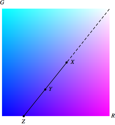
we obtain the point Y with coordinates (0.4, 0.25) in RG space.  This means the purple square could be obtained using RGB values of (0.4, 0.25, 1.0) and opacity 2/3.

And when a=0.5, we obtain the point Z with coordinates (0.2, 0) in RG space.  This means the purple square could be obtained using RGB values of (0.2, 0, 1.0) and opacity 0.5.

Note that even though Y is  halfway between X and Z in RG space, the a value is not halfway between 0.5 and 1.0.  This is because of the a in the denominators in the fractions above giving solutions for R and G.

There’s a nice geometrical interpretation of this picture, too.  If one color is an interpolation of two others, it must lie on the segment joining those two others.  So we need all colors C such that X is on the segment between C and (1,1).  This is just that part of RG space which is a continuation of the line starting at (1,1) and going past X.

Now we could have just used this geometrical idea from the beginning — but I wanted to work out the mathematics so you could see how to use the definition of opacity to solve color problems.  And of course sometimes the geometry is not so obvious, so you need to start with the algebraic definition.

So working with opacity isn’t too difficult as long as you understand what your computer is doing.  In the next post on Color, we’ll tackle the issue of the pink square….

Bridges: Mathematics and Art III. Jyvaskyla, Finland!

After a 24-hour journey yesterday, I finally returned home from my month-long trip to Europe.  Not that Vienna and Florence weren’t fantastic, but I must admit that Bridges 2016 was the highlight of my trip!  I’d like to share some especially memorable moments of the conference this week.

Of course the most memorable is the annual Art Exhibition.

IMAG3283

I’ll discuss some of the pieces in this post, but there is no way to include them all!  Luckily, there are online galleries for all the Bridges conferences.  You can access them at the  Bridges online art galleries, although the gallery for Bridges 2016 is not up yet (but will be soon).

Two of the most memorable displays in the exhibit (no bias here, of course!) are my two pieces,

IMAG3259

and my student Nick Mendler’s two pieces (the second piece is shown later).

IMAG3236

It’s a real pleasure just to walk among the artwork and admire the intricacy of the pieces close-up.  Pictures absolutely do not do justice to the experience….  Some pieces which particularly stood out for me were these spheres created by Kiyoko Urata.

IMAG3438

Look closely at how they are made.  The medium is silk thread.  Yes, these are knitted!  These models won the award for Best Craftmanship, and they definitely deserved it.

Many of the talks in the Bridges conferences were about works in the exhibition, but not all.  I was particularly fascinated by a talk given by James Mai of Illinois State University (click here to read the full paper).  He discussed Josef Albers’ series Homage to the Square; one piece in the series is shown below (image courtesy of Wikipedia).  I have written about Josef Albers before (see Day002), so you might imagine I was rather interested in seeing this talk.

Josef_Albers's_painting_'Homage_to_the_Square',_1965

I’d seen these images before, but I just thought they were color studies.  The point of the talk was to suggest that there are many possible ways to interpret these figures.  For example, a naive interpretation is just to look at this image as four squares, one on top of each other.  What fascinated me was how many other ways there are to look at this series by Albers.

For example, what if some of the square are transparent?  Then some of the colors you see are the result of other colors showing through some of the squares.  But which ones?  What combinations of transparency are possible?  If we take it a step further, we might imagine that there aren’t four squares, but perhaps some frames — that is, squares with smaller squares cut out.  Further still, one or more of these frames might also be transparent.

In total, Albers produced over 1000 images of four different configurations of squares in this series (see the paper for details).  In the talk, James Mai found that there are in fact 171 different combinations of frames/transparency that are possible!  This is an entirely different level of complexity that I never imagined possible in this Albers series.  I intend to discuss this phenomenon in my Mathematics and Digital Art course this fall, so be sure to follow along if you’re interested to see more.

Nick and I did talk about our own work.  I was happy with my talk, which prompted a lot of questions from the audience — always a good sign!  Nick really did well for a first time at a conference like this.  He had 15 minutes allotted for his talk, and if you’ve never given a short talk, you may not realize how difficult it is.  As Nick and I sat through sessions, I kept noting to him how rushed many of the presenters were at the end because they spent too long at the beginning getting into their talk.

IMAG3240

But Nick had no time issues at all.  We worked at getting rid of a few slides which took too much time to explain — Nick talked through the remaining slides at a leisurely pace, and even had a few minutes for questions at the end.  Really well done.

One special treat was a talk on spherical mirrors given by Henry Segerman.  It really can’t be described in words, but if you look at his YouTube channel, you’ll find some truly amazing videos.  I highly recommend it!

There were also many scheduled events outside the university.  Again, there is no way to describe them all, but my favorite was the exhibition by Rinus Roelefs (who was attending the conference) at the Art Gallery of Central Finland’s Natural History Museum.  This was a spectacular display of polyhedra with a special opening night during the conference.

IMAG3320

There must have been at least 200 models exhibited, all very intricate and exquisitely assembled.  See my Twitter @cre8math for more pictures of this one-of-a-kind display.

Expect the unexpected — if you’ve been following me on Twitter, you’ll recall I posted about “found art” just walking around the streets of Florence.  There was a really wonderful surprise along the pedestrian walkway through central Jyvaskyla.

IMAG3286

Not much explanation is needed here — but it was just so neat to find this piece in the middle of the street!

Hopefully this gives you a sense of the atmosphere of the conference.  Truly magical!  If you are really interested, Bridges 2017 is in Waterloo, Canada, so it’s a lot easier to get to than Jyvaskyla, Finland.  Nick and I are already determined to attend, and will be starting our planning later this Fall.  I’m planning to give a report on my Mathematics and Digital Art course I’m teaching this semester, and Nick is hoping to take his investigations into the third dimension and make some awesome movies.  You’re welcome to join us in Waterloo for Bridges 2017!


Guest Blogger: Geoffrey Owen Miller, II

Let’s hear more from Geoffrey about his use of color!  Without further ado….

Last week, I mentioned a way to combine the RGB and CMYK color wheels.

color wheels-02
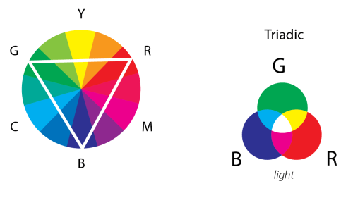
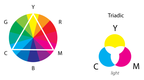
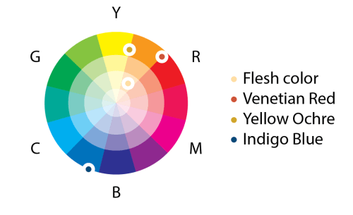
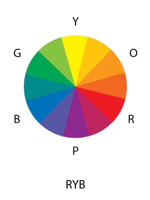
This lovely wheel is often called the Yurmby wheel because it’s somewhat more pronounceable then YRMBCG(Y). The benefit of the Yurmby is that the primary of one system is the secondary of the other. With the RGB system,

Red light + Blue light = Magenta light.

Red and Blue are the “primaries,” meaning they are used to mix all other colors, like Magenta, and they can’t be mixed by other colors within that system. The CMYK system is different because pigments absorb light and so it is the reverse of the RGB system:

Cyan pigment + Yellow pigment = Green pigment.

This spatial relationship on the wheel is important as it is an oversimplified representation of an important aspect of our vision. Our eyes only have three types of color sensitive cells—typically called Red, Blue, and Green cone cells. Each cell is sensitive to a different size of wavelength of light:  Long, Medium, and Short. When all three frequencies of light are seen together, we see white light. But more significantly, when we see a combination of Medium (green) and Long (red) wavelengths, our brain gets the same signal as if we saw yellow light, which has a medium longish wavelength!

color wheels-03

Going back to the Color Relationships, the first, and easiest to see is a Triadic relationship. Here three colors are chosen at similar distances from each other on the color circle. If we choose Red, Green and Blue, then you should feel a sense of familiarity. When light of all three colors is brought together we have white. But what if we move the triangle, you may ask? Well, let’s try Magenta, Yellow, and Cyan. To shorten the number of words written, I am going to increasingly use more abbreviations. C + Y + M = Black, right? Well yes, if mixed as pigment on paper it becomes a dark gray, as Cyan absorbs Red, Yellow absorbs Blue, and Magenta absorbs Green. But as light, they mix to White.

Cyan light is made up of both Green light and Blue light as that is how you make Cyan light: C = G + B. If we go back to our original equation

C + Y + M

and simplify further, we get

(G + B) + (G + R) + (R + B), or 2R + 2G + 2B.

color wheels-04

We can remove the 2’s as they are not important (think stoichometry in chemistry!) and we are left with RGB, or white. Now let’s try moving half a step clockwise:

 Magenta-Blue + Cyan-Green + Yellow-Red,

or

M + B + C + G + Y + R,

which simplifies to

(R + B) + B + (B + G) + G + (G + R) + R, or 3R + 3G + 3B,

which once again is RGB!

color wheels-05

The point of these “color relations” is to simplify the number of colors in use. Any three equally spaced colors would mix to white. A complementary color pair is the fewest number of colors necessary to engage all three cone cells in the eye; for example,

R + C = R + (G + B)= White.

A split complement is in between a complement-pair and a triad, as shown in the second figure below.

color wheels-06

So for the watercolors I started this discussion about, I had found an old tube of flesh color that I had bought while in Taiwan. I was oddly attracted to this totally artificial-looking hue as a representative for human skin, and it also seemed like a good challenge to get it to work harmoniously in a painting. To understand it better, I first went about trying to remix that flesh color with my other single pigment paints. It turned out to be a mixture of red, yellow, and lots of white — basically a pastel orange. The complementary color of this is a Cyan-Blue color, which I chose to be the pigment Indigo. I added to this pallet Yellow Ochre, which is a reddish-yellow, and Venetian Red which is a yellowish-red, which when mixed make an orange, though much earthier than the orange in that tube of Barbie-like flesh tone.

color wheels-07

Once I had the four colors I felt best about (which also took into consideration other characteristics of a pigment, such as how grainy they are), the painting became a process where intuition, chance, luck, skill, and the weather all played equal parts in creating a work of historical record — never to be repeated equally again.

Disciplines of Geography 10.28.11

–Geoffrey Owen Miller

Thanks, Geoffrey!  I’d like to remark that I asked Geoffrey to elaborate on the statement “Once I had the four colors I felt best about….”  How did he know what colors were “best”?  Geoffrey commented that it was “like Tiger Woods describing what goes through his mind when he swings a golf club.”

As I thought about his comment, I appreciated it more and more.  A color wheel is a tool to help you organize thoughts about colors — but a color wheel cannot choose the colors for you.  This is where artistry comes in.  Using your tools as a guide, you navigate your way through the color spectrum until — based on years of practice and experience — you’ve “found it.”

But this is exactly what happens when creating digital art!  It is easy to find the complement of a color from the RGB values — just subtract each RGB value from 1.  Sometimes it’s just what you want, but sometimes you need to tweak it a little.  While there are simple arithmetic rules relating colors, they are not “absolute.”

So it all comes back to the question, “What is art?”  I won’t attempt to answer this question here, but only say that having tools and techniques (and code!) at your disposal will allow you to create images, but that doesn’t necessarily mean that these images will have artistic value.

I hope you’ve enjoyed my first guest blogger — I’ll occasionally invite other bloggers as well in the future.  I’m off to Finland for the Bridges 2016 conference tomorrow, so next week I’ll be talking about all the wonderful art I encounter there!


Guest Blogger: Geoffrey Owen Miller, I

Disciplines of Geography 11.5.11.jpg
Disciplines of Geography 11.5.11

Geoffrey was one of the two most influential artists who guided me along the path of creating digital art.  We worked at the same school a few years ago, and I sat in on many of his art classes.  Since the faculty often ate lunch together, we’d sit and have many casual chats about art and color.

What I always appreciate about Geoffery is that even though he’s not a mathematician, he is still able to understand and appreciate the mathematical aspects of what I create.  He isn’t intimidated by the mathematics, and I’m not intimidiated by his artisitic expertise.  He really helps me develop as an artist.

Geoffrey is passionate about the use of color, and thinks and writes extensively about the subject.  I’m also fascinated by color, so I thought I’d invite him to be a guest on my blog.  He had so many great things to say, though, that is soon became too much to say in one post.

So enjoy these few weeks, and learn something more about color!  If you like what you see and read, visit Geoffrey’s website at www.geoffreyowenmiller.com.  Enough from me — we’ll let Geoffrey speak for himself….

Back in 2011, I started a series of watercolors that came to be called the Disciplines of Geography. I had just been in Europe and had spent a lot of time visiting the museums and thinking about history while walking amongst all those giant oil paintings. On my return, I was asked by a friend and talented poet to help create a cover for a book of her poems. I had been using the medium of watercolor to sketch during my travels and I decided to use it to make something more substantial and sustained. I found watercolor quite difficult compared to oil paint as every mark you make on the paper remains at some level visible. It forces you to accept mistakes while you do all you can to try and minimize them. But mostly I loved the color the transparent washes of color could create despite my perpetual uncertainty and constant mistakes.

Discipline of Geography  1.6.11
Disciplines of Geography 1.6.11

I determined to make my own version of a history painting with watercolor by focusing on the process of painting. I started thinking about how time and space were linked with the history of the European borders. To watch the ebb and flow of the borders of different countries and governments overlapping and being overlapped was similar to the way watercolor extends out from a pour of paint on wet paper. Each layer of color is effectively redrawing the boundaries, while simultaneously building a history where every subsequent state is influenced by the previous colors, values, and borders of those before them.

As these paintings are nonobjective abstractions, meaning I was not looking at anything specific to inform my color choices, I needed something to inform my decision making. Often abstractions come from found or referenced materials, like photos, or found objects, which can often help direct the choices of value, color, line, etc., that one is making. Why choose one blue instead of another? At some level we choose colors we like or look better to us, but I like working in or creating systems that push me outside of what I normally feel comfortable with. As these paintings existed in the realm of ideas and needed a similar structure to build upon, I really started looking into the color wheel as a tool to think about the relationships of the different colors. (This itself became a multi-year ongoing project.) Without going down that path too far, I wanted to share something I found interesting and helpful in the context of making these watercolors as well providing a greater understanding to how color relates in other contexts.

As a student I was shown, in conjunction with the color wheel, certain color relationships that were supposed to help us make harmonious color choices in our images. We were supposed to make color choices based off of the relationships of the colors’ locations on the color circle. Complementary colors were any two colors on opposite sides of the circle, split complements exchanged one of those two colors for the two colors on either side of it, triadic colors were three colors equally distanced from each other, and so on. But was yellow the complement of purple?  Or of blue?  Because artists use more than one color wheel, it depended on which color circle you decided to go with.

The Red Yellow Blue (RYB) primary color circle was most often used during my schooling. This was because those were the pigments we most often used, and in this case yellow did complement the mixture of red and blue, which was called purple. If you mixed all three you tended to get a dark color that, depending on your ratios, was a pretty decent neutral, which is really important in color mixing. Hardly anything in the world around us is a fully saturated color.

color wheels-01

However, with light it is very clear, and also demonstrable in your own home with flashlights and colored films, that blue is the complement of yellow. And when they mix they create a fairly neutral white. As color is essentially about light (and pigments are a complicated world in themselves) I decided to go with the Red Green Blue (RGB) color circle. As an added bonus, those clever artists and color scientists figured out that certain other pigments can work quite nicely in this structure. Cyan, Yellow, and Magenta are the colors that Red, Green, and Blue light make when mixed, while Red, Green, and Blue are made with Cyan, Yellow, and Magenta pigments. Learning that was incredibly satisfying.

color wheels-02

But since Cyan, Magenta, and Yellow pigments don’t actually create Black, Black is needed for the very darkest colors.  So this system is called the “CMYK” system, where “K” is used for Black so it’s not confused with Blue.

There’s a neat way these two systems can be combined, called the “Yurmby” wheel, which I used to create Disciplines of Geography.  That’s where we’ll start next week!