Creating Animated GIFs in Processing

Last week at our Digital Art Club meeting, I mentioned that I had started making a few animated gifs using Processing.  Like this one.

GIF

(I’m not sure exactly why the circles look like they have such jagged edges — must have to do with the say WordPress uploads the gif.  But it was my first animated gif, so I thought I’d include it anyway.)

And, of course, my students wanted to learn how to make them.  A natural question.  So I thought I’d devote today’s post to showing you how to create a rather simple animated gif.

sample

Certainly not very exciting, but I wanted to use an example where I can include all the code and explain how it works.  For some truly amazing animated gifs, visit David Whyte’s Bees & Bombs page, or my friend Roger Antonsen’s Art page.

Here is the code that produces the moving circles.

gif3

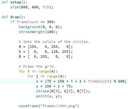
I’ll assume you’ve done some work with Processing, so you understand the setup and draw functions, you know that background(0, 0, 0) sets the background color to black, etc.

The idea behind an animated gif which seems to be a continuous loop is to create a sequence of frames whose last frame is essentially the same as the first.  That way, when the gif keeps repeating, it will seem as though the image is continually moving.

One way to do this is with the “mod” function — in other words, using modular arithmetic.  Recall that taking 25 mod 4 means asking “What is the remainder after dividing 25 by 4?”  So if you take a sequence of numbers, such as

1, 2, 3, 4, 5, 6, 7, 8, 9, 10, 11, 12, 13, 14, …

and take that sequence mod 4, you end up with

1, 2, 3, 0, 1, 2, 3, 0, 1, 2, 3, 0, 1, 2, ….

Do you see it already?  Since my screen is 600 pixels wide, I take the x-coordinate of the centers of the circles mod 600 (that’s what the “% 600” means in Python).  This makes the image wrap around horizontally — once you hit 600, you’re actually back at 0 again.  In other words, once you go off the right edge of the screen, you re-enter the screen on the left.

That’s the easy part….  The geometry is a little trickier.  The line

x = (75 + 150 * i + 2 * frameCount) % 600

requires a little more explanation.

First, I wanted the circles to be 100 pixels in diameter.  This makes a total of 400 pixels for the width of the circles.  Now since I wanted the image to wrap around, I needed 50 pixels between each circle.  To begin with a centered image, that means I needed margins which are just 25 pixels.  Think about it — since the image is wrapping around, I have to add the 25-pixel margin on the right to the 25-pixel margin on the left to get 50 pixels between the right and left circles.

So the center of the left circles are 75 pixels in from the left edge — 25 pixels for the margin plus 50 pixels for the radius.  Since the circles are 100 pixels in diameter and there are 50 pixels between them, there are 150 pixels between the centers of the circles. That’s the “150 * i.”  Recall that in for loops, the counters begin at 0, so the first circle has a center just 75 pixels in from the left.

Now here’s where the timing comes in.  I chose 300 frames so that by showing approximately 30 frames per second (many standard frame-per-second rates are near 30 fps) the gif would cycle in about 10 seconds.  But cycling means moving 600 pixels in the x direction — so the “2 * frameCount” will actually give me a movement of 600 pixels to the right after 300 frames.  You’ve got to carefully calculate so your gif moves at just the speed you want it to.

To make displaying the colors easier, I put the R, G, and B values in lists.  Of course there are many other ways to do this — using a series of if/else statements, etc.

One last comment:  according to my online research, .png files are better for making animated gifs, while .tif files (as I’ve also used in many previous posts) are better for making movies.  But .png files take longer to save, which is why your gif will look like it’s moving slowly when you use saveFrame, but will actually move faster once you make your gif.

So now we have our frames!  What’s next?  A few of my students mentioned using Giphy to make animated gifs, but I use GIMP.  It is open source, and can be downloaded for free here.  I’m a big fan of open source software, and I like that I can create gifs locally on my machine.

Once you’ve got GIMP open, select “Open as Layers…” from the File menu.  Then go to the folder with all your frames, select them all (using Ctrl-A or Cmd-A or whatever does the trick on your computer), and then click “Open.”  It may take a few minutes to open all the images, depending on how many you have.

Now all that’s left to do is export as an animated gif!  In the File menu, select “Export As…”, and make sure your filename ends in “.gif”.  Then click “Export.”  A dialog box should open up — be sure that the “As animation” and “Loop forever” boxes are checked so your animated gif actually cycles.  The only choice to make now is the delay between frames.  I chose 30 milliseconds, so my gif cycled in about 10 seconds.  Then click “Export.”  Exporting will also take a few seconds as well — again, depending on how many frames you have.

Unfortunately, I don’t think there’s a once-size-fits-all answer here.  The delay you choose depends on how big your gif actually is — the width of your screen in Processing — since that will determine how many frames you need to avoid the gif looking too “jerky.”  The smaller the time interval between frames, the more frames you’ll need, the more space those frames will take up, and the longer you’ll need to upload your images in Gimp and export them to an animated gif.  Trade-offs.

So that’s all there is to it!  Not too complicated, though it did take a bit longer for me the first time.  But now you can benefit from my experience.  I’d love to see any animated gifs you make!

Using Processing for the First Time

While I have discussed how to code in Processing in several previous posts, I realized I have not written about getting Processing working on your own computer.  Naturally I tell students how to do this in my Mathematics and Digital Art course.  But now that I have started a Digital Art Club at the University of San Francisco, it’s worth having the instructions readily accessible.

The file I will discuss may be used to create an image based on the work of Josef Albers, as shown below.

0001

See Day002 of my blog,  Josef Albers and Interaction of Color, for more about how color is used in creating this piece.

As you would expect, the first step is to download Processing.  You can do that here.  It may take a few moments, so be patient.

The default language used in Processing is Java.  I won’t go into details of why I’m not a fan of Java — so I use Python mode.  When you open Processing, you’ll see a blank document like this:

Day110Screen1

Note the “Java” in the upper right corner.  Click on that button, and you should see a menu with the option “Add Mode…”  Select this option, and then you should see a variety of choices — select the one for Python and click “Install.”  This will definitely take a few minutes to download, so again, be patient.

Now you’re ready to go!  Next, find some Processing code written in Python (from my website, or any other example you want to play around with).  For convenience, here is the one I’ll be talking about today:  Day03JosefAlbers.pyde.  Note that it is an Open Office document; WordPress doesn’t let you upload a .pyde file.  So just open this document, copy, and paste into the blank sketch.  Be aware that indentation is important in Python, since it separates blocks of code.  When I copied and pasted the code from the Open Office document, it worked just fine.  But in case something goes awry, I always use four spaces for successive indents.

Now run the sketch (the button with the triangle pointing to the right).  You will be asked to create a new folder; just say yes.  When Processing runs, it often creates additional files (as we’ll see in a moment), and so keeping them all in one folder is helpful.  You should also see the image I showed above; that is the default image created by this Processing program.

Incidentally, the button with the square in the middle stops running your sketch.  Sometimes Processing runs into a glitch or crashes, so stopping and restarting your sketch is sometimes necessary.  (I still haven’t figured out why it crashes at random times.)

Next, go to the folder that you just created.  You should see a directory called “frames.”  Inside, you should see some copies of the image.

Day110Screen2

Inside the “draw” function, there is a function call to “saveFrame,” which saves copies of the frames you make.  You can call the folder whatever you want; this is convenient, since you might want to make two different images with the same program.  Just change the folder name you save the images to.

A word about the syntax.  The “####” means the frames will be numbered with four digits, as in 0001.png, 0002.png, etc.  If you need more than 10,000 frames (likely you won’t when first starting), just add more hashtags.  The “.png” is the type of file.  You can use “.tif” as well.  I use “.tif” for making movies, and “.png” for making animated gifs.  There are other file types as well; see the documentation on saveFrame for more details.

Now let’s take a look at making your own image using this program.

Day110Screen3

If you notice, there are lines labelled “CHANGE 1” to “CHANGE 6” in the setup and draw functions.  These are the only lines you need to change in order to design you own piece. You may tweak the other code later if you like.  But especially for beginning programmers, I like to make the first examples very user-friendly.

So let me talk you through changing these lines.  I won’t bother talking about the other code right now — that would take some time!  But you don’t need to know what’s under the engine in order to create some interesting artwork….

CHANGE 1:  The hashtags here, by the way, indicate a comment in your code:  when your program runs, anything after a hashtag is ignored.  This makes it easy to give hints and provide instructions in a program (like telling you what lines to change).  I created a window 800 x 600 pixels; you can make it any size you want by changing those numbers. The “P2D” just means you’re working with a two-dimensional geometry.  You can work in 3D in Processing, but we won’t discuss that today.

CHANGE 2:  The “sqSide” variable indicates how big the square are, in units of pixels.  The default unit in Processing is always pixels, so if you want to use another geometry (like a Cartesian coordinate system), you have to convert from one coordinate system to another.  I do all this for you in the code; all you need to do is say how large each square is.  And if you didn’t go back and read the Josef Albers piece, by “square,” I mean a unit like this:

Day002Square

CHANGE 3, CHANGE 4:  The variables “sqRows” and “sqCols” indicate, as you would expect, how many rows and columns are in the final image.  Since I have 15 rows and the squares are 30 pixels on a side, the height of the image is 450 pixels.  Since my window is 600 pixels in height, this means there are margins of 75 pixels on the top and bottom.  If your image is too tall (or too wide) for the screen, it will be cropped to fit the screen.  Processing will not automatically resize — once you set the size of the screen, it’s fixed.

CHANGE 5:  The “background” function call sets the color of the background, using the usual RGB values from 0-255.

CHANGE 6:  The first three numbers are the RGB values of the central rectangles in a square unit.  The next three numbers indicate how the background colors of the surrounding rectangles change.  (I won’t go into that here, since I explain it in detail in the post on Josef Albers mentioned above.  The only difference is that in that post, I use RGB values from 0-1, but in the Processing code here, I use values from 0-255.  The underlying concept is the same.)

The last (and seventh) number is the random number seed.  Why is this important?  If you don’t say what the random number seed is (the code does involve choosing random numbers), every time you run the code you will get a different image — the computer just keeps generating more (and different) random numbers in a sequence.  So if you find an image you really like and don’t know what the seed is, you’ll likely never be able to reproduce it again!  And if you don’t quite like the texture created by using one random seed, you can try another.  It doesn’t matter so much if you have many rows and columns, but if you try a more minimalist approach with fewer and larger squares, the random number seed makes a big difference.

OK, now you’re on your own….  This should be enough to get you started, and will hopefully inspire you to learn a lot more about Python and Processing!


To Processing I

I made a decision last week to abandon using Sage (now called CoCalc) as a platform in my Mathematics and Digital Art class.  It was not an easy decision to make, as there are some nice features (which I’ll get to in a moment).  But now any effective use of Sage comes with a cost — the free version uses servers, and you are given this pleasant message:  “This project runs on a free server (which may be unavailable during peak hours)….”

This means that to guarantee access to CoCalc, you need a subscription.  It would not be prohibitively expensive for my class — but as I am committed to being open source, I am reluctant to continue putting sample code on my web page which requires a cost in order to use.  Yes, there is the free version — as long as the server is available….

When I asked my students last semester about moving exclusively to Processing, they responded with comments to the effect that using Sage was a gentle introduction to coding, and that I should stick with it.  I fully intended to do this, and got started preparing for the first few days of classes.  I opened my Sage worksheet, and waited for it to load.  And waited….

That’s when I began thinking — I did have experiences last year where the class virtually came to a halt because Sage was too slow.  It’s a problem I no longer wanted to have.

So now I’m going to Processing right from the beginning.  But why was I reluctant in the past?

The issue is that of user space versus screen space.  (See Making Movies with Processing I for a discussion of these concepts.)  With Sage, students could work in user space — the usual Cartesian coordinate system.  And the programming was particularly easy, since to create geometrical objects, all you needed to do was specify the vertices of a polygon.

I felt this issue was important.  Recall the success I felt students achieved by being able to alter the geometry of the rectangles in the assignment about Josef Albers and color.  (See the post on Josef Albers and Interaction of Color for a refresher on the Albers assignment.)

peyton
Peyton’s piece on Josef Albers.

Most students experimented significantly with the geometry, so I wanted to make that feature readily accessible.  It was easy in Sage, the essential code looking something like this:

Screen Shot 2017-08-26 at 11.08.35 AM

What is happening here is that the base piece is essentially an array of rectangles within unit squares, with lower-left corners of the squares at coordinates (i, j).  So it was easy for students to alter the polygons rendered by using graph paper to sketch some other polygon, approximate its coordinates, and then enter these coordinates into the nested loops.

Then Sage rendered whatever image you created on the screen, automatically sizing the image for you.

But here is the problem:  Processing doesn’t render images this way.  When you specify a polygon, the coordinates must be in screen space, whose units are pixels.  The pedagogical issue is this:  jumping into screen space right at the beginning of the semester, when we’re just learning about colors and hex codes, is just too big a leap.  I want the first assignment to focus on getting used to coding and thinking about color, not changing coordinate systems.

Moreover, creating polygons in Processing involves methods — object-oriented programming.  Another leap for students brand new to coding.

The solution?  I had to create a function in Processing which essentially mimicked the “polygon” function used in Sage.  In addition, I wanted to make the editing process easy for my students, since they needed to input more information this time.

Day108pyde1

In Processing — in addition to the number or rows and columns — students must specify the screen size and the length of the sides of the squares, both in pixels.  The margins — xoffset and yoffset — are automatically calculated.

Here is the structure of the revised nested for loops:

Day108pyde2

Of course there are many more function calls in the loops — stroke weights, additional fill colors and polygons, etc.  But it looks very similar to the loop formerly written in Sage — even a bit simpler, since I moved the translations to arguments (instead of needing to include them in each vertex coordinate) and moved all the output routines to the “myshape” function.

Again, the reason for this is that creating arbitrary shapes involves object-oriented concepts.  See this Processing documentation page for more details.

Here is what the myshape function looks like:

Day108pyde3

The structure is not complicated.  Start by invoking “createShape,” and then use the “beginShape” method.  Adding vertices to a shape involves using the “vertex” method, once for each vertex.  This seems a bit cumbersome to me; I am new to using shapes in Processing, so I’m hoping to learn more.  I had been able to get by with just creating points, lines, rectangles, and circles so far — but that doesn’t give students as much room to be creative as including arbitrary shapes does.

I should point out that shapes can have subshapes (children) and other various attributes.  There is also a “fill” method for shapes, but I have students use the fill function call in the for loop to avoid having too many arguments to myshape.  I also think it helps in understanding the logical structure of Processing — the order in which functions calls are invoked matters.  So you first set your fill color, then when you specify the vertices of your polygon, the most recently defined fill color is used.  That subtlety would get lost if I absorbed the fill into the myshape function.

As in previous semesters, I’ll let you know how it goes!  Like last semester, I’ll give updates approximately monthly, since the content was specified in detail in the first semester of the course (see Section L. of 100 Posts! for a complete listing of posts about the Mathematics and Digital Art course).

Throughout the semester, I’ll be continuously moving code from Sage to Processing.  It might not always warrant a post, but if I come across something interesting, I’ll certainly let you know!

On Coding XI: Computer Graphics III, POV-Ray

It has been a while since the last installment of On Coding.  I realized there is still more to say about computer graphics; I mentioned the graphics package POV-Ray briefly in On Coding IX, but feel it deserves much more than just a mere mention.

I’d say I began using POV-Ray in the late 1990’s, though I can’t be more precise.  This is one of the first images I recall creating, and the comments in the file reveal its creation date to be 19 September 1997.

petrie

Not very sophisticated, but I was just trying to get POV-Ray to work, as I (very vaguely) remember.  Since then, I’ve created some more polished images, like the polyhedron shown below.  I’ll talk more about polyhedra in a moment….

XT-18-19-28

First, a very brief introduction.  POV-Ray stands for Persistence of Vision Raytracer.  Ray tracing is a technique used in computer graphics to create amazingly realistic images.  Essentially, the color of each pixel in the image is determined by sending an imaginary light ray from a viewing source (the camera in the image below) and seeing where it ends up in the scene.

800px-Ray_trace_diagram.svg
Image by Henrik, Wikipedia Commons.

It is possible to create various effects by using different light sources, having objects reflect light, etc.  You are welcome to read the Wikipedia page on ray tracing for more details on how ray tracing actually works; my emphasis here will be on the code (of course!) I wrote to create various three-dimensional images.  And while the images you can produce using a ray tracing program are quite stunning at times, there is a trade-off: it takes longer to generate images because the color of each pixel in the image must be individually calculated.  But I do think the results are worth the wait!

My interest in POV-Ray stemmed from wanting to render polyhedra.  The images I found online indicated that you could create images substantially more sophisticated than those created with Mathematica.  And better yet, POV-Ray was (and still is!) open source.  That means all I needed to do was download the program, and start coding….

R_3-5_Dual

POV-Ray is a procedural programming language all in itself.  So to give you an idea of what a typical program looks like, I’ll show you the code which makes the following polyhedron:

tRp_52-3-5

Here’s how it begins.

POV4

The #include directive indicates that the given file is to be imported.  POV-Ray has many predefined colors and literally hundreds of different textures:  glass, wood, stone, gold and other metals, etc.  You just include those files you actually need.  To give you an idea, here is the logo I created for Dodecahedron Day using  silver and stone textures.

logo3

Next are the global settings.  There are actually many global settings which do a lot more than I actually understand…but I just used the two which were included in the file I modeled my code after.  Of course you can play with all the different settings (there is extensive online documentation) and see what effects they have on your final image, but I didn’t feel the need to.  I was getting results I liked, so I didn’t go any further down this path.

Then you set the camera.  This is fairly self-explanatory — position the camera in space, point it, and set the viewing angle.  A fair bit of tweaking is necessary here.  Because of way the image is rendered, you can’t zoom in, rotate, or otherwise interact with the created image.  So there is a bit of trial-and-error in these settings.

Lighting comes next.  You can use point light sources in any color, or have grids of light sources.  The online documentation suggested the area lighting here (a 5-by-5 grid of lights spanning 5 units on the x-axis and 5 units on the z-axis), and it worked well for me.  Since I wanted the contrast of the colors of the faces of the polyhedra on a black background, I needed a little more light than just a single point source.  You can read all about the “adaptive” and “jitter” parameters here, but I just used the defaults suggested in the documentation and my images came out fine.

There are spotlights and cylindrical lighting sources as well, and all may be given various parameters.  Lighting in Mathematica is quite a bit simpler with fewer options, so lighting was one of the most challenging features of POV-Ray to learn how to use effectively.

So that’s the basic setup.  Now for the geometry!  I can’t go into all the details here, but I can give you the gist of how I proceeded.

POV2

The nested while loops produce the 60 yellow faces of the polyhedron.  Because of the high icosahedral symmetry of the polyhedron, once you specify one yellow face, you can use matrices to move that face around and get the 59 others.

To get the 60 matrices, you can take each of 12 matrices representing the symmetries of a tetrahedron (tetra[Count]), and multiply each by the five matrices representing the rotations around the vertices of an icosahedron (fiverot[Count2]).  There is a lot of linear algebra going on here; the matrices are defined in the file “Mico.inc”, which is included.

The vertices of the yellow faces are given in “VF[16]”, where the “VF” stands for “vertex figure.”  These vertex figures are imported from the file “VFico.inc”.  Lots of geometry going on here, but what’s important is this:  the polygon with vertices listed in VF[16] is successively transformed by two symmetry matrices, and then the result is defined to be an “object” in our scene.  So the nested loops place 60 objects (yellow triangles) in the scene.  The red pentagrams are created similarly.

POV3

Finally, the glass tabletop!  I wanted the effect to be subtle, and found that the built-in texture “T_Glass2” did the trick — I created a square (note the first and last vertices are the same; a quirk of POV-Ray) of glass for the polyhedron to sit on.

POV-Ray does the rest!  The overall idea is this:  put whatever objects you want in a scene.  Then set up your camera, adjust the lighting, and let POV-Ray render the resulting image.

petrie10

Of course this introduction is necessarily brief — I just wanted to give you the flavor of coding with POV-Ray.  There are lots of examples online and within the documentation, so it should not be too difficult to get started if you want to experiment yourself!

On Coding X: Computer Graphics II

Now that I’ve talked about what I use computer graphics for in my last installment of On Coding, I’d like to talk about the most useful graphics package I’ve come across for writing mathematics:  TikZ.

First a word about the name, TikZ.  It’s an example of a recursive acronym, like GOD used in Douglas Hofstadter’s Gödel, Escher, Bach, which stands for “GOD Over Djinn.”  (By the way, read Gödel, Escher, Bach if you haven’t already — it’s an amazing book about Gödel’s Incompleteness Theorem.)

So TikZ stands for “TikZ ist kein Zeichenprogramm,” which is German for “TikZ is not a drawing program.”  According to its creator, Till Tantau, this indicates that TikZ is not a way to draw pictures with your mouse or tablet, but is more like a computer graphics language.  It is designed for use in LaTeX, and is built with a lower-level language called PGF, which stands for “portable graphics format.”

So enough history — you can read more in the TikZ manual.  But a word of caution — it’s over 1000 pages long, so there’s a lot there!  I’ll only be able to scratch the surface today.

The two most important features of TikZ, in my opinion, are (1) you can draw very precise graphics because you’re writing in a high-level langauge, not using a WYSIWYG environment, and (2) you can use it in LaTeX, including putting any LaTeX symbols in your graphics.  This second point is extremely important, since it means when you’re labelling a diagram, the labels (usually involving mathematical symbols) look exactly the same way as the do in your text.

I use TikZ almost exclusively for two-dimensional mathematical graphics.  In a recent paper, for example, I created the following image.

tikzexamples

Note how precisely all the elements are rendered — this is because you give precise coordinates for all the individual graphics elements.

Let’s take a look at another, somewhat simpler example from this paper.

tikzexamples2

I chose this example for a few reasons.  First, it requires using a lot of the basic TikZ commands.  Second, it illustrates the practical side of drawing computer graphics.  No, I’m not going to submit this image to a Bridges art exhibition any time soon — but if I need to make an image for a paper, I want it to look good.

So I thought I’d take some time to explain various aspects of the code which creates this image.  Maybe not the most glamorous graphic — but you’re welcome to look at the 1000+ page manual for hundreds of neat examples.  Here is a diagram for a finite-state automaton from page 179, for example.


tikzpgfmanual2

Here’s what you’d need to type in LaTeX to get the simple graph I mentioned a moment ago.

tikz

Let’s look at several different excerpts from this example.  The first line opens your TikZ environment, and scales the image.  The default unit is 1 cm, so you need to set the scale to get your image the right size.

The next line is just a comment — I don’t use comments much for simple images.  But for more complex images, they’re important.  Just as important as commenting computer code.

The next line draws a set of axes.  What’s important here is that I defined my own “\axes” command — so you can include user-defined functions as well.  The advantages of being able to do this are huge.  You can use any command you define in LaTeX in a TikZ image.

Another great feature is the looping construct, “\foreach.”  The red segments above are one unit long, and so the only difference is the starting points.  Also important here is that you can use mathematical expressions inside TikZ, like the “{(\x^2+9)/6}” expression in the curly brackets.

Note the directives “[thick, red]” after the “draw” command.  You have control over every aspect of the drawing routines in TikZ — and there are lots of them.  For example, there is the “dashed” directive in line 10.  But not only can you draw a dashed line, but you can also specify the lengths of the dash marks and the spaces between them, too!  Further, you can create user-defined styles if you use the same set of directives over and over again.  This is helpful if you are creating several related images, and you want to tweak the color, for example.  You only have to change the color specification in the style, and every image which uses that style will be rendered using the new color.

Notice the “\filldraw” command in line 6.  I wanted open circles, so I drew the circles in red, and filled them with white.  If I wanted to, I could have also specified precisely how thick I wanted the circles to be drawn, but the default thickness looked just fine to me.

Notice the use of “node” and “\node” throughout.  In line 9, for example, the “3” is centered at coordinates (3, -0.5).  Also note the placement of nodes at the end of line segments, as shown in lines 7 and 8.  Again, it is significant that you can include any text you can create in LaTeX in your diagram.

I hope this is enough to give you the feel of using TikZ.  As I mentioned in the last installment, I also use TikZ to create slideshow presentations since there is so much you can do.  Remember, there are over 1000 pages of examples of things you can do in TikZ in the manual.

I would like to mention one caveat, however.  I do sometimes use Mathematica to create images with mathematically intensive equations and calculations.  TikZ is closer to a markup language in its usage, as I see it — so any image that requires significant coding to produce is a bit too cumbersome syntactically.  Here is an example of an image I used Mathematica to create.

Figure1.png

But another nice TikZ feature is that you can import images into your environment — so I can draw complex images in Mathematica, include them in my TikZ picture, and then overlay LaTeX symbols on top of the image.  With this capability, the possibilities are quite literally endless.

A final comment:  TikZ and LaTeX are both open source, so if you’re interested, you can just download them and start experimenting!  The learning curve is a little steep, admittedly, but once you’ve climbed up, you’ll be able to create astonishingly beautiful graphical images for any purpose you have in mind.  Try it!


On Coding IX: Computer Graphics I

It has been some time since an On Coding installment, and I thought it finally time to discuss computer graphics.  Of course I’ve done that a lot already, as far as several applications go.  For this post, I asked myself something different:  what do I use computer graphics for?

2017-05-04BinaryTreeLambdais01.png

I had never really taken a step back to look at the larger picture, but that’s one of the purposes of this thread.  I came up with seven major uses, in roughly chronological order from when I started using graphics in each way:

  1. Creating fractals.
  2. Graphic design.
  3. Rendering polyhedra in three dimensions.
  4. Mathematical illustration.
  5. Web design.
  6. Mathematical art.
  7. Research.

Today, I’ll give a brief overview, and follow up in future posts with more details about the various platforms I’ve used.

I don’t need to say a lot about the first two uses, since I’ve discussed them in some detail in my posts on Postscript and iterated function systems.  My interest in fractals has of course continued, especially given my passion for Koch curves and binary trees.  I work less with graphic design now — I used to design stationery and business cards for myself and friends, but now that communication is so largely electronic, there is less of a need.  But I do still occasionally design business cards using my art logo, print them onto cardstock, and cut them myself when I need to.

Day092c2016Vienna

I also spend quite a bit of time designing title and separator slides for presentations.  (I frankly admit to never having created a PowerPoint presentation in my entire life.  Yuck.)  I now exclusively use TikZ in LaTeX since you have complete control over the graphics environment.

Day092a

I haven’t mentioned polyhedra extensively on my blog so far, but my interest in three-dimensional geometry goes back to my undergraduate days.  When I started teaching college for the first time, I designed (and eventually wrote a textbook for) a course on polyhedra based on spherical trigonometry.

The main tool I used early on was Mathematica, and when I redid all my graphics for my textbook about five years ago, I used Mathematica.  The image you see above was rendered using POV-Ray, a ray-tracing package which allows the user to specify a wide range of parameters to create realistic effects.  You can see shadows and a reflection as if the polyhedron were sitting on a shiny, black surface.  And while the images generated by POV-Ray are quite a bit nicer than those created with Mathematica, they take more time and effort to create.

Mathematical illustration covers a wide range of uses.  Drawing figures for a mathematical paper perhaps first comes to mind.  I used a package called PSTricks for quite a while (since the “PS” stands for Postscript), but once I learned about TikZ, I changed over fairly quickly.  This means I needed to re-render many older graphics (especially in my textbook) — but since for both packages you need precise coordinates, I already had all the mathematics worked out for the PSTricks function calls.  So converting to TikZ wasn’t all that problematic.  I will be talking in more detail about TikZ in a future post.

Day092b

Of course there are also geometrical puzzles and problems, as I’ve discussed before on my blog.  Nicely formatted graphics go a long way in making a puzzle appealing to the reader.

Web design is especially important, since I rely so much on my website for everything.  I have a web page for my artwork, for my publications, talks, and anything I do professionally.  I strive for functionality and aesthetics.  I’m also a minimalist as far as design goes — “less is more.”

Also important is ease of use for me.  It’s not hard to add something to my homepage.  I don’t have the time (or interest) in redesigning my homepage every I want to add a new link.  I’m not a fan of hiding everything in dropdown menus — I want the user to glance at my site, and immediately click on the relevant link without having to pore through menus.

Mathematical art has actually been a fairly recent use of computer graphics for me — I only really started getting into it about four years ago.  I don’t feel I have to say a lot about it right here, since it is a common thread throughout so many of my posts.  You can visit my art website, or look at my Twitter, where I try to update daily (as much as I can) with new and interesting pieces of mathematical art.

Finally, I’d like to say a word about the last use of computer graphics:  research.   I think this is extremely important, especially with the exploding world of data visualization.  Really, this has been perhaps Nick’s and my most important tool when it comes to studying binary trees.

2017-02-10tree1

Without going into too much detail about this image, is consists of six scaled and rotated copies of one tree (the ones in color) and a related dual tree (in white).  Now count the number of leaves (ends of paths) in common with the colorful trees — and you’ll count 1, 5, 10, 10, 5, and 1.  These are, of course, binomial coefficients:  row 5 of Pascal’s triangle.

Why is this the case?  And is there some general result to be proved?  The point I’m making is that when Nick and I create routines to display different trees or combinations of trees, we look at lots of examples, and seek recurring themes.

We learn a lot by doing this, and the direction of our research is heavily influenced by what we observe.  This might not be so surprising, since after all, fractal trees are such geometrical objects.  I can honestly say the pace of our progress in making conjectures is directly linked to our ability to produce large numbers of trees and knowing what to look for.

So that’s what I use computer graphics for!  In future posts, I’ll discuss the various software packages I use, and try to give some idea of the advantages and disadvantages of each.  I’ll give special emphasis to those that are open-source — there is so much out there that is free to download, anyone interesting in computer graphics will have no difficulty finding something interesting to experiment with!

Imagifractalous! 6: Imagifractalous!

No, the title of today’s post is not a typo….

About a month ago, a colleague who takes care of the departmental bulletin boards in the hallway approached me and asked if I’d like to create a bulletin board about mathematical art.  There was no need to think it over — of course I would!

Well, of course we would, since I immediately recruited Nick to help out.  We talked it over, and decided that I would describe Koch-like fractal images on the left third of the board, Nick would discuss fractal trees on the right third, and the middle of the bulletin board would highlight other mathematical art we had created.

I’ll talk more about the specifics in a future post — especially since we’re still working on it!  But this weekend I worked on designing a banner for the bulletin board, which is what I want to share with you today.

BBoardBanner

I really had a lot of fun making this!  I decided to create fractals for as many letters of Imagifractalous! as I could, and use isolated letters when I couldn’t.  Although I did opt not to use a third fractal “A,” since I already had ideas for four fractal letters in the second line.

The “I”‘s came first.  You can see that they’re just relatively ordinary binary trees with small left and right branching angles.  I had already incorporated the ability to have the branches in a tree decrease in thickness by a common ratio with each successive level, so it was not difficult to get started.

I did use Mathematica to help me out, though, with the spread of the branches.  Instead of doing a lot of tweaking with the branching angles, I just adjusted the aspect ratio (the ratio of the height to the width of the image) of the displayed tree.  For example, if the first “I” is displayed with an aspect ratio of 1, here is what it would look like:

2017-04-16Tree1

I used an aspect ratio of 6 to get the “I” to look just like I wanted.

Next were the “A”‘s.  The form of an “A” suggested an iterated function system to me, a type of transformed Sierpinski triangle.  Being very familiar with the Sierpinski triangle, it wasn’t too difficult to modify the self-similarity ratios to produce something resembling an “A.”  I also like how the first “A” is reminiscent of the Eiffel Tower, which is why I left it black.

I have to admit that discovering the “R” was serendipitous.  I was reading a paper about trees with multiple branchings at each node, and decided to try a few random examples to make sure my code worked — it had been some time since I tried to make a tree with more than two branches at each node.

fR

When I saw this, I immediately thought, “R”!  I used this image in an earlier draft, but decided I needed to change the color scheme.  Unfortunately, I had somehow overwritten the Mathematica notebook with an earlier version and lost the code for the original “R,” but luckily it wasn’t hard to reproduce since I had the original image.  I knew I had created the branches only using simple scales and rotations, and could visually estimate the original parameters.

The “C” was a no-brainer — the fractal C-curve!  This was fairly straightforward since I had already written the Mathematica code for basic L-systems when I was working with Thomas last year.  This fractal is well-known, so it was an easy task to ask the internet for the appropriate recursive routine to generate the C-curve:

+45  F  -90  F  +45

For the coloring, I used simple linear interpolation from the RGB values of the starting color to the RGB values of the ending color.  Of course there are many ways to use color here, but I didn’t want to spend a lot of time playing around.  I was pleased enough with the result of something fairly uncomplicated.

For the “T,” it seemed pretty obvious to use a binary tree with branching angles of 90° to the left and right.  Notice that the ends of the branches aren’t rounded, like the “I”‘s; you can specify these differences in Mathematica.  Here, the branches are emphasized, not the leaves — although I did decide to use small, bright red circles for the leaves for contrast.

The “L” is my favorite letter in the entire banner!  Here’s an enlarged version:

fL

This probably took the longest to generate, since I had never made anything quite like it before.  My inspiration was the self-similarity of the L-tromino, which may be made up of four smaller copies of itself.

2017-04-16Ltromino

The problem was that this “L” looked too square — I wanted something with a larger aspect ratio, but keeping the same self-similarity as much as possible.  Of course exact self-similarity isn’t possible in general, so it took a bit of work to approximate is as closely as I could.  I admit the color scheme isn’t too creative, but I liked how the bold, primary colors emphasized the geometry of the fractal.

The “O” was the easiest of the letters — I recalled a Koch-like fractal image I created earlier which looked like a wheel with spokes and which had a lot of empty space in the interior.  All I needed to do was change the color scheme from white-on-gray  to black-on-white.

Finally, the “S.”  This is the fractal S-curve, also known as Heighway’s dragon.  It does help to have a working fractal vocabulary — I knew the S-curve existed, so I just asked the internet again….  There are many ways to generate it, but the easiest for me was to recursively producing a string of 0’s and 1’s which told me which way to turn at each step.  Easy from there.

So there it is!  Took a lot of work, but it was worth it.  I’ll take a photo when it’s actually displayed — and update you when the entire bulletin board is finally completed.  We’ve only got until the end of the semester, so it won’t be too long….

Imagifractalous! 5: Fractal Binary Trees III

Last week I talked about working with binary trees whose branching ratio is 1 or greater.  The difficulty with having a branching ratio larger than one is that the tree keeps growing, getting larger and larger with each iteration.

But when you work with software like Mathematica, for example, and you create such a tree, you can specify the size of the displayed image in screen size.

So the trees above both have branching ratio 2 and branching angle of 70°.  The left image is drawn to a depth of 7, and the right image is drawn to a depth of 12.  I specified that both images be drawn the same size in Mathematica.

But even though they are visually the same size, if you start with a trunk 1 unit in length, the left image is about 200 units wide, while the second is 6000 units wide!

So this prompted us to look at scaling back trees with large branching ratios.  In other words, as trees kept getting larger, scale them back even more.  You saw why this was important last week:  if the scale isn’t right, when you overlap trees with r less than one on top of the reciprocal tree with branching ratio 1/r, the leaves of the trees won’t overlap.  The scale has to be just right.

2017-04-08ris2d.png

So what should these scale factors be?  This is such an interesting story about collaboration and creativity — and how new ideas are generated — that I want to share it with you.

For your usual binary tree with branching ratio less than one, you don’t have to scale at all.  The tree remains bounded, which is easy to prove using convergent geometric series.
2017-01-20ris1

What about the case when r is exactly 1, as shown in the above figure?  At depth n, if you start with a trunk of length 1, the path from the base of the trunk to the leaf is a path of exactly n + 1 segments of length 1, and so can’t be any longer than n + 1 in length.  As the branching angle gets closer to 0°, you do approach this bound of n + 1.  So we thought that scaling back by a factor of n + 1 would keep the tree bounded in the case when r is 1.

What about the case when r > 1?  Let’s consider the case when r = 2 as an example.  The segments in any path are of length 1, 2, 4, 8, 16, etc., getting longer each time by a power of 2.  Going to a depth of n, the total length is proportional to 2^n 
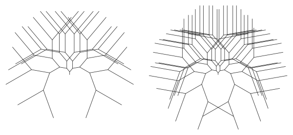
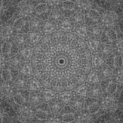
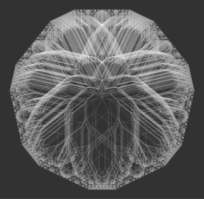
in this case.  In general, the total length is about 2\cdot r^n for arbitrary r, so scaling back by a factor of r^n would keep the trees bounded as well.

So we knew how to keep the trees bounded, and started including these scaling factors when drawing our images.  But there were two issues.  First, we still had to do some fudging when drawing trees together with their reciprocal trees.  We could still create very appealing images, but we couldn’t use the scale factor on its own.

And second — and perhaps more importantly — Nick had been doing extensive exploration on his computer generating binary trees.  Right now, we had three different cases for scaling factors, depending on whether r < 1, r = 1, or r > 1.  But in Nick’s experience, when he moved continuously through values of r less than 1 to values of r greater than one, the transition looked very smooth to him.  There didn’t seem to be any “jump” when passing through r = 1, as happened with the scale factors we had at the moment.

I wasn’t too bothered by it, though.  There are lots of instances in mathematics where 1 is some sort of boundary point.  Take geometric series, for example.  Or perhaps there is another boundary point which separates three fundamentally different types of solutions.  For example, consider the quadratic equation

x^2+c=0.

The three fundamentally different solution sets correspond to  c < 0, c = 0, and c > 0.  There is a common example from differential equations, too, though I won’t go into that here.  Suffice it to say, this type of trichotomy occurs rather frequently.

I tried explaining this to Nick, but he just wouldn’t budge.  He had looked at so many binary trees, his intuition led him to firmly believe there just had to be a way to unify these scale factors.

I can still remember the afternoon — the moment — when I saw it.  It was truly beautiful, and I’ll share it in just a moment.  But my point is this:  I was so used to seeing trichotomies in mathematics, I was just willing to live with these three scale factors.  But Nick wasn’t.  He was tenacious, and just insisted that there was further digging to do.

Don’t ask me to explain how I came up with it.  It was like that feeling when you just were holding on to some small thing, and now you couldn’t find it.  But you never left the room, so it just had to be there.  So you just kept looking, not giving up until you found it.

And there is was:  if the branching ratio was and you were iterating to a depth of n, you scaled back by a factor of

\displaystyle\sum_{k=0}^n r^k.

This took care of all three cases at once!  When r < 1, this sum is bounded (think geometric series), so the boundedness of the tree isn’t affected.  When r = 1, you just get n + 1 — the same scaling factor we looked at before!  And when r > 1, this sum is large enough to scale back your tree so it’s bounded.

Not only that, this scale factor made proving the Dual Tree Theorem so nice.  The scaling factors for a tree with r < 1 and its reciprocal tree with branching ratio 1/r matched perfectly.  No need to fudge!

This isn’t the place to go into all the mathematics, but I’d be happy to share a copy of our paper if you’re interested.  We go into a lot more detail than I ever could in a blog post.

This is how mathematics happens, incidentally.  It isn’t just a matter of finding a right answer, or just solving an equation.  It’s a give-and-take, an exploration, a discovery here and there, tenacity, persistence.  A living, breathing endeavor.

But the saga isn’t over yet….  There is a lot more to say about binary trees.  I’ll do just that in my next installment of Imagifractalous!

Imagifractalous! 4: Fractal Binary Trees II

Now that the paper Nick and I wrote on binary trees was accepted for Bridges 2017 (yay!), I’d like to say a little more about what we discovered.  I’ll presume you’ve already read the first Imagifractalous! post on binary trees (see Day077 for a refresher if you need it).

Recall that in that post, I discussed creating binary trees with branching ratios which were 1 or larger.  Below are three examples of binary trees, with branching ratios less that 1, equal to 1, and larger than 1, respectively.

2016-12-18threetrees.png

It was Nick’s insight to consider the following question:  how are trees with branching ratio r related to those with branching ratio 1/r?  He had done a lot of exploring with graphics in Python, and observed that there was definitely some relationship.

Let’s look at an example.  The red tree is a binary tree with branching ratio r less than one, and the gray tree has a branching ratio which is the reciprocal r.  Both are drawn to the same depth.

2016-12-03-doubletree1.png

Of course you notice what’s happening — the leaves of the trees are overlapping!  This was happening so frequently, it just couldn’t be coincidence.  Here is another example.

tree1

Notice how three copies of the trees with branching ratio less than one are covering some of the leaves of a tree with the reciprocal ratio.

Now if you’ve ever created your own binary trees, you’ll likely have noticed that I left out a particularly important piece of information:  the size of the trunks of the trees.  You can imagine that if the sizes of the trunks of the r trees and the 1/r trees were not precisely related, you wouldn’t have the nice overlap.

Here is a figure taken from our paper which explains just how to find the correct relationship between the trunk sizes.  It illustrates the main idea which we used to rigorously prove just about everything we observed about these reciprocal trees.

tree2

Let’s take a look at what’s happening.  The thick, black tree has a branching ratio of 5/8, and a branching angle of 25°.  The thick, black path going from O to P is created by following the sequence of instructions RRRLL (and so the tree is rendered to a depth of 5).

Now make a symmetric path (thick, gray, dashed) starting at P and going to O.  If we start at P with the same trunk length we started with at O, and follow the exact same instructions, we have to end up back at O.

The trick is to now look at this gray path backwards, starting from O.  The branches now get larger each time, by a factor of 8/5 (since they were getting smaller by a factor of 5/8 when going in the opposite direction).  The size of the trunk, you can readily see, is the length of the last branch drawn in following the black path from O to P.  This must be (5/8)5 times the length of the trunk, since the tree is of depth 5.

The sequence of instructions needed to follow this gray path is RRLLL.  It turns out this is easy to predict from the geometry.  Recall that beginning at P, we followed the instructions RRRLL along the gray path to get to O.  When we reverse this path and go from O to P, we follow the instructions in reverse — except that in going in the reverse direction, what was previously a left turn becomes a right turn, and vice versa.

So all we need to do to get the reverse instructions is to reverse the string RRRLL to get LLRRR, and then change the L‘s to R‘s and the R‘s to L‘s, yielding RRLLL.

There’s one important detail to address:  the fact that the black tree with branching ratio 5/8 is rotated by 25° to make everything work out.  Again, this is easy to see from the geometry of the figure.  Look at the thick gray path for a moment.  Since following the instructions RRLLL means that in total, you make one more left turn than you do right turns, the last branch of the path must be oriented 25° to the left of your starting orientation (which was vertical).  This tells you precisely how much you need to rotate the black tree to make the two paths have the same starting and ending points.

Of course one example does not make a proof — but in fact all the important ideas are contained in this one illustration.  It is not difficult to make the argument more general, and we have successfully accomplished that (though this blog is not the place for it!).

If you look carefully at the diagram, you’ll count that there are exactly 10 leaves in common with these two trees with reciprocal branching ratios.  There is some nice combinatorics going on here, which is again easy to explain from the geometry.

You can see that these common leaves (illustrated with small, black dots) are at the ends of gray branches which are oriented 25° from the vertical.  Recall that this specific angle came from the fact that there was one more L than there were R‘s in the string RRLLL.

Now if you have a sequence of 5 instructions, the only way to have exactly one more L than R‘s is to have precisely three L‘s (and hence two R‘s).  And the number of ways to have three L‘s in a string of length 5 is just

\displaystyle{5\choose3}=10.

Again, these observations are easy to generalize and prove rigorously.

And where does this take us?

canopies.png

On the right are 12 copies of a tree with a braching ratio of r less than one and a branching angle of 30°, and on the left are 12 copies of a tree with a reciprocal branching ratio of 1/r, also with a branching angle of 30°.  All are drawn to depth 4, and the trunks are appropriately scaled as previously discussed.

These sets of trees produce exactly the same leaves!  We called this the Dual Tree Theorem, which was the culmination of all these observations.  Here is an illustration with both sets of trees on top of each other.

2016-12-14gtree.png

As intriguing as this discovery was, it was only the beginning of a much broader and deeper exploration into the fractal world of binary trees.  I’ll continue a discussion of our adventures in the next installment of Imagifractalous!

Imagifractalous! 3: Fractal Binary Trees

I’ve taken a break from Koch-like curves and p-adic sequences for an arboreal interlude….  Yes, there’s a story about why — I needed to work with Nick on a paper he was writing for Bridges — but that story isn’t quite finished yet.  When it is, I’ll tell it.  But for now, I thought I’d share some of the fascinating images we created along the way.

b17depth6-7v2

Let’s start with a few examples of simple binary trees.  If you want to see more, just do a quick online search — there are lots of fractal trees out there on the web!  The construction is pretty straightforward.  Start by drawing a vertical trunk of length 1.  Then, move left and right some specified angle, and draw a branch of some length r < 1.  Recursively repeat from where you left off, always adding two more smaller branches at the tip of each branch you’ve already drawn.

If you look at these two examples for a moment, you’ll get the idea.  Here, the angle used is 40 degrees, and the ratio is 5/8.  On the left, there are 5 iterations of the recursive drawing, and there are 6 iterations on the right.

Here’s another example with a lot more interaction among the branches.

2016-12-01-tree1.png

This type of fractal binary tree has been studied quite a bit.  There is a well-known paper by Mandelbrot and Frame which discusses these trees, but it’s not available without paying for it.  So here is a paper by Pons which addresses the same issues, but is available online.  It’s an interesting read, but be forewarned that there’s a lot of mathematics in it!

2017-01-20ris1.png

In trying to understand various properties of these fractal trees, it’s natural to write code which creates them.  But here’s the interesting thing about writing programs like that — once they’re written, you can input anything you like!  Who says that r has to be less than 1?  The tree above is a nice example of a fractal tree with r = 1.  All the branches are of the same length, and there is a lot of overlap.  This helps create an interesting texture.

But here’s the catch.  The more iterations you go, the bigger the tree gets.  In a mathematical sense, the iterations are said to be unbounded.  But when Mathematica outputs a graphic, it is automatically scaled to fit your viewing window.  So in practice, you don’t really care how large the tree gets, since it will automatically be scaled down so the entire tree is visible.

It is important to note that when r < 1, the trees are bounded, so they are easier to study mathematically.  The paper Nick and I are working on scales unbounded trees so they are more accessible, but as I said, I’ll talk more about this in a later post.

2017-01-21rgt1

Here are a few examples with r > 1.  Notice that as there are more and more iterations, the branches keep getting larger.  This creates a very different type of binary tree, and again, a tree which keeps getting bigger (and unbounded) as the number of iterations increases.  But as mentioned earlier, Mathematica will automatically scale an image, so these trees are easy to generate and look at.

Nick created the following image using copies of binary trees with r approximately equal to 1.04.  The ever-expanding branches allow for the creation of interesting textures you really can’t achieve when r < 1.

blackwhitetree

Another of my favorites is the following tree, created with r = 1.  The angle used, though, is 90.9 degrees.  Making the angle just slightly larger than a right angle creates an interesting visual effect.

2017-01-18binarytree

But the exploration didn’t stop with just varying r so it could take on values 1 or greater.  I started thinking about other ways to alter the parameters used to create fractal binary trees.

For example, why does r have to stay the same at each iteration?  Well, it doesn’t!  The following image was created using values of r which alternate between iterations.

2016-12-21-ralt.png

And the values of r can vary in other ways from iteration to iteration.  There is a lot more to investigate, such as generating a binary tree from any sequence of r values.  But studying these mathematically may be somewhat more difficult….

Now in a typical binary tree, the angle you branch to the left is the same as the angle you branch to the right.  Of course these two angles don’t have to be the same.  What happens if the branching angle to the left is different from the branching angle to the right?  Below is one possibility.

2016-12-25-2a1.png

And for another possibility?  What if you choose two different angles, but have the computer randomly decide which is used to branch left/right at each iteration?  What then?

2017-01-02randangles2.png

Here is one example, where the branching angles are 45 and 90 degrees, but which is left or right is chosen randomly (with equal probability) at each iteration.  Gives the fractal tree a funky feel….

You might have noticed that none of these images are in color.  One very practial reason is that for writing Bridges papers, you need to make sure your images look OK printed in black-and-white, since the book of conference papers is not printed in color.

But there’s another reason I didn’t include color images in this post.  Yes, I’ve got plenty…and I will share them with you later.  What I want to communicate is the amazing variety of textures available by using a simple algorithm to create binary trees.  Nick and I never imagined there would be such a fantastic range of images we could create.  But there are.  You’ve just seen them.

Once the Bridges paper is submitted, accepted (hopefully!), and revised, I’ll continue the story of our arboreal adventure.  There is a lot more to share, and it will certainly be worth the wait!