To Processing I

I made a decision last week to abandon using Sage (now called CoCalc) as a platform in my Mathematics and Digital Art class.  It was not an easy decision to make, as there are some nice features (which I’ll get to in a moment).  But now any effective use of Sage comes with a cost — the free version uses servers, and you are given this pleasant message:  “This project runs on a free server (which may be unavailable during peak hours)….”

This means that to guarantee access to CoCalc, you need a subscription.  It would not be prohibitively expensive for my class — but as I am committed to being open source, I am reluctant to continue putting sample code on my web page which requires a cost in order to use.  Yes, there is the free version — as long as the server is available….

When I asked my students last semester about moving exclusively to Processing, they responded with comments to the effect that using Sage was a gentle introduction to coding, and that I should stick with it.  I fully intended to do this, and got started preparing for the first few days of classes.  I opened my Sage worksheet, and waited for it to load.  And waited….

That’s when I began thinking — I did have experiences last year where the class virtually came to a halt because Sage was too slow.  It’s a problem I no longer wanted to have.

So now I’m going to Processing right from the beginning.  But why was I reluctant in the past?

The issue is that of user space versus screen space.  (See Making Movies with Processing I for a discussion of these concepts.)  With Sage, students could work in user space — the usual Cartesian coordinate system.  And the programming was particularly easy, since to create geometrical objects, all you needed to do was specify the vertices of a polygon.

I felt this issue was important.  Recall the success I felt students achieved by being able to alter the geometry of the rectangles in the assignment about Josef Albers and color.  (See the post on Josef Albers and Interaction of Color for a refresher on the Albers assignment.)

peyton
Peyton’s piece on Josef Albers.

Most students experimented significantly with the geometry, so I wanted to make that feature readily accessible.  It was easy in Sage, the essential code looking something like this:

Screen Shot 2017-08-26 at 11.08.35 AM

What is happening here is that the base piece is essentially an array of rectangles within unit squares, with lower-left corners of the squares at coordinates (i, j).  So it was easy for students to alter the polygons rendered by using graph paper to sketch some other polygon, approximate its coordinates, and then enter these coordinates into the nested loops.

Then Sage rendered whatever image you created on the screen, automatically sizing the image for you.

But here is the problem:  Processing doesn’t render images this way.  When you specify a polygon, the coordinates must be in screen space, whose units are pixels.  The pedagogical issue is this:  jumping into screen space right at the beginning of the semester, when we’re just learning about colors and hex codes, is just too big a leap.  I want the first assignment to focus on getting used to coding and thinking about color, not changing coordinate systems.

Moreover, creating polygons in Processing involves methods — object-oriented programming.  Another leap for students brand new to coding.

The solution?  I had to create a function in Processing which essentially mimicked the “polygon” function used in Sage.  In addition, I wanted to make the editing process easy for my students, since they needed to input more information this time.

Day108pyde1

In Processing — in addition to the number or rows and columns — students must specify the screen size and the length of the sides of the squares, both in pixels.  The margins — xoffset and yoffset — are automatically calculated.

Here is the structure of the revised nested for loops:

Day108pyde2

Of course there are many more function calls in the loops — stroke weights, additional fill colors and polygons, etc.  But it looks very similar to the loop formerly written in Sage — even a bit simpler, since I moved the translations to arguments (instead of needing to include them in each vertex coordinate) and moved all the output routines to the “myshape” function.

Again, the reason for this is that creating arbitrary shapes involves object-oriented concepts.  See this Processing documentation page for more details.

Here is what the myshape function looks like:

Day108pyde3

The structure is not complicated.  Start by invoking “createShape,” and then use the “beginShape” method.  Adding vertices to a shape involves using the “vertex” method, once for each vertex.  This seems a bit cumbersome to me; I am new to using shapes in Processing, so I’m hoping to learn more.  I had been able to get by with just creating points, lines, rectangles, and circles so far — but that doesn’t give students as much room to be creative as including arbitrary shapes does.

I should point out that shapes can have subshapes (children) and other various attributes.  There is also a “fill” method for shapes, but I have students use the fill function call in the for loop to avoid having too many arguments to myshape.  I also think it helps in understanding the logical structure of Processing — the order in which functions calls are invoked matters.  So you first set your fill color, then when you specify the vertices of your polygon, the most recently defined fill color is used.  That subtlety would get lost if I absorbed the fill into the myshape function.

As in previous semesters, I’ll let you know how it goes!  Like last semester, I’ll give updates approximately monthly, since the content was specified in detail in the first semester of the course (see Section L. of 100 Posts! for a complete listing of posts about the Mathematics and Digital Art course).

Throughout the semester, I’ll be continuously moving code from Sage to Processing.  It might not always warrant a post, but if I come across something interesting, I’ll certainly let you know!
On Coding XI: Computer Graphics III, POV-Ray

It has been a while since the last installment of On Coding.  I realized there is still more to say about computer graphics; I mentioned the graphics package POV-Ray briefly in On Coding IX, but feel it deserves much more than just a mere mention.

I’d say I began using POV-Ray in the late 1990’s, though I can’t be more precise.  This is one of the first images I recall creating, and the comments in the file reveal its creation date to be 19 September 1997.

petrie

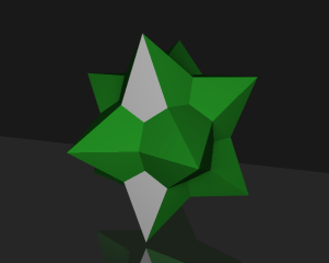
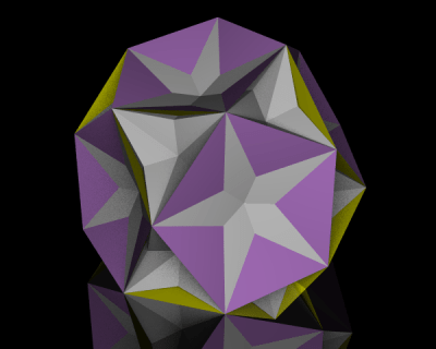
Not very sophisticated, but I was just trying to get POV-Ray to work, as I (very vaguely) remember.  Since then, I’ve created some more polished images, like the polyhedron shown below.  I’ll talk more about polyhedra in a moment….

XT-18-19-28

First, a very brief introduction.  POV-Ray stands for Persistence of Vision Raytracer.  Ray tracing is a technique used in computer graphics to create amazingly realistic images.  Essentially, the color of each pixel in the image is determined by sending an imaginary light ray from a viewing source (the camera in the image below) and seeing where it ends up in the scene.

800px-Ray_trace_diagram.svg
Image by Henrik, Wikipedia Commons.

It is possible to create various effects by using different light sources, having objects reflect light, etc.  You are welcome to read the Wikipedia page on ray tracing for more details on how ray tracing actually works; my emphasis here will be on the code (of course!) I wrote to create various three-dimensional images.  And while the images you can produce using a ray tracing program are quite stunning at times, there is a trade-off: it takes longer to generate images because the color of each pixel in the image must be individually calculated.  But I do think the results are worth the wait!

My interest in POV-Ray stemmed from wanting to render polyhedra.  The images I found online indicated that you could create images substantially more sophisticated than those created with Mathematica.  And better yet, POV-Ray was (and still is!) open source.  That means all I needed to do was download the program, and start coding….

R_3-5_Dual

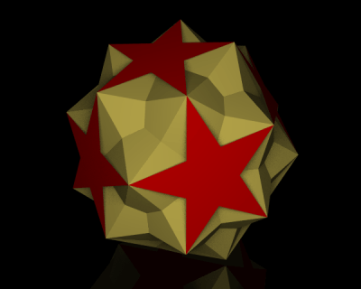
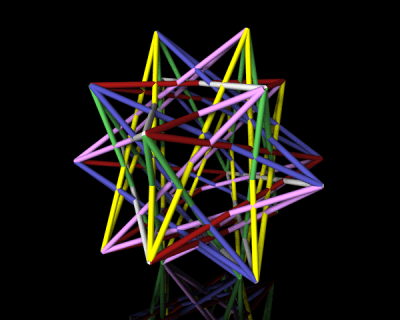
POV-Ray is a procedural programming language all in itself.  So to give you an idea of what a typical program looks like, I’ll show you the code which makes the following polyhedron:

tRp_52-3-5

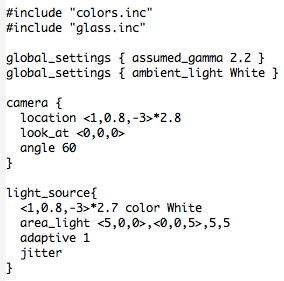
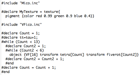
Here’s how it begins.

POV4

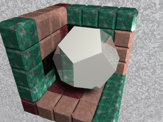
The #include directive indicates that the given file is to be imported.  POV-Ray has many predefined colors and literally hundreds of different textures:  glass, wood, stone, gold and other metals, etc.  You just include those files you actually need.  To give you an idea, here is the logo I created for Dodecahedron Day using  silver and stone textures.

logo3

Next are the global settings.  There are actually many global settings which do a lot more than I actually understand…but I just used the two which were included in the file I modeled my code after.  Of course you can play with all the different settings (there is extensive online documentation) and see what effects they have on your final image, but I didn’t feel the need to.  I was getting results I liked, so I didn’t go any further down this path.

Then you set the camera.  This is fairly self-explanatory — position the camera in space, point it, and set the viewing angle.  A fair bit of tweaking is necessary here.  Because of way the image is rendered, you can’t zoom in, rotate, or otherwise interact with the created image.  So there is a bit of trial-and-error in these settings.

Lighting comes next.  You can use point light sources in any color, or have grids of light sources.  The online documentation suggested the area lighting here (a 5-by-5 grid of lights spanning 5 units on the x-axis and 5 units on the z-axis), and it worked well for me.  Since I wanted the contrast of the colors of the faces of the polyhedra on a black background, I needed a little more light than just a single point source.  You can read all about the “adaptive” and “jitter” parameters here, but I just used the defaults suggested in the documentation and my images came out fine.

There are spotlights and cylindrical lighting sources as well, and all may be given various parameters.  Lighting in Mathematica is quite a bit simpler with fewer options, so lighting was one of the most challenging features of POV-Ray to learn how to use effectively.

So that’s the basic setup.  Now for the geometry!  I can’t go into all the details here, but I can give you the gist of how I proceeded.

POV2

The nested while loops produce the 60 yellow faces of the polyhedron.  Because of the high icosahedral symmetry of the polyhedron, once you specify one yellow face, you can use matrices to move that face around and get the 59 others.

To get the 60 matrices, you can take each of 12 matrices representing the symmetries of a tetrahedron (tetra[Count]), and multiply each by the five matrices representing the rotations around the vertices of an icosahedron (fiverot[Count2]).  There is a lot of linear algebra going on here; the matrices are defined in the file “Mico.inc”, which is included.

The vertices of the yellow faces are given in “VF[16]”, where the “VF” stands for “vertex figure.”  These vertex figures are imported from the file “VFico.inc”.  Lots of geometry going on here, but what’s important is this:  the polygon with vertices listed in VF[16] is successively transformed by two symmetry matrices, and then the result is defined to be an “object” in our scene.  So the nested loops place 60 objects (yellow triangles) in the scene.  The red pentagrams are created similarly.

POV3

Finally, the glass tabletop!  I wanted the effect to be subtle, and found that the built-in texture “T_Glass2” did the trick — I created a square (note the first and last vertices are the same; a quirk of POV-Ray) of glass for the polyhedron to sit on.

POV-Ray does the rest!  The overall idea is this:  put whatever objects you want in a scene.  Then set up your camera, adjust the lighting, and let POV-Ray render the resulting image.

petrie10

Of course this introduction is necessarily brief — I just wanted to give you the flavor of coding with POV-Ray.  There are lots of examples online and within the documentation, so it should not be too difficult to get started if you want to experiment yourself!

Polygons

In working on a proposal for a book about three-dimensional polyhedra last week, I needed to write a brief section on polygons.  I found that there were so many different types of polygons with such interesting properties, I thought it worthwhile to spend a day talking about them.  If you’ve never thought a lot about polygons before, you might be surprised how much there is to say about them….

So start by imagining a polygon — make it a pentagon, to be specific.  Try to imagine as many different types of pentagons as you can.

How many did you come up with?  I stopped counting when I reached 20….

Likely one of the first to come to mind was the regular pentagon — five equal sides at angles of 108° from each other.  Question:  did you only think of the vertices and edges, or did you include the interior as well?

Day106Penta3

Why consider this question?  An important geometrical concept is that of convexity.  A convex polygon property has the property that a line segment joining any two points in the polygon lies entirely within the polygon.

Day106Convexity

The two polygons on the left are convex, while the two on the right are not.  But note that for this definition to make any sense at all, a polygon must include all of its interior points.

Convex polygons have various properties.  For example, if you take the vertices of a convex polygon and imagine stretching a rubber band beyond the vertices and letting it snap back, the rubber band will describe the edges of the polygon.  See this Wikipedia article on convex polygons for more properties of convex polygons.

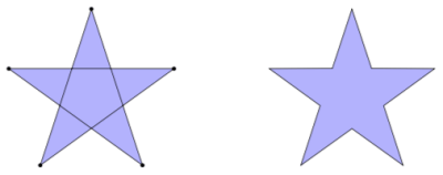
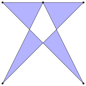
Did the edges of any of your pentagons cross each other, like the one on the left below?

Day106Penta4

In this picture, we indicate vertices with dots to illustrate that this is in fact a pentagon.  The points where the edges cross are not considered vertices of the polygon.  The polygon on the right is actually a nonconvex decagon, even though it bears a resemblance to the pentagon on the left.

But not so fast!  If you ask Mathematica to draw the polygon on the left with the five vertices in the order they are traversed when drawing the edges, here is what you get:

Day106Penta1.png

So what’s going on here?  Why is the pentagon empty in the middle?  When I gave the same instructions using Tikz in LaTeX (which is how I created the light blue pentagram shown above), the middle pentagon was filled in.

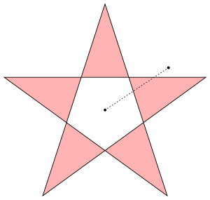
Some computer graphics programs use the even-odd rule when drawing self-intersecting polygons.  This may be thought of in a few ways.  First, if you imagine drawing a segment from a point in the interior pentagon to a point outside, you have to cross two edges of the pentagon, as shown above.  If you draw a segment from a point in one of the light red regions to a point outside, you only need to cross one edge.  Points which require crossing an even number of edges are not considered as being interior to the polygon.

Said another way, if you imagine drawing the pentagram, you will notice that you are actually going around the interior pentagon twice.  Any region traversed twice (or an even number of times) is not considered interior to the polygon.

Why would you want to color a polygon in this way?  There are mathematical reasons, but if you watch this video by Vi Hart all the way through, you’ll see some compelling visual evidence why you might want to do this.

We call polygons whose edges intersect each other self-intersecting or crossed polygons.  And as you’ve seen, including the interiors can be done in one of two different ways.

But wait!  What about this polygon?  Can you really have a polygon where a vertex actually lies on one of the edges?

Day106Penta2.png

Again, it all depends on the context.  I think you’re beginning to see that the question “What is a pentagon?” is actually a subtle question.  There are many features a pentagon might have which you likely would not have encountered in a typical high school geometry course, but which still merit some thought.

Up to now, we’ve just considered a polygon as a two-dimensional geometrical object.  What changes when you jump up to three dimensions?

Again, it all depends on your definition.  You might insist that a polygon must lie in a plane, but….

It is possible to specify a polygon by a list of points in three dimensions — just connect the points one by one, and you’ve got a polygon!  Of course with this definition, many things are possible — maybe you can repeat points, and maybe the points do not all lie in the same plane.

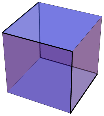
An interesting example of such a polygon is shown below, outlined in black.

Day106Cube

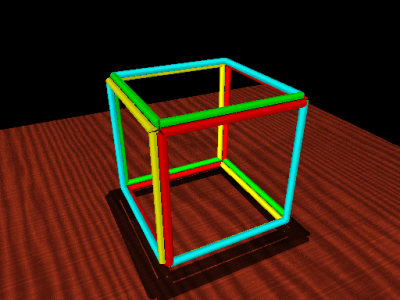
It is called a Petrie polygon after the mathematician who first described it.  In this case, it is a hexagon — think of holding a cube by two opposite corners, and form a hexagon by the six edges which your fingers are not touching.

There is a Petrie polygon for every Platonic solid, and may be defined as follows:  it is a closed path of connected edges such that no three consecutive edges belong to the same face.  If you look at the figure above, you’ll find this is an alternative way to define a Petrie hexagon on a cube.

And if that isn’t enough, it is possible to define a polygon with an infinite number of sides!  Just imagine the following jagged segment continuing infinitely in both directions.

Day106Apeirogon

This is called an apeirogon, and may be used to study the tiling of the plane by squares, four meeting at each vertex of the tiling.

And we haven’t even begun to look at polygons in other geometries — spherical geometry, projective geometry, inversive geometry….

Suffice it to say that the world of polygons is much more than just doodling a few triangles, squares or pentagons.  It is always amazes me how such a simple idea — polygon — can be the source of such seemingly endless investigation!  And serve as another illustration of the seemingly infinite diversity within the universe of Geometry….

Bridges 2017 in Waterloo, Canada!

Bridges 2017 was in full swing last weekend, so now it’s time to share some of the highlights of the conference.  Seems like they keep getting better each year!

The artwork was, as usual, quite spectacular.  I’ll share a few favorites here, but you can go to the Bridges 2017 Gallery to see all the pieces in the exhibitions, along with descriptions by the artists.

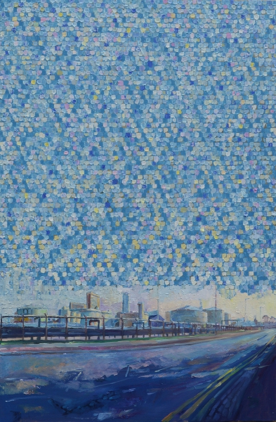
My favorite painting was Prime numbers and cylinders by Stephen Campbell.

campbell

What is even more amazing than the piece itself is that Stephen makes his own paint!  So each piece involves an incredible amount of work – and the results are worth it.  Visit Stephen’s website to see more of his work and learn a bit more about his artistic process.

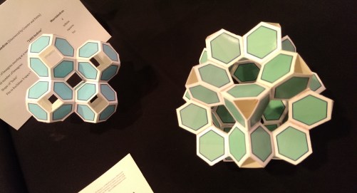
I also liked these open tilings of space by Frank Gould.

IMAG6969

Although they are simple in design, the overall effect is quite appealing.  I often find that the fewer elements in a piece, the more difficult it is to coax them into interacting in a meaningful way.  It is challenging to be a minimalist.

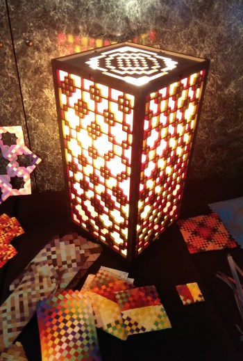
This lantern, Variations on Colourwave 17 — Mod 2, designed by Eva Knoll, shows a pattern created using modular arithmetic.

IMAG6988

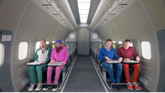
The plenary talks this year were almost certainly the best I have ever experienced at any conference.  Opening the conference was a talk by Damian Kulash of the band OK Go.  He described his creative process and gave some insight to how he makes his unbelievable videos.

OKGo.png

They really cannot be described in words – one example he talked about was this video filmed in zero gravity in an airplane!  There are no tricks here — just unbridled creativity and cleverness.

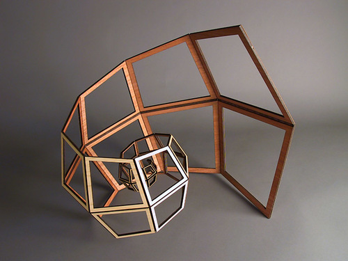
Another favorite was the talk by John Edmark.  Many of his ideas had a spiral theme, like the piece you see below.

edmark

But what is fascinating about his work is how it moves.  When this structure is folded inward, it actually stretches out.  This is difficult to describe in words, but you can see a video of this phenomenon on John’s website.  What made his talk really interesting is that he discussed the mathematics behind the design of his work.

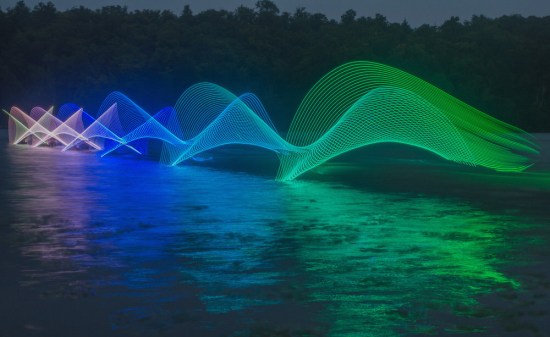
Stephen Orlando talked about his motion exposure photography.

orlando2

Although seemingly impossible, this image is just one long-exposure photograph — the colors you see were not added later.  Stephen’s technique is to put programmable LED lights on a paddle and photograph a kayaker paddling across the water.

But where is the kayaker?  Notice the background — it’s almost dark.  It turns out that if the kayaker moves at a fast enough rate, the darkness does not allow enough time for an image of the kayaker to be captured.  Simply amazing.  Visit Stephen’s website for more examples of his motion exposure photographs.

There were also many other interesting talks given by Bridges participants, but there is not enough room to talk about them all.  You can always go to the Bridges 2017 website and download any of the papers you’re interested in reading.

But Bridges is also more than just art and talks.  Bridges participants are truly a community of like-minded people, so social and cultural events are also an important aspect of any Bridges conference.

I shared an AirBnB with Nick and his parents a short walk from campus — the house was spacious and comfortable, and really enhanced the Bridges experience.  Sandy (Nick’s mother) wanted to host a gathering, so I invited several friends and colleagues over the Friday night of the conference for an informal get-together.

It was truly an inspiring evening!  There were about fifteen of us, mostly from around the Bay area.  Everyone was talking about mathematics and art — we were so engrossed, it turns out that no one even remembered to take any pictures!  One recurring topic of discussion was the possibility of having some informal gatherings throughout the year where we could share our current thoughts and ideas.  I think it may be possible to use space at the University of San Francisco — I’ve already begun looking into it.

Lunch each day was always from 12:00–2:00, so there was never any need to rush back.  This left plenty of time for conversation, and often allowed time to admire the art exhibitions.  It seems that you always noticed something new every time you walked through the displays.

On Saturday evening of the conference was a choir concert featuring a cappella voices singing a wide range of pieces spanning from the 15th century to the present day.  It was a very enjoyable performance; you can read more about it here.

The evening of Sunday, July 30th, was the last evening of the conference for us.  Many participants were going to Niagara Falls the next day, but we were all flying out on Monday.  We decided to find a group and go out for dinner — and about a dozen of us ended up at a wonderful place for pizza called Famoso.

We chatted for quite some time, and then split up — some wanted to attend an informal music night/talent show on campus, but others (including me and the Mendlers) went to shoot some pool at a local pool hall.  Again, a good time was had by all.

While the first day of the conference seemed a little slow, the rest just flew by.  Another successful Bridges conference!  Nick and I both had artwork exhibited and gave talks, caught up with friends and colleagues from all around the globe, enjoyed many good meals, and got our fill of mathematical art.

Although the location for the next Bridges conference is usually announced at the end of the last plenary talk, these is still some uncertainty about who will be hosting the conference next year.  But regardless of where it is, you can expect that Nick and I will certainly be there!