Let’s hear more from Geoffrey about his use of color! Without further ado….
Last week, I mentioned a way to combine the RGB and CMYK color wheels.
 This lovely wheel is often called the Yurmby wheel because it’s somewhat more pronounceable then YRMBCG(Y). The benefit of the Yurmby is that the primary of one system is the secondary of the other. With the RGB system,
Red light + Blue light = Magenta light.
Red and Blue are the “primaries,” meaning they are used to mix all other colors, like Magenta, and they can’t be mixed by other colors within that system. The CMYK system is different because pigments absorb light and so it is the reverse of the RGB system:
Cyan pigment + Yellow pigment = Green pigment.
This spatial relationship on the wheel is important as it is an oversimplified representation of an important aspect of our vision. Our eyes only have three types of color sensitive cells—typically called Red, Blue, and Green cone cells. Each cell is sensitive to a different size of wavelength of light: Long, Medium, and Short. When all three frequencies of light are seen together, we see white light. But more significantly, when we see a combination of Medium (green) and Long (red) wavelengths, our brain gets the same signal as if we saw yellow light, which has a medium longish wavelength!
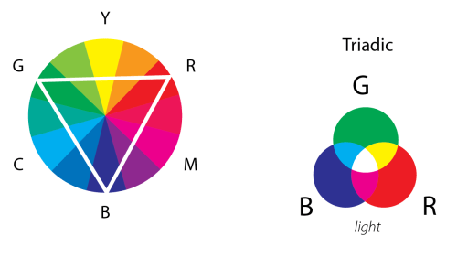
Going back to the Color Relationships, the first, and easiest to see is a Triadic relationship. Here three colors are chosen at similar distances from each other on the color circle. If we choose Red, Green and Blue, then you should feel a sense of familiarity. When light of all three colors is brought together we have white. But what if we move the triangle, you may ask? Well, let’s try Magenta, Yellow, and Cyan. To shorten the number of words written, I am going to increasingly use more abbreviations. C + Y + M = Black, right? Well yes, if mixed as pigment on paper it becomes a dark gray, as Cyan absorbs Red, Yellow absorbs Blue, and Magenta absorbs Green. But as light, they mix to White.
Cyan light is made up of both Green light and Blue light as that is how you make Cyan light: C = G + B. If we go back to our original equation
C + Y + M
and simplify further, we get
(G + B) + (G + R) + (R + B), or 2R + 2G + 2B.
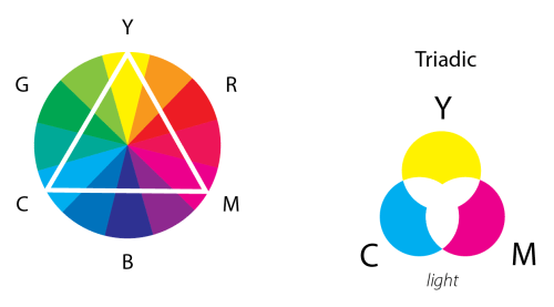
We can remove the 2’s as they are not important (think stoichometry in chemistry!) and we are left with RGB, or white. Now let’s try moving half a step clockwise:
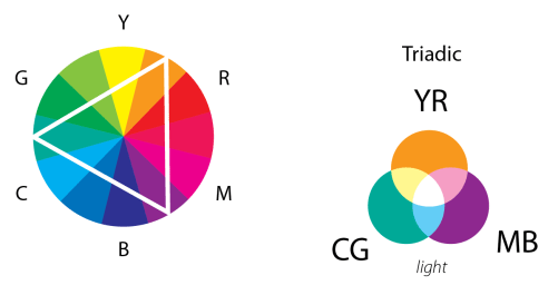
Magenta-Blue + Cyan-Green + Yellow-Red,
or
M + B + C + G + Y + R,
which simplifies to
(R + B) + B + (B + G) + G + (G + R) + R, or 3R + 3G + 3B,
which once again is RGB!
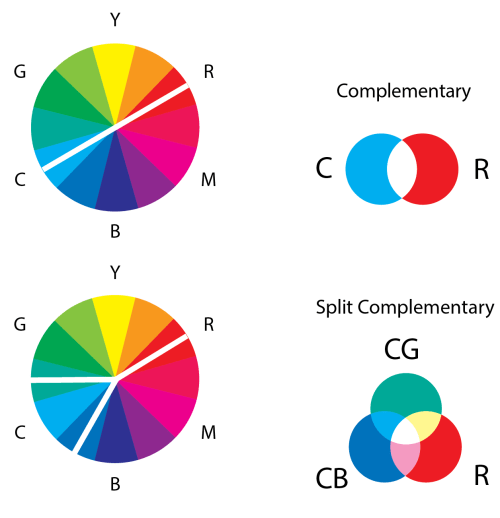
The point of these “color relations” is to simplify the number of colors in use. Any three equally spaced colors would mix to white. A complementary color pair is the fewest number of colors necessary to engage all three cone cells in the eye; for example,
R + C = R + (G + B)= White.
A split complement is in between a complement-pair and a triad, as shown in the second figure below.
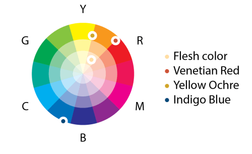
So for the watercolors I started this discussion about, I had found an old tube of flesh color that I had bought while in Taiwan. I was oddly attracted to this totally artificial-looking hue as a representative for human skin, and it also seemed like a good challenge to get it to work harmoniously in a painting. To understand it better, I first went about trying to remix that flesh color with my other single pigment paints. It turned out to be a mixture of red, yellow, and lots of white — basically a pastel orange. The complementary color of this is a Cyan-Blue color, which I chose to be the pigment Indigo. I added to this pallet Yellow Ochre, which is a reddish-yellow, and Venetian Red which is a yellowish-red, which when mixed make an orange, though much earthier than the orange in that tube of Barbie-like flesh tone.
Once I had the four colors I felt best about (which also took into consideration other characteristics of a pigment, such as how grainy they are), the painting became a process where intuition, chance, luck, skill, and the weather all played equal parts in creating a work of historical record — never to be repeated equally again.
–Geoffrey Owen Miller
Thanks, Geoffrey! I’d like to remark that I asked Geoffrey to elaborate on the statement “Once I had the four colors I felt best about….” How did he know what colors were “best”? Geoffrey commented that it was “like Tiger Woods describing what goes through his mind when he swings a golf club.”
As I thought about his comment, I appreciated it more and more. A color wheel is a tool to help you organize thoughts about colors — but a color wheel cannot choose the colors for you. This is where artistry comes in. Using your tools as a guide, you navigate your way through the color spectrum until — based on years of practice and experience — you’ve “found it.”
But this is exactly what happens when creating digital art! It is easy to find the complement of a color from the RGB values — just subtract each RGB value from 1. Sometimes it’s just what you want, but sometimes you need to tweak it a little. While there are simple arithmetic rules relating colors, they are not “absolute.”
So it all comes back to the question, “What is art?” I won’t attempt to answer this question here, but only say that having tools and techniques (and code!) at your disposal will allow you to create images, but that doesn’t necessarily mean that these images will have artistic value.
I hope you’ve enjoyed my first guest blogger — I’ll occasionally invite other bloggers as well in the future. I’m off to Finland for the Bridges 2016 conference tomorrow, so next week I’ll be talking about all the wonderful art I encounter there!

One thought on “Guest Blogger: Geoffrey Owen Miller, II”