About a month has passed since beginning my third semester of Mathematics and Digital Art! As with last semester, I plan on giving updates about once a month to discuss changes in the course and to showcase student work.
The main difference this semester (as I discussed a few weeks ago) was starting with Processing right from the beginning. From my perspective, the course has run more smoothly than ever — and some of my students are already really getting into the coding aspect of creating digital art.
I do believe that beginning this way will pay off when we get to making movies. Since we’ll already know the basics and understand the difference between user space and screen space, I can focus more on the interactive abilities of Processing — such as having features of the displayed image change by moving the mouse or pressing different keys on the keyboard.
The first two assignments were essentially the same as last semester. We began with discussing color and the work of Josef Albers, emphasizing the fact that there is no such thing as “pure color” — colors are only perceived in relation to other colors.
Again, I was surprised by the diversity of the images students created. Like last year, a few students experimented with a minimalist approach. Here is what Alex generated using just a 2-by-2 grid of squares.

I should point out that outlining the geometrical objects (using the strokeWeight function) is not “pure” Albers — you aren’t really seeing one color on top of another due to the black outlines. But I did have students submit three pieces, insisting that one of the pieces was created only by changing the parameters in the original Albers routine, as shown in the following submission.
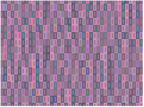
Here is Courtney’s submission on this theme, again created only by changing parameters to the drawing routine.
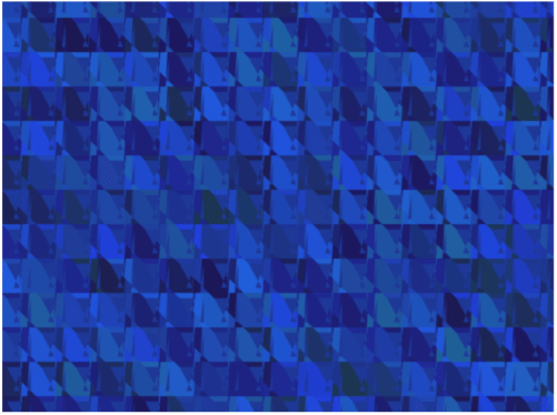
Most students — I think in part due to the fact that we started discussing code even earlier than previous semesters — really pushed the geometry far beyond the simple idea of rectangles within rectangles.
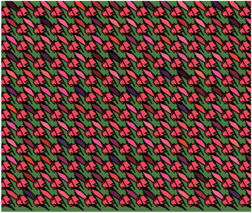
While toying with various geometrical motifs, Tera found something that reminded her of a rose. This influenced her color palette: reds and pinks for the flowers, with a green background, meant to suggest that the flowers were in a garden.
Cissy explored the geometry as well. Note how keeping the stroke weight at zero — so that the geometrical objects have no outline — creates a more subtle effect, especially since the randomness from the dominant color is not too pronounced.
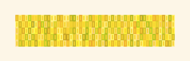
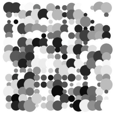
The second art assignment, as in the previous semesters, was to explore creating textures using randomness in both color and shape. As with the first assignment, I wanted students to submit one piece which involved only changing the parameters to a given function. In this case, the function created a grid of gray circles, with both the intensity of the gray and the size of the circles having some degree of randomness. I think it is important that students do some work within given constraints — it really challenges their creativity. Here is Terry’s piece along these lines.
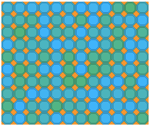
The second piece was based on a function which created a grid of squares of the same size, but random colors. Here, there were no constraints — students could modify the geometry in any way they wanted to. Several were quite creative. For example, Sepid approached this task by choosing both shape and color to create an image reminiscent of a stained glass window.
The third piece involved a color gradient (see my previous posts on Evaporation). If you look back at these posts, you’ll recall that a color gradient can be created by increasing the randomness of the colors as you move from the top of the image to the bottom using a power function: 

As I was discussing this in class, one student asked what would happen if you used a negative exponent. I had never thought about this before! Jack used this idea in his piece, which he said reminds him of looking at a fire.
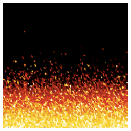
It turns out that using a negative exponent creates a gradient beginning with black on the top. Why is this? As the image proceeds lower down the screen, the algorithm subtracts values from the RGB parameters proportional to 


So if the exponent 
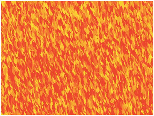
Another student also worked with yellows and reds to imitate fire in another way. Instead of making small circles, he made larger circles with quite a bit of overlap, creating a rather different effect.
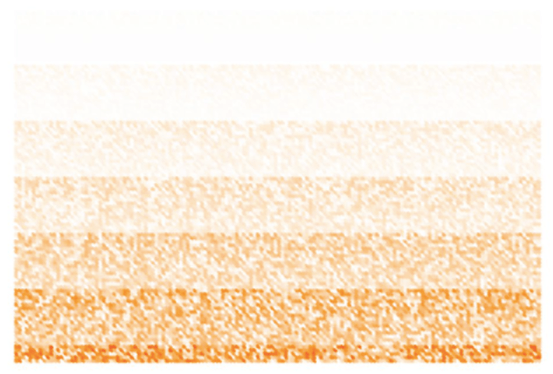
And Rosalie found in interesting say to create stripes with the algorithm. I had not seen this effect before.
So that’s it for the first update of the Fall 2017 installment of Mathematics and Digital Art. As you can see, my students are already being quite creative. I look forward to seeing their work develop as the semester progresses!

One thought on “Mathematics and Digital Art: Update 1 (Fall 2017)”