This week, I’ll discuss some of the artistic decisions made in producing the images in last week’s post, as well as explore randomly-generated envelopes.
First, let’s look at the following piece.

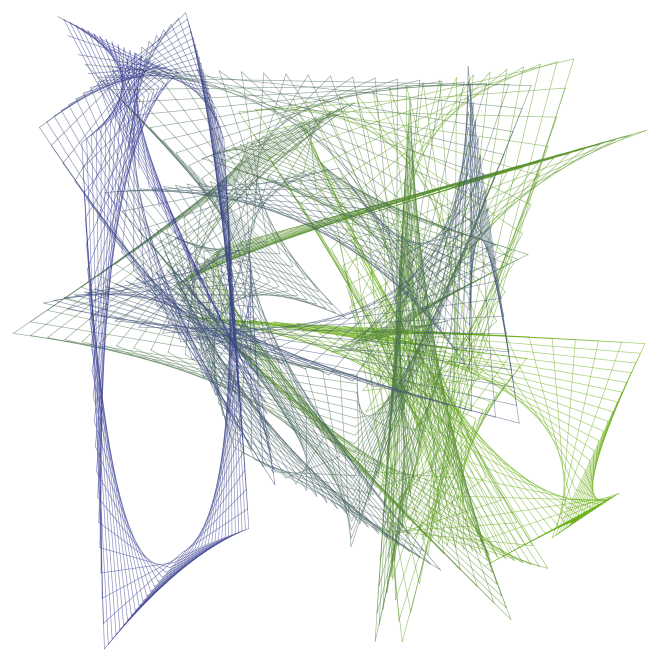
Initially, I created the image below, which is essentially a recreation of a hand-drawn sketch made in 1983.

Although the lines are clean and precise, the overall impression lacks a hand-drawn feel. I thought to create more texture by having the alternating envelopes go around the origin more than once, as seen here.

I liked this better, but I thought to adjust the angular sizes of the envelopes so that the tips were evenly spaced around a circle. I also adjusted the number of lines in each envelope, producing the final result.
The point of this discussion is to illustrate the process of creating digital art – it’s not as simple as just writing a few lines of code and executing them. There is an iterative give-and-take to the process, which is half the fun of it, anyway.
The next image I’d like to look at is the spiral, shown below.

This is a recreation of an image originally drawn in red, and I thought to create texture by introducing a color gradient. However, using a linear color gradient from the first line to the last produced the following result.

This looked a little off to me – moving toward the green a bit too fast. Now if you remember the discussion of color gradients when we looked at the Evaporation piece (see Day012), you’ll recall that we could create nonlinear gradients which created different visual effects. I found that changing the gradient from linear (a power of 1) to a power of 0.8 produced something I liked more. Of course the difference is not drastic, but I want to illustrate the fact fine-tuning parameters can introduce subtle effects in the final image.
Now on to a discussion of randomly-generated envelopes. Today will only be an introduction – there’s lots more to explore, including envelopes in three dimensions. But I’ve only begun working on this idea a few weeks ago, and so hope to illustrate how previous work with randomness may be incorporated into the design of envelopes.
Of course just what is random is a more subtle question here. Below is an image where the successive endpoints used to create the envelope are randomly chosen from a unit square, and a color gradient is produced from the beginning to the end to give a sense of motion.
You’ll immediately notice that some envelopes span the entire width or height of the image. As it happens, this makes finding nicely-balanced images difficult. I looked at a few hundred images before I found the one above – most lacked balance.
I also wanted to try bright colors against black – this produces nice results for an online blog (though not so wonderful for a printed image). Again, I didn’t like the results obtained by allowing the points determining the envelopes to be completely random. So I introduced a constraint that the endpoint of the next segment had to be “close” to the previous one – in the image below, the endpoints could be no further than one unit in either the x- or y-direction from the previous point. So there are more local effects, and none of the broader lines slicing the image in half.

The image looked a little too square, and I thought the contrast too much for so many envelopes. So I looked at a few hundred more images on a wider field, this time in yellow. I found one with some interesting interactions, shown below.
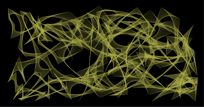
Now I felt I was getting somewhere. But I thought the image looked a bit too flat – I wanted to add some texture or dimensionality to the image.
The first thing I tried was slightly varying the yellows used to draw the lines. This helped to add a measure of interest to the envelope. But the background needed some work.
I wanted the background to contrast the flowing curves of the envelopes, and so I thought some overlapping squares of varying dark shades of gray might do the trick. Here is the result.
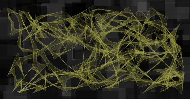
The background took a few hundred iterations as well. Now I didn’t want the squares too small, and I didn’t want too many – the sizes of the squares should compare to the sizes of the individual envelopes, and there should be roughly as many. But the problem was that randomly-generated sets of squares would often leave too many gaps in the background – and simply overlaying a background of a single shade of gray wasn’t particularly pleasing.
So I had to play with the parameters generating the overlapping squares, as well as try a few hundred iterations until I found something with a nice balance. In addition, I wanted the background to be “interesting” in the largish hole just left of center – some iterations just produced a solid gray there, which didn’t work for me.
It took a bit of time – as well as feedback from my friend Sandy (thanks, Sandy!) to whom I showed successive drafts of this image – but I finally found a combination of colors/backgrounds which I felt held together. Of course you might think otherwise – and you are welcome to give it a try and create your own image with randomly-generated envelopes….
I hope this helps to illustrate the creative process – one of the main themes of this blog. While a final image may look complex with various different aspects interacting with each other, it’s not always the case that each aspect was conceived of at the same time. This is the great thing about computer-generated art – it’s so easy to explore a multitude of ideas without leaving the comfort of your keyboard.
But this is also perhaps the greatest challenge – because you can do so much, finding the right balance between simplicity and complexity in part distinguishes computer-generated images from computer-generated art.
Finally, I cannot resist including an image I tweeted a few days ago @cre8math — a variation on the spiral theme. I find it unusually compelling.

