Creating Fractals VII: Iterated Function Systems III

Today, we’re going to wrap up our discussion of iterated function systems by looking at an algorithm which may be used to generate fractal images.

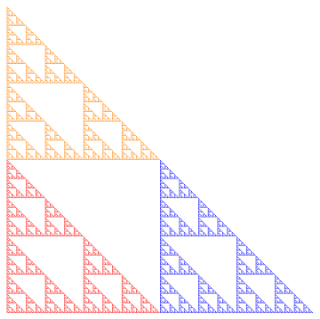
Recall (look back at the first post if you need to!) the Sierpinski triangle.  No matter what initial shape we started with, the iterations of the function system eventually looked like the Sierpinski triangle.

Sierp4

But there’s a computational issue at play.  Since there are three different transformations, each iteration produces three times the number of objects.  So if we carried out 10 iterations, we’d have 310 = 59,049 objects to keep track of. Not too difficult for a computer.

But let’s look at the Sierpinski carpet. With eight different transformations, we’d have 810 = 1,073,741,824 objects to keep track of. Keeping track of a billion objects just isn’t practical.

Of course you could use fewer iterations — but it turns out there’s a nice way out of this predicament. We can approximate the fractal using a random algorithm in the following way.

Begin with a single point (usually (0,0) is the easiest).  Then randomly choose a function in the system, and apply it to this point.  Then iterate:  keep randomly choosing a function from the system, then apply it to the last computed point.

What the theory says (again, read the Barnsley book for all the proofs!) is that these points keep getting closer and closer to the fractal image determined by the system.  Maybe the first few are a little off — but if we just get rid of the first 10 or 100, say, and plot the rest of the points, we can get a good approximation to the fractal image.

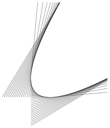
Consider the Sierpinski triangle again.  Below is what the first 20 points look like (after (0,0)), numbered in the order in which they’re produced.

Sierp20.png

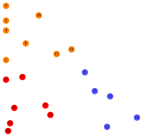
Let’s look at this in a bit more detail.  For reference, we’ll copy the function system which produces the Sierpinski triangle from the first post.

F_1\left(\begin{matrix}x\\y\end{matrix}\right)=\left[\begin{matrix}0.5&0\\0&0.5\end{matrix}\right] \left(\begin{matrix}x\\y\end{matrix}\right)

F_2\left(\begin{matrix}x\\y\end{matrix}\right)=\left[\begin{matrix}0.5&0\\0&0.5\end{matrix}\right] \left(\begin{matrix}x\\y\end{matrix}\right)+\left(\begin{matrix}1\\0\end{matrix}\right)

F_3\left(\begin{matrix}x\\y\end{matrix}\right)=\left[\begin{matrix}0.5&0\\0&0.5\end{matrix}\right] \left(\begin{matrix}x\\y\end{matrix}\right)+\left(\begin{matrix}0\\1\end{matrix}\right)

Now here’s how the color scheme works.  Any time F_1 is randomly chosen, the point is colored red.  For example, you can see that after Point 6 was drawn, F_1 was chosen, so Point 7 was simply halfway between Point 6 and the origin.

Any time F_2 is chosen, the point is colored blue.  For example, after Point 8 was drawn, F_2 was randomly chosen.  You can see that if you move Point 8 halfway to the origin and then over right one unit, you land up exactly at Point 9.

Finally, any time F_3 is chosen, the point is colored orange.  So for example, it should be clear that moving Point 7 halfway toward the origin and then up one unit results in Point 8.

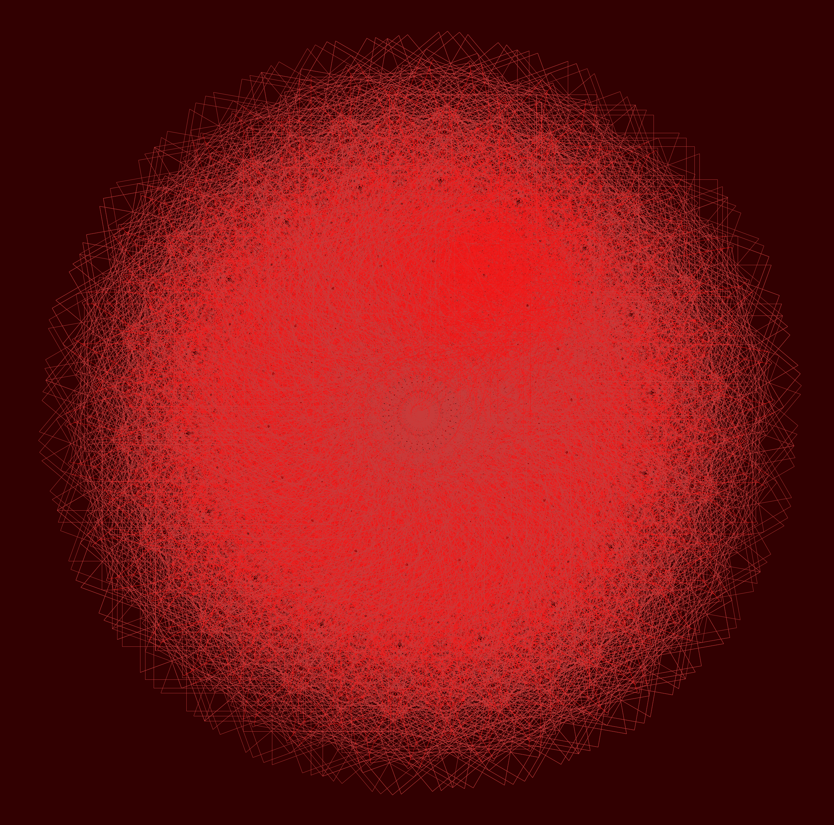
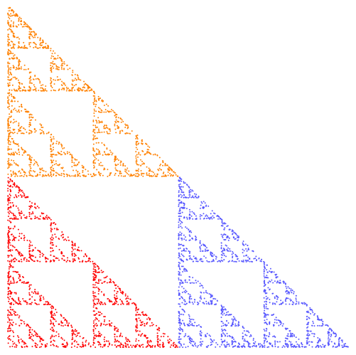
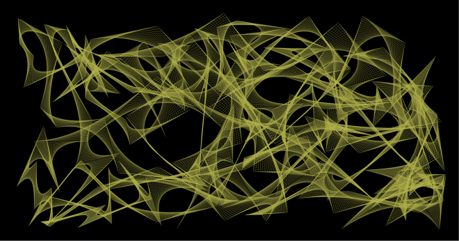
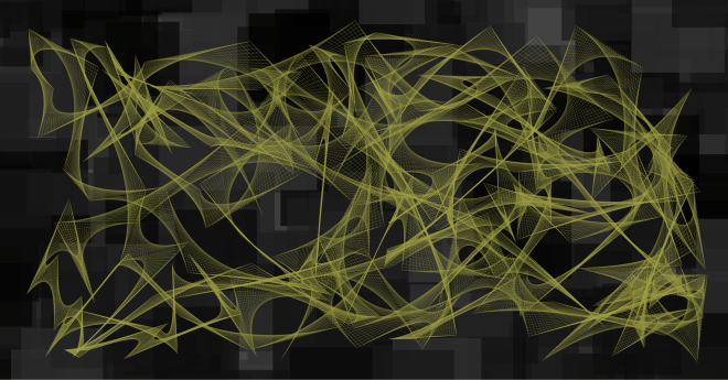
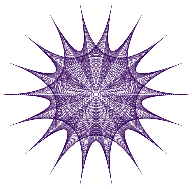
Of course plotting more points results in a more accurate representation of the fractal.  Below is an image produced using 5000 points.

Sierp5000.png

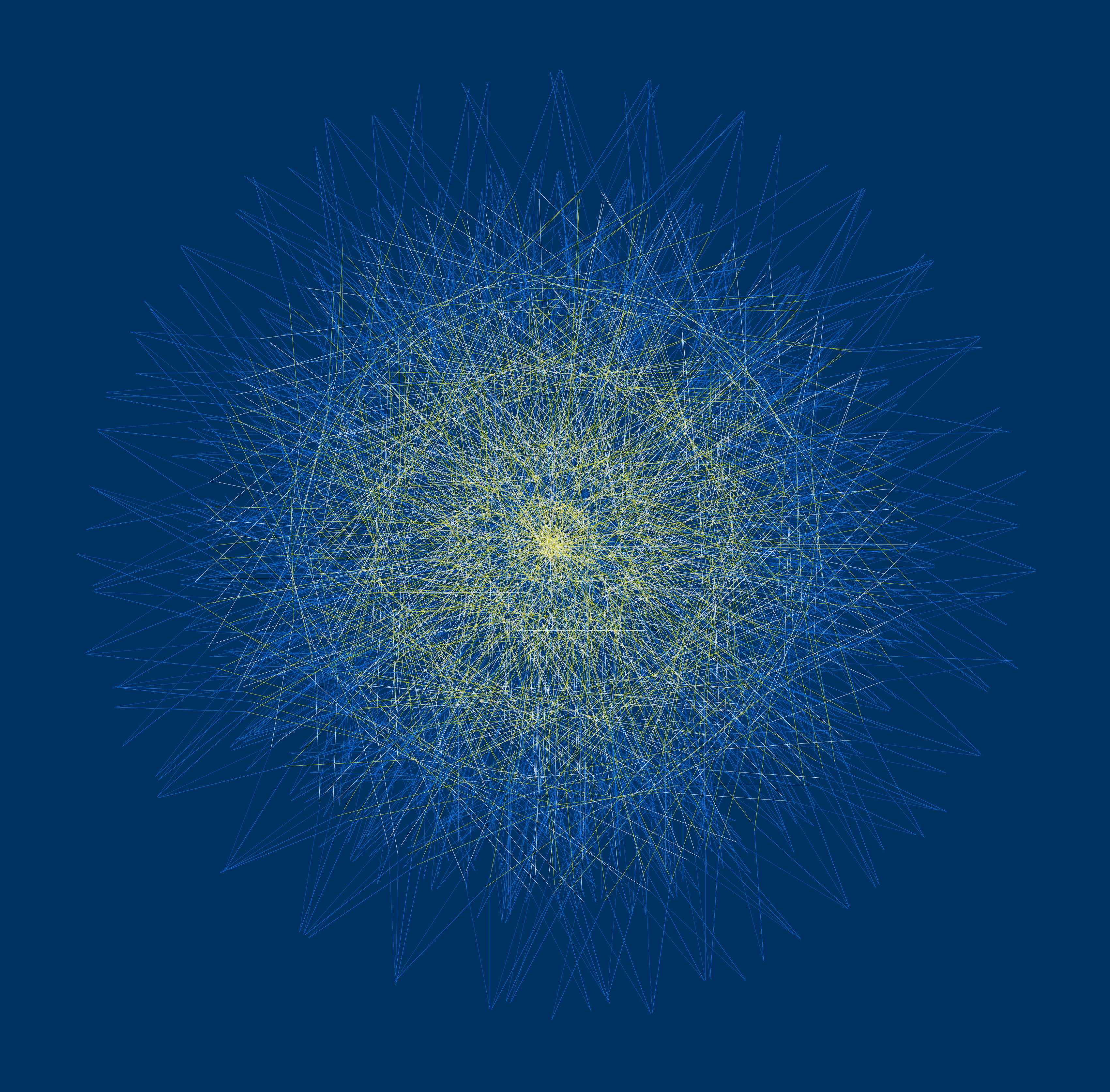
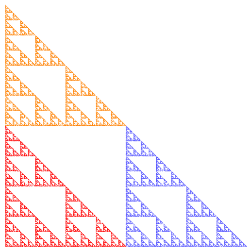
To get more accuracy, simply increase the number of points, but decrease the size of the points (so they don’t overlap).  The following image is the result of increasing the number of points to 50,000, but using points of half the radius.

Sierp50000

There’s just one more consideration, and then we can move on to the Python code for the algorithm.  How do we randomly choose the next affine transformation?

Of course we use a random number generator to select a transformation.  In the case of the Sierpinski triangle, each of the three transformations had the same likelihood of being selected.

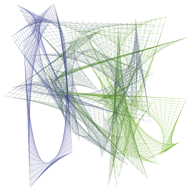
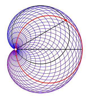
Now consider one of the fractals we looked at last week.

Two4

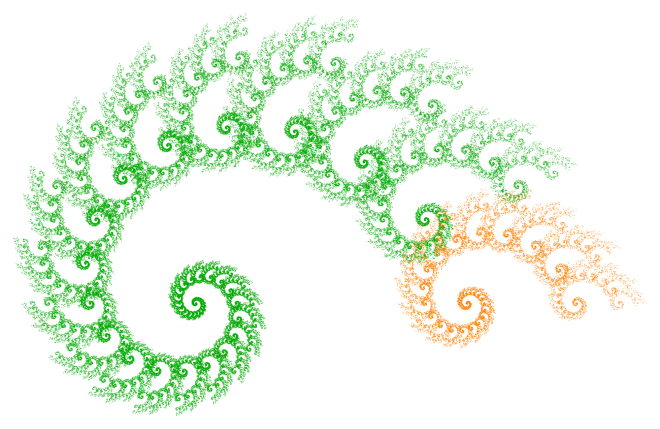
If the algorithm chose either transformation with equal probability, this is what our image would look like:

Two450.png
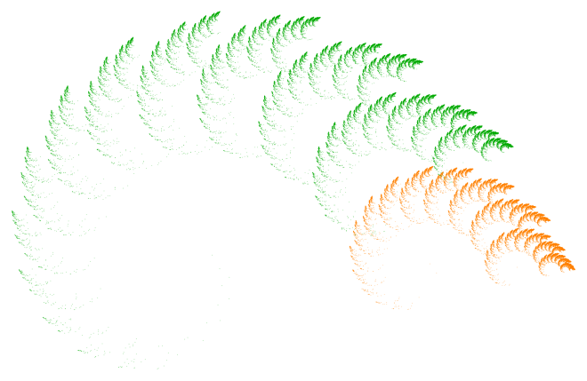
Of course there’s a huge difference!  What’s happening is that transformation F_{{\rm orange}} actually corresponds to a much smaller portion of the fractal than F_{{\rm green}} — and so to get a more realistic idea of what the fractal is really like, we need to choose it less often.  Otherwise, we overemphasize those parts of the fractal corresponding to the effect of F_{{\rm orange}}.

Again, according to the theory, it’s best to choose probabilities roughly in proportion to the portions of the fractal corresponding to the affine transformations.  So rather than a 50/50 split, I chose F_{{\rm green}} 87.5% of the time, and F_{{\rm orange}} just 12.5% of the time.  As you’ll see when you experiment, a few percentage points may really impact the appearance of a fractal image.

From a theoretical perspective, it actually doesn’t matter what the probabilities are — if you let the number of points you draw go to infinity, you’ll always get the same fractal image!  But of course we are limited to a finite number of points, and so the probabilities do in fact strongly influence the final appearance of the image.

So once you’ve chosen some transformations, that’s just the beginning.  You’ve got to decide on a color scheme, the number of points and their size, as well as the probabilities that each transformation is chosen.  All these choices impact the result.

Now it’s your turn!  Here is the Sage link to the python code which you can use to generate your own fractal images.  (Remember, you’ve got to copy it into one of your own Projects first.)  Freely experiment — I’ve also added examples of non-affine transformations, as well as affine transformations in three dimensions!

And please comment with interesting images you create.  I’m interested to see what you can come up with!
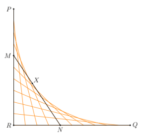
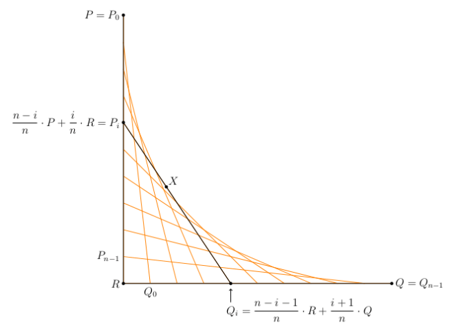
Number Searches I

It’s been some time since there have been any puzzles to solve.  I’ve created something new (well, as far as I know) just for my blog.  I hope you enjoy it!

Many puzzle magazines have puzzles where you need to find words or numbers hidden in a grid. They may be placed in a straight line horizontally, vertically, or diagonally, and may be written either backwards or forwards. Here’s one for you — find the numbers at the right in the grid on the left.

Day031Fig1

Looks like there’s not enough room? Well, there’s a twist in this puzzle. The numbers are written in base 10 on the right, but in the grid, they’re represented in a different base, which you need to determine. Now this is a bit trickier, so I’ll give you two hints. First, the base is a prime number. And second, all the numbers in the grid are used in the completed puzzle. We’ll work out the solution next — so if you want to try to solve it on your own, now’s the time.

Impossible?  Seems like it — until you notice where the 0’s are in the grid.  Since numbers don’t begin with a 0, and since you’re given that every number in the grid must be used — that means that some numbers end in a 0, meaning they’re a multiple of the base.  And since you’re given that the base is prime, that suggests looking at the prime factorizations of the numbers on the right.

You can look at some python code to find prime factorizations of numbers — both recursive and iterative versions.

112 24 . 7
373 prime
3181 prime
8533 7 . 23 . 53
11,665 5 . 2333
14,420 22 . 5 . 7 . 103
1,354,097 29 . 53 . 881

This table shows the prime factorizations of the numbers to be found in the grid.

So what do you notice?  Since at least two of the numbers end in 0 in the grid, at least two of the numbers must share a common prime factor.  The only prime factors that any numbers have in common are 2, 5, 7, and 53.

But note that there are the digits 8 and 9 in the grid — which means that the base must be at least 10.  This eliminates all possibilities except 53.

Alternatively, you can notice that any number on the right can be expressed using at most four digits in the “mystery” base.  Since 344 is only 1,336,336, the base must be at least 35.  This would also eliminate all options except 53.

Once you know the base, the rest is fairly straightforward — once you know how to write numbers in base 53!  Luckily, I’ve also written some python code to perform this task for you, as well.  It’s the usual algorithm — find the highest power of 53 less than the number (using logarithms), find the corresponding digit, subtract, and repeat.  You’re welcome to take out your pocket calculator, write your own code, or just use mine.  But there’s no avoiding this task.

Whatever the method, you should have come up with the following results in base 53, listed in increasing order: 26, 72, 171, 320, 485, 574, and 9530.  Below you’ll see the completed puzzle.

Day031Fig2

Where did this idea come from?  It’s never possible to say exactly where an idea “comes from.”  I was thinking about taking an ordinary puzzle and adding a new twist.  The idea of using different bases popped into mind.

Then the challenge was to create a puzzle that had some interesting feature — like the 0’s.  I knew that one way to solve the puzzle would be to write a computer program which would take all the numbers in the list, and write them in different bases starting (in this case) at 35.  Then see which lists could be found in the grid.  Not so very interesting.

But with the hint and two zeroes in the grid, well, I felt I was making some progress — and I hope you’ll agree….

Now I needed to come up with another puzzle or two — which were related to the example, but which didn’t simply require going through the same steps.  Maybe only one zero instead of two?  How was that much different?  I pondered for a few minutes, and came up with the following.

In the following Number Search puzzle, find the numbers on the right in the grid on the left (written in some prime base).  Fill in all the missing numbers (which are all single digits) in the grid, and find the missing number in the list on the right (which is in increasing order).  You know that every number in the grid is used in the completed puzzle, and that the missing number on the right does not end in 0 when circled in the grid.  Good luck!

Day031Fig3

Although likely a challenge if you’ve never done a puzzle like this before, I thought it must be possible to introduce still another level of difficulty for the truly dedicated solver.  So here’s another.

In the following Number Search puzzle, find the numbers on the right in the grid on the left.  The catch?  The numbers on the right are not written in base 10 (although they are all written in the same base), and the numbers to circle in the grid are also not in base 10 (although, again, they are all in the same base).  Your task to find both bases and solve the puzzle!

Day031Fig4

The bases are prime (but I don’t think that will actually help at all).  A few other hints:  as in a usual search puzzle, you can’t count “1011” and “1101” as two different numbers — once you circle a set of numbers, you can’t use it again in the reverse order.  Of course no number in the grid begins with “0.”  And finally, all circled numbers in the grid are four digits long, and every number is used at least once.  As a further tease, you can find out the bases with just a few lines of algebra — you only need a computer/calculator to convert from one base to the other!

Next week, I’ll explain how I designed the puzzle (and in doing so, give the solution as well) — there were two big hurdles.  First, the numbers had to use only the digits 0–9 in both bases.  And second, I wanted to be sure there was some way to solve it without an exhaustive computer search.  More next week.  Happy solving!

Envelopes III: Art and Randomness

This week, I’ll discuss some of the artistic decisions made in producing the images in last week’s post, as well as explore randomly-generated envelopes.

First, let’s look at the following piece.

Day020env7

Initially, I created the image below, which is essentially a recreation of a hand-drawn sketch made in 1983.

Day022env1

Although the lines are clean and precise, the overall impression lacks a hand-drawn feel. I thought to create more texture by having the alternating envelopes go around the origin more than once, as seen here.

Day022env4

I liked this better, but I thought to adjust the angular sizes of the envelopes so that the tips were evenly spaced around a circle. I also adjusted the number of lines in each envelope, producing the final result.

The point of this discussion is to illustrate the process of creating digital art – it’s not as simple as just writing a few lines of code and executing them. There is an iterative give-and-take to the process, which is half the fun of it, anyway.

The next image I’d like to look at is the spiral, shown below.

Day020spiral3

This is a recreation of an image originally drawn in red, and I thought to create texture by introducing a color gradient. However, using a linear color gradient from the first line to the last produced the following result.

Day022spiral3old

This looked a little off to me – moving toward the green a bit too fast. Now if you remember the discussion of color gradients when we looked at the Evaporation piece (see Day012), you’ll recall that we could create nonlinear gradients which created different visual effects. I found that changing the gradient from linear (a power of 1) to a power of 0.8 produced something I liked more. Of course the difference is not drastic, but I want to illustrate the fact fine-tuning parameters can introduce subtle effects in the final image.

Now on to a discussion of randomly-generated envelopes. Today will only be an introduction – there’s lots more to explore, including envelopes in three dimensions.  But I’ve only begun working on this idea a few weeks ago, and so hope to illustrate how previous work with randomness may be incorporated into the design of envelopes.

Of course just what is random is a more subtle question here. Below is an image where the successive endpoints used to create the envelope are randomly chosen from a unit square, and a color gradient is produced from the beginning to the end to give a sense of motion.

Day022RandEnv2

You’ll immediately notice that some envelopes span the entire width or height of the image. As it happens, this makes finding nicely-balanced images difficult. I looked at a few hundred images before I found the one above – most lacked balance.

I also wanted to try bright colors against black – this produces nice results for an online blog (though not so wonderful for a printed image). Again, I didn’t like the results obtained by allowing the points determining the envelopes to be completely random. So I introduced a constraint that the endpoint of the next segment had to be “close” to the previous one – in the image below, the endpoints could be no further than one unit in either the x- or y-direction from the previous point. So there are more local effects, and none of the broader lines slicing the image in half.

Day022RandEnv1-12-26-15x

The image looked a little too square, and I thought the contrast too much for so many envelopes.  So I looked at a few hundred more images on a wider field, this time in yellow. I found one with some interesting interactions, shown below.

Day022RandEnv2-12-26-15

Now I felt I was getting somewhere. But I thought the image looked a bit too flat – I wanted to add some texture or dimensionality to the image.

The first thing I tried was slightly varying the yellows used to draw the lines. This helped to add a measure of interest to the envelope. But the background needed some work.

I wanted the background to contrast the flowing curves of the envelopes, and so I thought some overlapping squares of varying dark shades of gray might do the trick. Here is the result.

Day022RandEnv4-12-27-15

The background took a few hundred iterations as well. Now I didn’t want the squares too small, and I didn’t want too many – the sizes of the squares should compare to the sizes of the individual envelopes, and there should be roughly as many. But the problem was that randomly-generated sets of squares would often leave too many gaps in the background – and simply overlaying a background of a single shade of gray wasn’t particularly pleasing.

So I had to play with the parameters generating the overlapping squares, as well as try a few hundred iterations until I found something with a nice balance. In addition, I wanted the background to be “interesting” in the largish hole just left of center – some iterations just produced a solid gray there, which didn’t work for me.

It took a bit of time – as well as feedback from my friend Sandy (thanks, Sandy!) to whom I showed successive drafts of this image – but I finally found a combination of colors/backgrounds which I felt held together. Of course you might think otherwise – and you are welcome to give it a try and create your own image with randomly-generated envelopes….

I hope this helps to illustrate the creative process – one of the main themes of this blog. While a final image may look complex with various different aspects interacting with each other, it’s not always the case that each aspect was conceived of at the same time. This is the great thing about computer-generated art – it’s so easy to explore a multitude of ideas without leaving the comfort of your keyboard.

But this is also perhaps the greatest challenge – because you can do so much, finding the right balance between simplicity and complexity in part distinguishes computer-generated images from computer-generated art.

Finally, I cannot resist including an image I tweeted a few days ago @cre8math — a variation on the spiral theme.  I find it unusually compelling.

Day022spiral01-08-16

Envelopes II: Making Spirals

While I don’t intend to make a habit of midweek posts (though thanks for the idea, Dane!), last week’s entry was so popular that I thought I’d write a short post on how the spiral designs are created.  Here’s one of last week’s images to refresh your memory.

Day020spiral3

These are not difficult to create,  but because of all the overlap of lines, it’s not immediately obvious how they are generated.  The image below shows the first forty line segments drawn, and highlights the endpoints of these segments.

Day021spiralmethod

The first line drawn is horizontal, and the endpoints are 180 degrees apart.   More lines are generated by having the orange endpoint (starting at the right) move 4 degrees counterclockwise, while the green endpoints (starting at the left) move just 3 degrees.  As a result, the endpoints of the second segment are just 179 degrees apart on the circle.  The orange endpoints start gaining on the green endpoints, closing the gap by 1 degree with each successive segment.

So the final spiral includes exactly 180 segments, which may be expressed in a form which may be easily generalized (and which is used in the Python code).  Note that the “180” on the left side of the equation represents the number of segments drawn, and the “180” on the right indicates the angular distance that the endpoints of the initial segment are separated on the circle.

180 = \dfrac{180}{4-3}.

All 180 segments are shown below, where the endpoints are retained to illustrate the process (although note that many endpoints are written over as the algorithm progresses).

Day021spiralmethod2

The Python code is fairly short (here is the Sage link — look at some of the earlier posts about using Sage if you haven’t used it before). The only mathematics you need to understand is the standard conversion from polar to rectangular coordinates — it’s much easier to describe the endpoints first in polar coordinates since the radius of the circle is fixed and only the angles the endpoints make with the center of the circle change.

Finally, I include an image created with contrasting colors on the background as well.  Create your own version, and post as a comment!

Day021spiral3

Envelopes I

Most of us have probably created a mathematical envelope, although we likely didn’t call it that.  Below is an example which may easily be sketched on a piece of graph paper.  You can see the “move one up/down, move one left/right” method of determining the ends of the line segments.  I created this envelope of lines using Python — we’ll look at the code later so you can make some of your own.
Day020Envelope1

I first began sketching envelopes when I was an undergraduate.  Of course they were aesthetically quite interesting — but as a mathematician, you cannot help but ask exactly what curve you’re approximating by drawing an envelope of lines.

Although it seems that you might be drawing tangents to a circular arc, this is not the case.  By continuing the pattern of moving one up/down and left/right, the envelope in the first quadrant develops into the following figure.

Day020Envelope2

You can fairly easily see a parabola forming — and this parabola is in fact the curve whose tangents we drew on our graph paper.

How can we prove this?  We need a theorem about tangents to parabolas, which we state as it applies to the case at hand, as shown below.Day020Envelope3

Here is how the theorem goes.  Suppose P and Q are points on a parabola whose tangents intersect at R.  If X is a point on the parabola between P and Q, and if the tangent at X intersects PR at M and QR at N, then

[PM] / [MR] = [MX] / [XN] = [RN] / [NQ],

where we use “[AB]” to mean the length of the segment AB.  But in our case, [PR] = [QR], so this means that

[PM] = [RN]  and  [MR] = [NQ],

which validates our “one down, one right” method of creating endpoints of tangent segments.  This is because by moving down one and right one, we are preserving the relationship [PM] = [RN], and hence also [MR] = [NQ].

For the curious reader, this helpful theorem about tangents to parabolas is very nicely proved by Steven Taschuk in his Notes on tangents to parabolas on p. 5 (where the names of points in my diagram above correspond to the names of points in his proof of the theorem).

So they’re parabolas!  Not what you’d expect at first glance.

Of course back when I was beginning college, there was no easy way to create desktop graphics, and so I used the tried and true pen-and-paper method.  I took a photo of one of my favorites from that time period.

Day020byhand

Drawing these figure takes patience and concentration.  I distinctly recall the first draft of this piece.  If you look at the left square, you’ll notice that the blue lines look like they’re underneath the red lines.  This isn’t hard to do — just draw the red lines first, and then when drawing the blue lines, just stop at the red and continue after.  But I lost focus for just a second, and drew a blue line right over the red lines — and then had to start over.  There was no erasing.

For those of you who want to try creating images by hand, a word about technique.  When using an ink pen, the ink tends to blot — and if you drag the pen along a ruler, you might get end up with a smear of ink.  So keep a napkin or paper towel handy, and wipe the tip of your pen on the paper towel after drawing each line.  It’ll save you a lot of grief.

Despite the relatively simple method of drawing envelopes of lines, there is ample room for creativity.  Here is a computer-generated version of a drawing dated December 24, 1986.  It’s another of my favorites, and I love the effect of bright color against black.

Day020Twist

There’s no reason to stop at purely geometrical designs, either.  Here is an abstract half-face of a tiger, created with a simulated graph paper background.

Day020Tiger

And then there’s polar graph paper!  When you wanted a graph, well, you just drew it — there was no graphing calculator/computer to do it for you.  So you had graph paper handy.  Below is a design I created just for this post, based on some older sketches.

Day020env7

Here’s another image based on a sketch made on polar graph paper.

Day020spiral3

It’s been really interesting to experiment with the computer, since designs which might have taken hours to draw can be rendered in a few seconds (after you’ve done the programming, of course).

Envelopes are not restricted to being created by lines, however.  The figure below creates a cardioid from tangent circles.

Day020Envelope4

A base circle (in red) is given, and a point on the circle is selected (the white point at the left).  Now for every other point on the circle (like the red point), create a circle by using that point and the white point as ends of a diameter of the circle (drawn in black).  These circles are internally tangent to a cardioid.

I don’t have room for the proof of this construction here, but there is a very nice book called Envelopes by Boltyanskii (just google it) which illustrates many additional examples of envelopes as well as techniques to determine what the resulting curve is.  Some of the techniques do involve calculus, so be forewarned!  This book was my real introduction to a study of mathematical envelopes.

Now it’s time for you to create your own envelopes!  You can click on the Sage link to follow along and alter the code as you see fit.

The routines aren’t really too complex.  Note the use of vectors in Python to make working with the mathematics fairly simple.  This is so we can compute the endpoints of the segments of the envelope easily.  The mathematics involved is illustrated in the following figure.

Day020Envelope5

It looks more complicated than it is.  Since P_i is between P and R, we may write P_i as a weighted average of P and R.  We must do so in such a way that i=0 gives the point P=P_0, and P_{n-1} is just above R.

Similarly, Q_i is a weighted average of R and Q, and must be such that Q_0 is just to the right of R, and Q_{n-1}=Q.  Take a moment to study the figure and see that it all works out.  Note that the variables in the code mimic those in the figure exactly, so at least there is visual proof that the labels are correct!

So I’ll leave you to go ahead and experiment.  Feel free to comment with images you create using the Python code.  And stay tuned for next week, when I’ll talk about creating random envelopes.  There’s some really interesting stuff going on there….

Evaporation II

Last week, we began exploring the piece Evaporation.  In particular, we looked at two aspects of the piece — randomness of both the colors and the sizes of the circles — and experimented with these features in Python.  Look at last week’s post for details!

Day011Evaporation2bWeb

Today, we’ll examine the third significant aspect of the piece — the color gradient.  The piece is a pure sky blue at the top, but becomes more random toward the bottom.  How do we accomplish this?

Essentially, we need to find a way to introduce “0” randomness to each color at the top, and more randomness as we move toward the bottom.  To understand the concept, though, we’ll be introducing 0 randomness at the bottom, and more as we move up.  You’ll see why in a moment.

Let’s first look at a linear gradient.  Imagine that we’re working with a 1\times1 
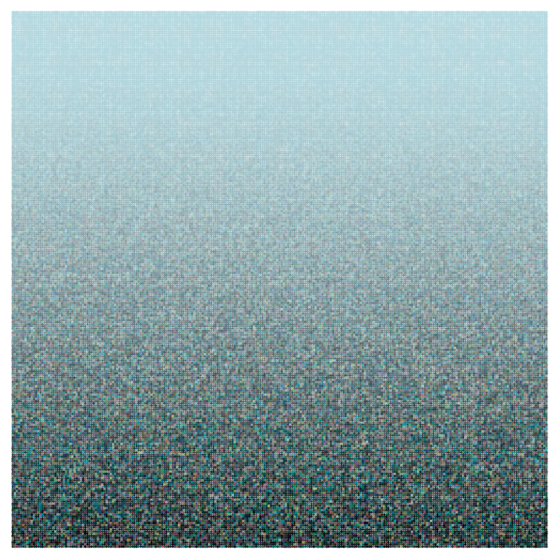
square — we can always scale later.  Here’s what it looks like:
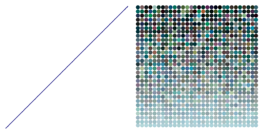
Day012linear

The “linear” part means we’re looking at randomness as a function of y^1=y.  So when y=0, we subtract y=0 randomness to each color.  But when y=1/2, we subtract a random number between 0 and y=1/2 from each of the RGB values.  Finally, at the very top, we’re subtracting a random number between 0 and 1 from each RGB value.  Recall that if an RGB value would ever fall below 0 as a result of subtraction, we’d simply treat the value as 0.

Why do we subtract as we go up?  Recall that black has RGB values (0,0,0), so subtracting the randomly generated number pushes the sky blue toward black.  If we added instead, this would push the sky blue toward white.  In fact, you can push the sky blue toward any color you want, but that’s a little too involved for today’s post.
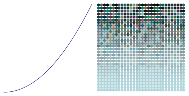
The piece Evaporation was actually produced with a quadratic gradient.  Let’s look at a picture first:

Day012quadratic

That the gradient is quadratic means that the randomness introduced is proportional to y^2 for each value of y.  In other words, at a level of y=1/2 on our square, we subtract a random number between 0 and

(1/2)^2=1/4.

You can visually see this as follows.  Look at the gradient of color change from 0 to 1/2 for the quadratic gradient.  This is approximately the same color change you see in the linear gradient between 0 and 1/4.  Why does this happen?  Because when you square numbers less than 1, they get smaller.  So smaller numbers will introduce less randomness in a quadratic gradient than they will in a linear gradient.

We can go the other way, we well.  If we use a quadratic gradient (exponent of 2>1), the color changes more gradually at the bottom.  But if we use an exponent less than 1 (such as in taking a root, like a square root or cube root), we get the opposite effect:  color changes more rapidly at the bottom.  This is because taking a root of a number less than 1 increases the number.  It’s easiest to see this with an example:

Day012root

In this case, the exponent used is 0.4, 
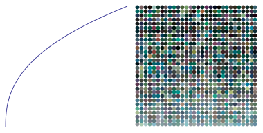
so that for a particular y value, a random number between 0 and y^{0.4} is subtracted from each RGB value.  Note how quickly the color changes from the sky blue at the bottom toward very dark colors at the top.

Of course this is just one way to vary colors.  But I find it a very interesting application of power and root functions usually learned in precalculus — using computer graphics, we can directly translate an algebraic, functional relationship geometrically into a visual gradient of color.  Another example of why it is a good idea to enlarge your mathematical toolbox — you just never know when something will come in handy!  If I didn’t really understand how power and root functions worked, I wouldn’t have been able to create this visual effect so easily.

Now it’s your turn!  You can visit the Evaporation worksheet to try creating images on your own.  If you’ve been trying out the Python worksheets all along, the code should start to look familiar.  But a few comments are in order.

First, we just looked at a 1\times 1 square.  It’s actually easier to think in terms of integer variables “width” and “height” (after all, there is no reason our image needs to be square).  In this case, we use “j” as the height parameter, since it is more usual to use variables like “i” and “j” for integers.  So “j/height” would correspond to y.  This would produce a color gradient of light to dark form bottom to top.

To make the gradient go from top to bottom, we use “(height-j)/height” instead (see the Python code).  This makes values near the top of the image correspond to 0, and values near the bottom of the image correspond to 1.  I’ll leave it to you to explore all the other details of the Python code.

Please feel free to comment with images you create using the Sage worksheet!

As mentioned in the previous post as well, each parameter you change — each number which appears anywhere in your code — affects the final image.  Some choices seem to give more appealing results than others.  This is where are meets technology.

As a final word — the work on creating fractals is still ongoing.  I’ve learned to make movies now using Processing:

You’ll notice how three copies of one fractal image morph into one of another.  You can find more examples on Twitter: @cre8math.  Once I feel I’ve had enough experience using Processing, I’ll post about how you can use it yourself.  The great thing about Processing is that you can use Python, so all your hard work learning Python will yield even further dividends!

Evaporation I

This and the next post will walk you through how to create digital art similar to Evaporation.  I’ll also show you some Python code you can use yourself to experiment.

Day011Evaporation2bWeb

There are three significant features of Evaporation. First is the randomness of the colors. Second — if you look closely — the sizes of the circles are also different; these are randomly generated as well. The third feature is the gradient of the color — from a pure sky blue at the top, to a fairly randomly colored row of circles at the bottom. We’ll look at the first two features today.

Day011Evap1

Let’s look at color. In the figure above, the small teal square at the left has RGB values of 0, 0.5, and 0.7, respectively. The larger square at the left consists of 100 smaller squares. The color of each of these squares is generated by adding a random number between 0 and 0.1 to each of the RGB values 0, 0.5, and 0.7 — with a different random number added to each value. In the middle square, a random number between 0 and 0.2 is added, so this creates a wider range of color values. For the right square, the random numbers added are between 0 and 0.3.

But there is no reason that the ranges need to the same for each color. In the images below, the red values have a wider range of randomness then the green, which is “more random” than the blue.

Dao011Evap2

You can see that different ranges of random numbers create different color “textures.” This is where I think computer meets art — as a programmer, when it comes to creating random numbers, you have to specify a range for the randomness of each variable. The choices you make determine how your image looks. How do you make “artistic” choices? There is no easy answer, of course.

Another way to use randomness is by varying the size of the graphic objects. In the left square below, texture is created by randomly changing the radii of the circles.

Day011Texture2

In the middle square, the circles are all the same size, but random shades of gray. The right square varies both the size of the circles and their color. The final result depends on “how much” randomness is used. You can try it for yourself by altering the Python code linked to below — change the randomness and see what happens!

I think of my laptop as an art laboratory. It is a place to experiment with different ideas — change this parameter, increase randomness, try out different color combinations. Can you imagine creating any of the images in this post by hand? The computer allows us to perform experiments unthinkable to Rembrandt and Van Gogh. We may lose the texture of brush strokes or the dimensionality of paint on canvas, but what we gain by having a programming language at our disposal makes up for this loss.  At least in my opinion….

Now let’s look at how we can use Python to create these images.  You can experiment with this color and texture worksheet.

There is not much more to say here since a lot is explained in the worksheet. But as you are creating, keep a few things in mind.

1. Use descriptive variable names. This helps a lot when you’re looking a lines of code. Using variables a, b, c, etc., doesn’t help much when you’re looking at a program you wrote a few months ago.

2. Comment liberally! Notes to yourself are easy to use in Python — just start a line (or part of a line) with the “\#” character. You’ll thank yourself later.

3.  Save versions often! I won’t bore you with stories of using Mathematica to do some intense computations for creating digital art — and then read the “Mathematica quit unexpectedly” message on my screen — before I saved my work. I’ve encountered this in Python, too — if you use the online version, you’re connecting to an external server, which hopefully will not encounter problems while you’re working….

Also, as you change parameters, you may want to keep track of results you like. If there are a lot of these, sometimes I write the parameters as comments — so I can reproduce them later. Very important: don’t forget to keep track of the random number seed you use! The feel and texture of an image can vary dramatically with the random number seed, so don’t ignore this vital parameter.

One final thought.  In creating this type of art, I keep in mind the tension between structure and randomness.  You can use the computer to create randomness — but if there’s too much randomness, the image doesn’t seem to hang together.  But if there’s too much structure, the image can lose its interesting texture, and appear flat and purely two-dimensional.  So the choice of parameters in creating randomness is fairly crucial in determining how the final image will look.  And as I’ve said before — this is where technology meets art.  It is fairly easy to create a computer-generated image — but not as easy to create computer-generated art.  The difference is not exactly easy to describe — and certainly opinions will differ.  It is the questions which arise in describing the difference which are intriguing and exciting.

Enough philosophizing. Time to begin the artistic process!  Feel free to comment by posting any images you create using the Python code.

Creating Fractals III: Making Your Own

Last week, we laid down some of the mathematical foundation needed to generate fractal images.  In this third and final post about creating fractals, we’ll discuss in some detail Python code you can adapt to making your own designs.  Follow along in this Sage notebook.

In order to produce fractal images iteratively, we need a function which returns the highest power of 2 within a positive integer (as discussed last week).  It is not difficult to write a recursive routine to do this, as is seen in the notebook.  This is really all we need to get started.  The rest involves creating the graphics.  I usually use PostScript for my images, like the one below discovered by Matthieu Pluntz.  There isn’t time to go into that level of detail here, though.

Day009Koch090-150

As far as the graphics are concerned, it would be nice to have an easily described color palette.  You might look here to find a wide range of predefined colors, which are available once we execute the “import mathplotlib” command (see Line 20).  These names are used in the “colors” variable.  Since each motif has four segments, I’ll color each one differently (though you may choose a different color scheme if you want to).

The loop is fairly straightforward.  On each iteration, first find the correct angle to turn using the highestpowerof2 function.  Then the segment to add on to the end of the path is

({\rm len}\cdot\cos(\theta), {\rm len}\cdot\sin(\theta)),

which represents converting from polar to rectangular coordinates.  This is standard fare in a typical high school precalculus course.  Note the color of the segment is determined by i % 4, since 0 is the index of the first element of any list in Python.

All there is left to do is output to the screen.  We’re done!  You can try it yourself.  But note that the way I defined the function, you have to make the second argument negative (compare the image in the notebook with last week’s post).  Be patient:  some of these images may take a few moments to generate.  It would definitely help the speed issue if you downloaded Sage on your own computer.

To create the image shown above, you need to use angles of 90 and -210 (I took the liberty of rotating mine 15 degrees to make it look more symmetrical).  To create the image below, angles of 90 and -250 are used.  However, 26,624 steps are needed to create the entire image!  It is not practical to create an image this complex in the online Sage environment.

Day009koch090-110

How do you know what angles to use?  This is still an open question — there is no complete answer that I am aware of.  After my first post on October 4, Matthieu Pluntz commented that he found a way to create an infinite variety of fractal images which “close up.”  I asked him how he discovered these, and he responded that he used a recursive algorithm.  It would take an entire post just to discuss the mathematics of this in detail — so for now, we’ll limit our discussion to how to use this algorithm.  I’ve encoded it in the function “checkangles.”

To use this function, see the examples in the Sage notebook.  Be careful to enter angles as negative when appropriate!  Also, you need to enter a maximum depth to search, since perhaps the angles do not result in an image which “closes up,” such as with 11 and -169.  But here’s the difficult part mathematically — just because our algorithm doesn’t find where 11 and -169 closes up does not mean that the fractal doesn’t close.  And further, just because our algorithm produced a positive result does not mean the algorithm must close.  Sure, we’ve found something that produces many results with interesting images — which suggests we’re on the right track.  But corroboration by a computer program is not a proof.

At the end of the notebook, I wrote a simple loop illustrating how you can look for many possibilities to try at once.  The general rule of thumb is that the more levels required in the algorithm to produce a pair of angles (which is output to the screen), the more segments needed to draw it.  I just looked for an example which only required 5 levels, and it was fairly easy to produce.

So where do we go from here?  Personally, I’ve found this investigation fascinating — and all beginning from a question by a student who is interested in learning more about fractals.  I’ve tried to give you an idea of how mathematics is done in the “real world” — there is a lot of exploration involved.  Proofs will come later, but it is helpful to look at lots of examples first to figure out what to prove.  When I find out something significant, I’ll post about it.

And I will admit a recent encounter with the bane of a programmer’s existence — the dreaded sign error.  Yes, I had a minus sign where I should have had a plus sign.  This resulted in my looking at lots of images which did not close up (instead of closing up, as originally intended).  Some wonderful images resulted, though, like the one below with angles of 11 and -169.  Note that since the figure does not close up (as far as I know), I needed to stop the iteration when I found a sufficiently pleasing result.

Day009koch011-191

If I hadn’t made this mistake, I might have never looked at this pair of angles, and never created this image.  So in my mind, this wasn’t really a “mistake,” but rather a temporary diversion along an equally interesting path.

I’ve been posting images regularly to my Twitter feed, @cre8math.  I haven’t even touched on the aesthetic qualities of these images — but suffice it to say that it has been a wonderful challenge to create interesting textures and color effects for a particular pair of angles.  Frankly, I am still amazed that such a simple algorithm — changing the two angle parameters used to create the Koch snowflake — produces such a wide range of intriguing mathematical and artistic objects.  You can be sure that I’m not finished exploring this amazing fractal world quite yet….

Cryptarithms

One of the goals of creating this blog was to show you some cool math stuff you might not have seen before. So I thought I’d create a puzzle about this:

Day005Crypt1Just replace each letter with a digit from 0–9 so that the sum is correct. No number begins with a 0. One more thing: M + T = A. Good luck!

Perhaps you’ve never seen puzzles like this before — they’re called cryptarithms. At first they look impossible to solve — almost any assignment of numbers to letters seems possible. But not really. You’re welcome to try on your own first — but feel free to read on for some helpful advice.

Look at the last column (the units). If L + H + G ends in H, then L + G must end in a 0. Since L and G are digits, then L + G = 10. This doesn’t completely determine L or G, but once you know one of the numbers, you know the other.

As a result, you also know there’s a carry over to the third column (tens). What does this mean? That 1 + O + T + O ends in C. Since O + O is an even number, this means that if T is even, then C is odd, and if T is odd, then C is even. We even know a bit more about T from looking at the sum: T is either 1 or 2, since adding three numbers less than 10,000 gives a sum less than 30,000.

What about the second column? O + A + L ends in A. We might be tempted to think that O + L must end in a 0, but that would mean that O + L is 10. This can’t be, since that would mean that G = O (remember that L + G = 10). Therefore there has to be a carry from the third column over to the second column, meaning O + L = 9. So O is one less than G.

Get the idea? There’s a lot of information you can figure out by looking at the structure of the letters in the sum. But it turns out that without the condition M + T = A, there are 12 solutions to this puzzle! Multiple solutions must occur here, for if you can solve this puzzle, you can also solve

Day005Crypt2The M and B occur just once, and at the beginning of numbers. This means if M = 7 and B = 9 in a solution, then putting M = 9 and B = 7 — with all other letters staying the same — will also produce a solution. In looking at all the solutions, I found that giving M + T = A results in a unique solution without giving values for specific letters.

That’s all the help you get! Sometimes you might just guess well and stumble onto a solution — but take the additional challenge and prove you’ve got the only solution to the cryptarithm.

How do you create a cryptarithm? There was a time I did so by hand — but those days are gone. Read more if you’d like to see how you can use programming to help you create these neat puzzles.  (Of course there are online cryptarithm solvers, but that takes all the fun out of it!)

Continue reading Cryptarithms

CrossNumber Puzzles

This week, we’ll look at one of my favorite types of puzzles — CrossNumber Puzzles. These are like crossword puzzles, except that the clues describe numbers instead of words. The only rule is that no entry in a CrossNumber Puzzle can start with a “0.” You can try this one — but don’t worry if you get stuck. We’ll look at different ways you can go about solving it in just a moment.

Day003Puzzle1

How would you go about solving this puzzle? Try to look for the clues which give you the most information. For example, look at 1 Across and 3 Down. Now 1 Across is the cube of a two digit number, and its third digit is actually the first digit of the cube root. So we might want to print out a chart of all four-digit cubes of two-digit numbers:

10 1000 16 4096
11 1331 17 4913
12 1728 18 5832
13 2197 19 6859
14 2744 20 8000
15 3375 21 9261

You can see that the only possibility is that 1 Across is 4913 and 3 Down is 17.

Looking at 5 Across doesn’t help much, since there are too many possibilities.

But looking at 5 Down is a good next choice. Note that 9 Across has to start with 1 or 3 in order to fit four odd digits in the grid, but no perfect squares end in 3, and so no perfect fourth powers end in 3, either.  This means that 9 Across has to start with 1 so that 5 Down ends in 1.  To help figure out 5 Down, below is a list of four-digit fourth powers:

6 1296 8 4096
7 2401 9 6561

So 5 Down must be either 2401 or 6561. If it were 2401, then 6 Across would begin with a “0,” so that leaves 6561 as the only option for 5 Down.

I’ll leave it to you to complete the puzzle. I won’t post a solution so that you’re not tempted to peek — but if you add 2 Down and 6 Across when you’re done, you’ll get 157,991.

How can you make your own CrossNumber puzzle? Start by making a grid, and shade in some of the squares. Usually the pattern of shaded squares is symmetric, but it doesn’t have to be. Fill in some of the entries with numbers which have specific properties, like being a perfect square or cube. Or perhaps make one of the entries the product or sum of two others. The only limit is your imagination! It might help to continue reading below, since then you could print different charts and look at the numbers for something interesting. (And get another puzzle to solve, too.)

Continue reading CrossNumber Puzzles