Mathematics and Digital Art III

Now that the overall structure of the course is laid out, I’d like to describe the week-by-week sequence of topics.  Keep in mind this may change somewhat when I actually teach the course, but the progression will stay essentially the same.

Week 1 is inspired by the work of Josef Albers (which I discuss on Day002 of this blog).  Students will be introduced to the CMYK and RGB color spaces, and will begin by creating pieces like this:Albers2

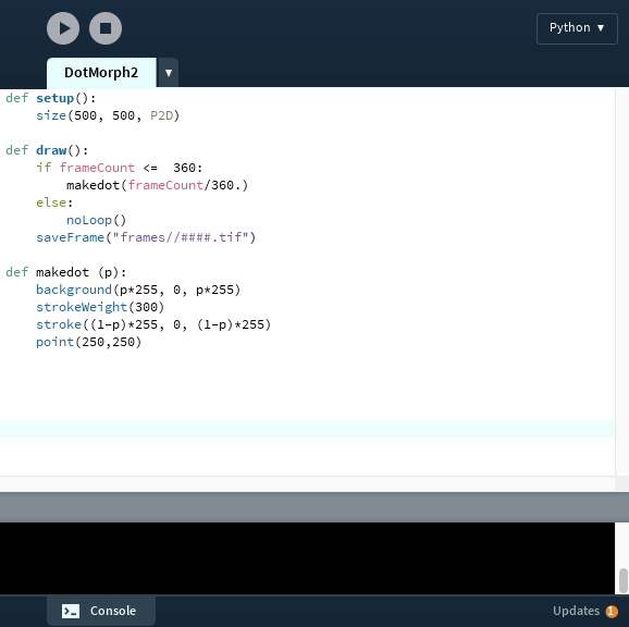
We’ll use Python code in the Sage environment (a basic script will be provided), and learn about the use of random number generation to create pattern and texture.  This may be many students’ first exposure to working with code, so we’ll take it slowly.  As with many of the topics we’ll discuss, students will be asked to read the relevant blog post before class.  While we’ll still have to review in class, the idea is to free up as much class time as possible for exploration in the computer lab.

Week 2 will revolve around creating pieces like Evaporation,

Day011Evaporation2bWeb

which I discuss on Day011 and Day012.  Again, we’ll be in the Sage environment (with a script provided).  Here, the ideas to introduce are basic looping constructs in Python, as well as creating a color gradient.

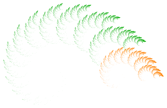
Weeks 3–5 will be all about fractals.  This is an ambitious three weeks, so we’ll begin with iterated function systems (IFS), which I discuss extensively on my blog (see Day034, Day035, and Day036 for an introduction).

Two

The important mathematical concept here is affine transformation, which will likely be unfamiliar to most students.  Sure, they may understand a matrix as an “array of numbers,” but likely do not see a matrix as a representation of a linear transformation.

But there is such a wealth of fascinating images which can be created using affine transformations in an IFS, I think the effort is worth it.  I’ve done something similar with a linear algebra course for computer science majors with some success.

I’ll start with the well-known Sierpinski triangle, and ask students to think about the self-similar nature of this fractal.  While the self-similarity may be simple to explain in words, how would you explain it mathematically?  This (and similar examples) will be used to motivate the need for affine transformations.

In parallel with this, we’ll look at a Python script for creating an IFS.  There is a bit more to this algorithm than the others encountered so far, so we’ll need to look at it carefully, and see where the affine transformations fit in.  I’ll create a “dictionary” of affine transformations for the class, so they can see and learn how the entries of a matrix influence the linear/affine transformations.

Having students understand IFS in these three weeks is the highest priority, since they form the basis of our work with Processing later on in the semester.  As with any course like this, so much depends on the students who are in the course, and their mathematical background knowledge.

With this being said, it may be that most of these weeks will be devoted to affine transformations and IFS.  With whatever time is left over, I’ll be discussing fractal images based on the same algorithm used to produce the Koch curve/snowflake (which I discuss on Day007, Day008, Day009, and Day027).

Day007Starburst

The initial challenge is to get students to understand a recursive algorithm, which is always a challenging new idea, even for computer science majors.  Hopefully the geometric nature of the recursion will help in that regard.

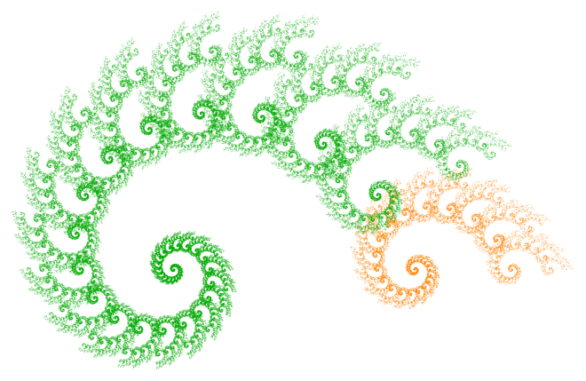
If there is time, we’ll take a brief excursion into number theory.  Without going into too many details (see the blog posts mentioned above for more), choosing angles which allow the algorithm to close up and draw a centrally symmetric figure depends on solving a linear diophantine equation like

ax+by\equiv c\quad ({\rm mod}\ m).

It turns out that the relevant equation may be solved explicitly, yielding whole families of values which produce intricate images.  Here is one I just created last week for a presentation on this topic I’ll be giving at the Symmetry Festival 2016 in Vienna this July:

Koch_336_210_218

There is quite a bit of number theory which goes into setting up and solving this equation, but all at the elementary level.  We’ll just go as far as we have time to.

Week 6 will be the first in a series of three Presentation Weeks.  This week will be devoted to having students select and present a paper or two from the Bridges archive.  This archive contains over 1000 papers given at the Bridges conferences since 1998, and is searchable.

The idea is to expose students to the breadth of the relationship between mathematics and art.  Because of the need to explain both the mathematics and programming behind the images we’ll create in class, there necessarily will be some sacrifice in the breadth of the course content.   Hopefully these brief presentations will remedy this to some extent.

With three 65-minute class periods and 13 students, it shouldn’t be difficult to allow everyone a 10-minute presentation during this week.  It is not expected that a student will understand every detail of a particular paper, but at least communicate the main points.

Presentations will be both peer-evaluated and evaluated by me.  As these are first-year students, it is understood that they may not have given many presentations of this type before.  It is expected that they will improve as the semester progresses.

I realize that some of these ideas are repeated from last week’s post, but I did want to make these two posts covering the week-by-week sequence of topics self-contained.  I also wanted to give enough detail so that anyone considering offering a similar course has a clear idea of what I have in mind.  Next week, we’ll finish the outline, so stay tuned!

Mathematics and Digital Art II

This week, I want to talk more about the overall structure of the Mathematics and Digital Art (MDA) course I’ll be teaching in the fall.  I won’t have time to address specifics about content today, but I’ll begin with that next week.

As I mentioned last week, because I can’t require students to bring a laptop to class, MDA will meet in a computer laboratory.  Here is my actual classroom:

CO214_10182013

Each day, there will be some time in class — usually at least half the 65-minute period — for students to work at their comptuers.  This is a typical 16-week course meeting three times a week.  (Though courses at USF are four credits, hence the longer class time each day.)

Because the course is project-based, there are homework assignments and projects due, but no exams.  There may be an occasional homework quiz on the mathematics, where I let students use their notes.  I prefer this method to collecting homework, since there are always issues of too much copying.  Because I typically change the numbers in homework quiz problems, it is difficult to do well on this type of quiz if all you do is copy your homework from someone else.

Instead of a Final Exam, there is a major project due at the end of the course.  So the first half of the semester — roughly eight weeks — covers a breadth of topics so that students have lots of options when writing a proposal for their Final Project.

Their proposals are due mid-semester, so I have time to evaluate and discuss them, as well as make suggestions.  I try to make sure each project is appropriate for each student — enough to challenge them, but not frustrate them.  Of course there is flexibility for projects to undergo changes along the way, but the proposal allows for a very concrete starting point.

In the second half of the semester, most weeks will include one day for working on Final Projects.  Not only does this emphasize the importance of the projects, but it also lets me see their progress and perhaps alter the direction they’re going if necessary.

The other main focus of the second half of the semester is the use of Processing to make movies.  Because most students will not have studied programming before, I need to make sure there is plenty of time for them to be successful.  We’ll need to take it slowly.

Of course this means that students will not be able to include the use of Processing in their course proposals, but that doesn’t mean they can’t adapt their project along the way to include the use of Processing if they want to.  This is a necessary trade-off, however, since front-loading the course with a discussion of Processing would mean sacrificing the breadth of topics covered.  I like the students to see as much as possible before they write their Final Project proposals.

This is the broad structure of the course.  There are a few other aspects of MDA which also deserve mention.  Three weeks of the course are devoted to presentations.  The idea here is twofold.  First, there is the clear benefit of developing students’ public speaking abilities.

Second, because students will be giving presentations on papers from the Bridges archive (the archive of all papers presented in the Bridges conferences since 1998), they will need to find a paper on a topic of interest to themselves at a level they can understand.  As there are over 1000 papers here, along with an ability to search using keywords, this should not pose a siginificant problem.  Of course should a student have another source about mathematics and art they are keen to share, this would be acceptable as well.

Because the class size is small (13 students), it will feasible to have all students present in each of the three weeks.  The first Presentation Week on Bridges papers will be about the sixth week of the semester, and the second will be about the eleventh week.

The third Presentation Week will be at the fourteenth week of the semester, but this time will be focused on Final Projects.  I will invite mathematics, computer science, and art/design faculty to these presentations as well, and of course will let the students know this in advance.  All presentations will be both peer-evaluated and evaluated by me.

There is also a plan to bring guest speakers from the Bay area into the classroom.  I know a handful of mathematical artists in the area, so bringing in two or three speakers over the course of a semester would be feasible.  This is one of the design features of the First-Year Seminar, incidentally — expose students to the larger San Francicso/Bay area community.

In addition, I can have a student assistant in the classroom as well.  Nick, my student who is also going to the Bridges conference in Finland this year, will serve in that role.  We’ve spent a semester in a directed study to prepare for the Bridges 2016 conference, so he has unique qualifications.  I’ll talk more about Nick in a future post.

When teaching a programming course with a laboratory component, it is difficult to be able to get around to help all students in any given class period.  Certainly some questions students ask have simple answers (as in a syntax fix), but others will require sitting down with a student for several minutes.

So it will be great to have Nick as an assistant, since that will allow two of us to circulate around the classroom during the laboratory part of the class.  The benefit to students will be obvious, and with the small class size, I’m confident they’ll get the attention they need.

Finally, I left the last week (just two class periods) open for special topics.  Given all the demands of a first-semester student just before Final Exam week, I thought it would be nice for them to have a short breather.  I’ll take suggestions for topics from the students, with the Bridges papers they presented on as a good starting point.

So that’s what the course looks like, broadly.  Next week, I’ll begin a week-by-week discussion of the mathematical/artistic content of the course.  I also intend to post weekly or biweekly while the course is going on — course design is a lot easier in theory than in practice, and I’ll be able to share pitfalls and triumphs in real time!


Mathematics and Digital Art I

Last week I discussed a movie project I had my linear algebra students do which involved the animation of fractals generated by  iterated function systems.  This week, I’d like to discuss a new classroom project — a Mathematics and Digital Art course I’ll be teaching this Fall at the University of San Francisco!

The idea came to me during the Fall 2015 semester when we were asked to list courses we’d like to teach for the Fall 2016 semester.  I noticed that one of my colleagues had taught a First-Year Seminar course  — that is, a course with a small enrollment (capped at 16) focused on a topic of special interest to the faculty member teaching the course.  The idea is for each first-year student to get to know one faculty member fairly well, and get acclimated to university life.

So I thought, Why not teach a course on mathematics and art?  My department chair urged me to go for it, and so I drafted a syllabus and started the process going.  Here’s the course description:

What is digital art? It is easy to make a digital image, but what gives it artistic value? This question will be explored in a practical, hands-on way by having students learn how to create their own digital images and movies in a laboratory-style classroom. We will focus on the Sage/Python environment, and learn to use Processing as well. There will be an emphasis on using the computer to create various types of fractal images. No previous programming experience is necessary.

I have two”big picture” motivations in mind.  First, I want the course to show real applications of mathematics and programming.  Too many students have experienced mathematics as completing sets of problems in a textbook.  In this course, students will use mathematics to help design digital images.  I’ll say more about this in later posts.

And second, I want students to have a  positive experience of mathematics.  This course might be the only math course they have to take in college, and I want them to enjoy it!  Given prevailing attitudes about mathematics in general, I think it is completely legitimate to have “students will begin to enjoy mathematics” as a course goal.

I also think that every student should learn some programming during their college career.  Granted, students will start by tweaking Python code I give to them, just like with the movie project.  Some students won’t progress much beyond this, but I am hopeful that others will.  Given the type of course this is, I really can’t have any prerequisites, so I’m assuming I will have students who either haven’t taken a math course in a year or two, and/or have never written a line of code before.

I’ll go into greater detail in the next few posts about content and course flow, but today I’ll share three project ideas which will drive much of the mathematics and programming content.  The first revolves around the piece Evaporation, which I discuss on Day011 and Day012 of my blog.

Day011Evaporation2bWeb

Creating a piece like this involves learning the basics of representing colors digitally, as well as basic programming ideas like variables and loops.

The second project revolves around the algorithm which produces the Koch curve, which I discuss in some detail on Day007, Day008, Day009, and Day027 of my blog.

Day007koch-45-175

By varying the usual angles in the Koch curve algorithm, a variety of interesting images may be produced.  Many exhibit chaotic behavior, but some, like the image above, actually “close up” and are beautifully symmetric.

It turns out that entire families of images which close up may be generated by choosing pairs of angles which are solutions to a particular linear Diophantine equation.  So I’ll introduce some elementary number theory so we can look at several families of solutions.

The third (and largest) project revolves around creating animated movies of iterated function systems, as I described in the last six posts.

This involves learning about linear and affine transformations in two dimensions, and how fractals may be described by iterated function systems.  The mathematics is at a bit higher level here, but students can still play with the algorithms to generate fractal images without having completely mastered the linear algebra.

But I think it’s worth it, so students can learn to create movies of fractals.  In addition, fractals are just cool.  I think using IFS is a good way not only to show students an interesting application of mathematics and programming, but also to foster an enjoyment of mathematics and programming as well.  I had great success with my linear algebra students in this regard.

I’d like to end this post with a few words on the process of creating a course like Mathematics and Digital Art at USF.  Some of these points might be obvious, others not — and some may not even be relevant at your particular school.

  • Start early!  In my case, the course needed to be first approved by the Dean, then next by a curriculum committee in order to receive a Core mathematics designation, and then finally by the First-Year Seminar committee.  The approval process took four months.
  • Consider having your course in a computer lab.  At USF, I could not require students to bring a laptop to class, since it could be the case that some students do not have their own personal computer.  I hadn’t anticipated this wrinkle.
  • Don’t reinvent the wheel!  One reason I’m writing about Mathematics and Digital Art on my blog is to make it easier for others to design a similar course.  I’ll be talking more about content and course flow in the next few posts, so feel free to use whatever might be useful.  And if would help, here is my course syllabus.

As I mentioned, next week’s post will focus more on the actual content of the course.  Stay tuned!

Making Movies with Processing VI

The last post in this series will address how I used Processing in the classroom this past semester.  Although my experience has been limited so far, the response has been great!

In the Spring 2016 semester, I used Processing in my Linear Algebra and Probability course, which is a four-credit course specifically for CS majors.  The idea is to learn linear algebra first from a geometrical perspective, and then say that a matrix is simply a representation of a geometrical transformation.

I make it a point to generalize and include affine transformations as well, as they are the building blocks for creating fractals using iterated function systems (IFS).  The more intuition  students have about affine transformations, the easier it is for them to work with IFS.  (To learn more about IFS, see Day034, Day035, and Day036 of my blog.)

If you’ve noticed, many of the movies I’ve discussed deal with IFS.  Within the first three weeks of the class (here is the link to the course website), I assign a project to create a single fractal image using an IFS.  I use the Sage platform as it supports Python and is open source, and all of my students were supposed to have taken a Python course already.  All links, prompts, and handouts for this project may be found on Days 5 and 6 of the course website.

This sets up the class for a Processing project later on in the semester.  The timing is not critical; as it turns out the project was due during the Probability section of the course (the last third) as most students had other large projects due a bit earlier.  A sample movie provided to the students may be found on Day 22 of the course website, and the project prompt may be found on Day 33.

The basic idea was to use a parameter to vary the numbers in a series of affine transformations used to create a fractal using an IFS.  As the parameter varied, the fractal image varied as well.  This allowed  for an animation from an initial fractal image to a final fractal image.

My grading rubric was fairly simple:  each feature a student added beyond my bare-bones movie bumped their grade up.  Roughly speaking, four additional features resulted in an A for the assignment.  These might include use of color, background image, music, text, etc.

I was inspired by how eagerly students took on this assignment!  They really got into it.  They appreciated using mathematics — specifically linear algebra — in a hands-on application.  I do feel that it is important for CS majors to understand mathematics from an applied viewpoint as well as a theoretical one.  Very few CS majors will go on to become theoretical computer scientists.

We did take some class time to watch movies which students uploaded to my Google drive.  All had their interesting features, but some were particularly creative.  Let’s take a look at a few of them.

Here is Monica’s description of her movie:

My fractal movie consists of a Phoenix, morphing into a shell, morphing into the yin-yang symbol, and then morphing apart. I chose my background color to be pure black to create contrast between the orange and yellow colors of my fractal. The top fractal, which starts out as yellow, shifts downward the whole time. On the other hand, the bottom fractal, which starts out orange, shifts upward. In both cases, a small number of the points from each fractal get stuck in the opposite fractal and begin to shift with it. This leaves the two fractals at the end of the movie intertwined. I created text at the bottom of the fractal movie, which says “Phoenix.” I wanted to enhance the overall movie and give it a name. Lastly, I added music to my fractal movie. I picked the song “Sweet Caroline” by Neil Diamond.

Ethan says this about his movie:

The inspiration for this fractal came from a process of trial and error.  I knew I wanted to have symmetry and bright color, but everything else was undecided.  After creating the shape of the fractal, I decided to create a complete copy of the fractal and rotate one copy on top of the other.  After seeing what it looked like with a simple rotation, I decided something was missing so I had the copied image rotate and either shrink or grow, depending on a random variable.  In this movie the image shrinks.  I used transitional gradients because I wanted to add more color without it looking too busy or cluttered.

Finally, this is how Mohamed describes his video:

This video starts as a set of four squares scaled by 0.45, and each square has either x increased by 0.5, y increased by 0.5, both increased by 0.5, or neither increased by 0.5. The grays and blacks as the video starts show the random points plotted as the numbers fed into the function are increasing, while the blues and whites show the points as the numbers fed into the function are decreasing. I chose to do this because we often see growth of functions in videos, but we do not see the regression back to its original form too often….

I was very pleased how creative students got with the project, and how enthusiastic they were about their final videos.  I have another project underway where I use Processing — a Mathematics and Digital Art course I’ll be teaching this Fall semester.  I’ll be talking about this course soon, so be sure to follow along!

Making Movies with Processing V

Last week, we saw how to use linear interpolation to rotate a series of fractal images.  It was not unusually difficult, but it was important to call functions in the right sequence in order to make the code as simple as possible.

This week we’ll explore different ways to use color.  Using color in digital art is a broad and complex topic, so we’ll only scratch the surface today.

The first movie shows how the different parts of the Sierpinski triangles corresponding to different affine transformations of the iterated function system can be drawn in different colors.

Recall that the points variable stored all the points to be drawn in any given fractal image.  Since the points are drawn all at once, it is difficult to say which of the three transformations generated a particular point.  But this is important because we want the color of a point to correspond to the transformation used to generate it.

One idea is to use three variables to store the points, and have these variables correspond to the three affine transformations.  Here is the code — we’ll discuss it in detail in a moment.

CodeSnippet5

We use variables points1, points2, and points3 to store the points generated by each of the three affine transformations.  Note that the use of append is now within each if statement, not after all the if statments.  This is because we want to remember which points are generated by which transformation, so we can plot them all the same color.

As a result, we now need three separate calls to the stroke and point routines.  Recall that in Processing, a call to the stroke command changes the color of everything drawn after that stroke command is called.  So if we want to draw using three different colors, we need three calls to the stroke command.

Of course it follows that we need three calls to the point routine, since once we change the color of what is drawn, we need to make sure the correct set of points is that color.  In this case, all the points in points1 are yellow, those in points2 are red, and those in points3 are blue.

Again, not unusually complicated.  You just have to make sure you know how each function in Processing works, and the appropriate order in which to call the functions you use.

On to the next color experiment!  It’s been a few weeks since we used linear interpolation with color.  You’ll see in the movie below that the yellow triangle gradually turns to red, the blue triangle changes to yellow, and the red triangle becomes blue.

Let’s see how we’d use linear intepolation to accomplish this.  Below is the only code which needs to be altered — the stroke and point commands.  Also, I left out the rotate function so the changing of the colors would be easier to follow.

CodeSnippet6

We’ll focus on how to change the red triangle to blue in this example, which occurs for the points in the variable points2.  The other color changes are handled similarly.  All we need to do is use linear interpolation on each of the RGB values of the colors we are looking at.

For example, red has an R value of 255, but blue has an R value of 0.  Now when p = 0 the triangle is red, and when p = 1, the triangle is blue.  So we need to start (p, R) at (0, 255) and end at (1, 0).  Creating a line between these two points results in the equation

R = (1 – p) * 255.

You can see the right-hand side of this equation as the first argument to the stroke command used to change the color for points2.

Working with the G values is easy.  Since both red and blue have a G value of 0, we don’t need linear interpolation at all!  Just leave the G value 0, and everything will be fine.

Finally, we look at the B value.  For red, the B value is 0, but it’s 255 for blue.  So we need to start (p, R) at (0, 0) and end at (1, 255).  This is not difficult to do; we get the line

R = p * 255.

You’ll see the right-hand side of this equation as the third argument to the stroke command which changes the color for points2.

Just linear interpolation at work again!  It’s not too difficult, once you look at it the right way.

For our last example, we’ll let the triangles “fade out,” as shown in the following movie.

Can you figure out how this is done?  Linear interpolation again, but this time in the strokeWeight function.  Here are the changes:

CodeSnippet7

Let’s what this if-else clause does.  If the parameter p is less than 0.5, leave the stroke weight as 2.  Otherwise, calculate the stroke weight to be (1 – p)*4.

What does this accomplish?  Well, at p = 0.5, the stroke weight is (1 – 0.5)*4, which is 2.  And at p = 1, the stroke weight is 0.  This means that the stroke weight is 2 for the first half of the movie, then gradually diminishes to 0 by the end of the movie.  In other words, a fade out.

Of course when you write the code, you have to reverse engineer it.  If I call my stroke weight W, I want to start (p, W) at (0.5, 2) and end at (1, 0).  Creating a line between these two points gives the equation

W = (1 – p) * 4.

That’s all there is to it!

I hope you’ve seen how linear interpolation is a handy tool you can use to create all types of special effects.  The neat thing is that it can be applied to any function which takes numerical parameters — and those parameters can correspond to color values, angles of rotation, location, or stroke weight.  The only limit to how you can incorporate linear interpolation into your movies is your imagination!

Making Movies with Processing IV

Last week, we saw how using linear interpolation allowed us to create animations of fractals.  This week, we’ll explore how to create another special effect by using linear interpolation in a different way.  We’ll build on last week’s example, so you might want to take a minute to review it if you’ve forgotten the details.

Let’s suppose that in addition to morphing the Sierpinski triangle, we want to slowly rotate it as well.  So we insert a rotate command before plotting the points of the Sierpinski triangle, as shown here:

CodeSnippet1

First, it’s important to note that the rotate command takes angles in radian measure, not degrees.  Recall from your trigonometry classes that

360^\circ=2\pi{\rm \ radians.}

But different from your trigonometry classes is that the rotation is in a clockwise direction.  When you studied the unit circle, angles moved counter-clockwise around the origin as they increased in measure.  This is not a really complicated difference, but it illustrates again how not every platform is the same.  I googled “rotating in processing” to understand more, and I found what I needed right away.

Let’s recall that p is a parameter which is 0 at the beginning of the animation, and 1 at the end.  So when p = 0, there is a rotation of 0 radians (that is, no rotation), and when p = 1, there is a rotation of 2\pi radians, or one complete revolution.  And because we’re using linear interpolation, the rotation changes gradually and linearly as the parameter p varies from 0 to 1.

Let’s see what effect adding this line has.  (Note:  Watch the movie until the end.  You’ll see some blank space in the middle — we’ll explain that later!)

What just happened?  Most platforms which have a rotate command assume that the rotation is about the origin, (0,0).  We learned in the first post that the origin in Processing is in the upper left corner of the screen.  If you watch that last video again, you can clearly see that the Sierpinksi triangle does in fact rotate about the upper left corner of the screen in a clockwise direction.

Of course this isn’t what we want — since most of the time the fractals are out of the view screen!  So we should pick a different point to rotate around.  You can pick any point you like, but I though it looked good to rotate about the midpoint of the hypotenuse of the Sierpinski triangles.  When I did this, I produced the following video.

So how did I do this?  It’s not too complicated, but let’s take it one step at a time.  We’ve got to remember that before scaling, the fractal fit inside a triangle with vertices (0,0), (0,2), and (2,0).  I wanted to make it 450 pixels wide, so I scaled by a factor of 225.

This means that the scaled Sierpinski triangle fits inside a right triangle with vertices (0, 0), (0, 450), and (450, 0).  Using the usual formula, we see that the midpoint of the hypotenuse of this triangle has coordinates

\dfrac12\left((0,450)+(450,0)\right)=(225,225).

To make (225, 225) the new “origin,” we can just subtract 225 from the x– and y-coordinates of our points, like this:

CodeSnippet2

Remember that the positive y-axis points down in Processing, which is why we use an expression like 225 – y rather than y – 225.  This produces the following video.

This isn’t quite what we want yet, but you’ll notice what’s happening.  The midpoint of the hypotenuse is now always at the upper left corner.  As the triangle rotates, most of it is outside the view screen.  But that’s not hard to fix.

All we have to do now is move the midpoint of the hypotenuse to the center of the screen.  We can easily do this using the translate function.  So here is the complete version of the sierpinski function, incorporating the translate function as well:

CodeSnippet3

So let’s briefly recap what we’ve learned.  Rotating an image is not difficult as long as you remember that the rotate function rotates about the point (0,0).  So first, we needed to decided what point in user space we wanted to rotate about – and we chose (225, 225) so the fractals would rotate around the midpoint of the hypotenuse of the enclosing right triangle.  This is indicated in how the x– and y-coordinates are changed in the point function.

Next, we needed to decided what point in screen space we wanted to rotate around.  The center of the screen seemed a natural choice, so we used (384, 312).  This is indicated in the arguments to the translate function.

And finally, we decided to have the triangles undergo one complete revolution, so that p = 0 corresponded to no rotation at all, and p = 1 corresponded to one complete revolution.  We accomplished this using linear interpolation, which was incorporated into the rotate function.

But most importantly — we made these changes in the correct order.  If you played around and switched the lines containing the translate and rotate functions, you’d get a different result.

It is worth remarking that it is possible to use the rotate function first.  But then the translate function would be much more complicated, since you would have to take into account where the point (384, 312) moved to.  And you’d have to review your trigonometry.  Here’s what the two lines would need to look like:

CodeSnippet4

As you can see, there is a lot more involved here!  So when you’re thinking about designing algorithms to produce special effects, it’s worth thinking about the order in which you perform various tasks.  Often there is a way that is easier than all the others — but you don’t always hit upon it the first time you try.  That’s part of the adventure!

Next week we’ll look a few more special effects you can incorporate into your movies.  Then we’ll look at actual movies made by students in my linear algebra class.  They’re really great!

Making Movies with Processing III

This week, we begin a discussion of creating movies consisting of animated fractals.  Last week’s post about the dot changing colors was at a beginning level as far as Processing goes.  This week’s post will be a little more involved, but will assume a knowledge of Iterated Function Systems.  I talked about IFS on Day034, Day035, and Day036.  Feel free to look back for a refresher….

Today, we’ll see how to create the following movie.  You’ll notice that both the beginning and final Sierpinski triangles are fractals discussed on Day034.

As a reminder, these are the three transformations which produce the initial Sierpinksi triangle:

F_1\left(\begin{matrix}x\\y\end{matrix}\right)=\left[\begin{matrix}0.5&0\\0&0.5\end{matrix}\right] \left(\begin{matrix}x\\y\end{matrix}\right),

F_2\left(\begin{matrix}x\\y\end{matrix}\right)=\left[\begin{matrix}0.5&0\\0&0.5\end{matrix}\right] \left(\begin{matrix}x\\y\end{matrix}\right)+\left(\begin{matrix}1\\0\end{matrix}\right),

F_3\left(\begin{matrix}x\\y\end{matrix}\right)=\left[\begin{matrix}0.5&0\\0&0.5\end{matrix}\right] \left(\begin{matrix}x\\y\end{matrix}\right)+\left(\begin{matrix}0\\1\end{matrix}\right).

Also, recall that to get the modified Sierpinski triangle at the end of the video, all we did was change the first transformation to

F_1\left(\begin{matrix}x\\y\end{matrix}\right)=\left[\begin{matrix}0.25&0\\0&0.5\end{matrix}\right] \left(\begin{matrix}x\\y\end{matrix}\right).

We’ll how to use linear interpolation to create the animation.  But first, let’s look at the Python code for creating a fractal using an iterated function system.

ifscode

The parameter p is for the linear interpolation (which we’ll discuss later), and n is the number of points to plot.  First, import the library for generating random integers — since each transformation will be weighted equally, it’s simpler just to choose a random integer from 1, 2, and 3.  The variable points keeps track of all the points, while last keeps track of the most recently plotted point.  Recall from earlier posts that you only need the last point in order to get the next one.

Next, the for loop just creates new points, one at a time, and appends them to points.  Once an affine transformation is randomly chosen by selecting a randint in the range from 1 to 3, it is applied to the last point generated.  For the purpose of writing Python code, it’s easier to use the notation

F_2\left(\begin{matrix}x\\y\end{matrix}\right)=\left(\begin{matrix}0.5 \ast x+1\\0.5\ast y\end{matrix}\right)

rather than matrix notation.  In order to use vector and matrix notation, you’d need to indicate that (1,2) is a vector by writing

v = vector(1,2),

and similarly for matrices.  Since we’re doing some fairly simple calculations, just writing out the individual terms of the result is easier and requires less code.

Once the points are all created, it’s time to plot them.  You’ll recognize the background, stroke, and strokeWeight functions from last week.  Nothing fancy here, since we’re focusing on algorithms today.  Just a black background and small orange dots.

The last line plots the points, and is an example of what is called list comprehension in Python.  First, note that the iterated function system would create a fractal which would fit inside a triangle with vertices (0,2), (0,0), and (2,0).  So we need to suitably scale the fractal — in this case by a factor of 225 so it will be large enough to see.  Remember that units are in pixels in Processing.

Then we need to compensate for Processing’s coordinate system.  You’ll notice a similarity to what we did a few weeks ago.

What the last line does is essentially this:  for every point x in the list points, adjust the coordinates for screen space, and then plot x with the point function.  List comprehension is convenient because you don’t have to make a loop or other iterative construct — it’s done automatically for you.

Of course that doesn’t mean you never need a for loop.  It wouldn’t be easy to replace the for loop above with a list comprehension as each new point depends on the previous one.  But for plotting a bunch of points, for example, it doesn’t matter which one you plot first.

Now for the linear interpolation!  We want the first frame to be the usual Sierpinski triangle, and the last frame to be our modified triangle.  The only difference is that one of the constants in the first function changes from 0.5 to 0.25.

This is perfect for using linear interpolation.  We’d like our parameter p to be 0.5 when p = 0, and 0.25 when p = 1.  So we just need to create a linear function of p which passes through the points (0, 0.5) and (1, 0.25).  This isn’t hard to do; you should easily be able to get

0.5 - 0.25 \ast p.

The effect of using the parameter p in this way is to create a series of fractals, each one slightly different from the one before.  Since we’re taking 360 steps to vary from 0.5 to 0.25, there is very little difference from one fractal to the next, and so when strung together, the fractals make a convincing animation.

I should point out the dots look like they’re “dancing” because each time a fractal image is made, a different series of random affine transformations is chosen.  So while the points in each successive fractal will be close to each other, most of them will actually be different.

For completeness, here is the code which comes before the sierpinski function is defined.

ifscodesetup2

It should look pretty familiar from last week.  Similar setup, creating the parameter p, writing out the frames, etc.  You’ll find this a general type of setup which you can use over and over again.

So that’s all there is to it!  Now that you’ve got a basic grasp of Processing’s screen space and a few different ways to use linear interpolation, you can start making movies on your own.

Of course there are lots of cool effects you can add by using linear interpolation in more creative ways.  We’ll start to take a look at some of those next week!

Making Movies with Processing II

Last week we learned a little about the history of Processing, as well as what the coordinate system is like in Processing (and many other graphics applications as well).  Today I’d like to discuss an idea which I find very helpful in making movies — linear interpolation.  We’ll only have time for one simple example today, but we’ll go through that example very thoroughly.

So here’s the movie we’ll explore today.  Not glamorous, but it’s a start.

You’ll notice what’s happening — the dot slowly turns from magenta to black, while the background does the opposite.  Let’s look at the dot first.  In Processing, RGB values go from 0 to 255.  Magenta is (255, 0, 255) in RGB, and black is (0, 0, 0).  We want the dot to go smoothly from magenta to black.

The way I like to do this is to introduce a parameter p.  I think of p = 0 as my starting point, and p = 1 as my ending point.  In this example, p = 0 corresponds to magenta, and p = 1 corresponds to black.  As p varies from 0 to 1, we want the dot to go from magenta go black.

This is where linear interpolation comes in.  For any start and end values, the expression

(1 – p) * start + p * end

will vary continuously from the start value to the end value as p goes from 0 to 1.  It should be clear that when p = 0, you get the start value, and when p = 1, you get the end value.  Any value of p in between 0 and 1 will be in between the start and end values — closer to the start value when p is near 0, and closer to the end value when p is near 1.

Because this expression is linear in p — no quadratic terms, no square roots, no sines or cosines — we say that this expression gives a linear interpolation between the start and end values.

Let’s see how this works in Processing.  Here’s a screen shot of the code that produced the video shown above.

screenshot2

The basic functions for making a simple movie are setup and draw.  The setup function is executed once before the movie starts.  Then the draw function is called repeatedly — each time the draw function is called, a new frame of the movie is created.

In a typical program, if you wanted to repeat something over and over, you’d need to make a loop.  But in Processing — since its purpose is to create frames for movies — this is built in to how the application works.  No need to do it yourself.

So in Processing, the variable frameCount automatically keeps track of which frame you’re creating.  And it is automatically incremented each time the draw function executes.  You’ll find that this is a very nice feature!  This way, you don’t have to keep track of frames yourself.

Note the size declaration in the setup function.  Last week, I mentioned that you’ve got to set the size of your coordinate system when you start your movie.  The “P2D” means you’re creating a two-dimensional image.  You can make 3D objects in processing, but we won’t look at that today.

Typical applications which make movies (like PhotoShop, or the Movie Maker found in Processing’s “Tools” menu) use about 30 frames per second.  So 360 frames (as above) will be a 12-second movie.  Enough to see the dot and background change colors.

The if/else clause determines the frames produced.  Note that when frameCount gets larger than 360, you skip to the “else” clause, which is “noLoop()”.  This essentially stops Processing from creating new frames.  The saveFrame command saves the individual frames to whatever directory you specify; if you forget the else clause, Processing will just keep generating more and more .tiff files and clutter up your directory.

So the if/else clause basically tells Processing this:  make 360 frames, one at a time, and save then in a directory called “frames.”  Once all 360 frames are made, it’s time to stop.

The makedot function is what actually creates the frame.  Now we’re getting to the linear interpolation!  The frameCount/360. is what creates the value of p.  When frameCount is 1, the value of p is 1/360 (close enough to 0 for the purposes of our movie), and when frameCount is 360, the value of p is 1.  As the value of frameCount increases, p increases from about 0 to 1.

It’s important to use a decimal point after the number 360.  If you don’t, Python will use integer division, and you’ll get 0 every time until frameCount reaches 360, and only then will you get 1.  (I learned this one the hard way…took a few minutes to figure out what went wrong.)

So let’s go through the makedot function line by line.  First, we set the background color.  Note that when p is 0, the color is (0, 0, 0) — black.  As p moves closer to 1, the black turns to magenta.  It is also important to note that when you call the background function, the entire screen is set to the color you specify.  Processing will write over anything else that was previously displayed.  So be careful where you put this command!

Next, the width of lines/points drawn is set with strokeWeight.  Remember that the units are pixels — so the width of the dot is 300 pixels on a screen 500 pixels wide.  Pretty big dot.

The stroke command sets the color of lines/points on the screen.  Notice the (1 – p) here — we want to begin with magenta (when p = 0), and end with black (when p = 1).  So we go the “opposite” direction from the background.

Maybe you noticed that at one point, the dot looked like it “disappeared.”  Not really — note that when p = 1/2, then 1 – p = 1/2 as well!  At this time, the dot and background are exactly the same color.  That’s why it looked like the dot vanished.

And last but not least — the dot.  Remembering the coordinate system, the dot is centered on the screen at (250, 250).

That’s it.  Not a long program, but all the essentials are there.  Now you’ve got a basic idea of how simple movies can me made.  The next post will build on this week’s and look at some more examples of linear interpolation.  Stay tuned!


Making Movies with Processing I

If you’ve been following my Twitter (@cre8math), you’ll have noticed I posted quite a few videos last fall.  At the time I was writing a lot about creating fractal images, and I really wanted to learn how to make animations using these images.  I had heard about Processing from a lot of friends, and decided that it was time to dive in!  Here is one of earlier movies, but still one of my favorites.

Processing has been around since 2001.  From the very beginning, Processing was used in the classroom as a tool to allow students to quickly create graphical images and movies.  It is now used widely by educators, artist, designers, architects, and researchers.  Many companies use Processing for data visualization.  Click on the link to read more!

One of the great things about Processing is that it’s open source — a specific intention of the developers.  Now, there’s even a Processing Foundation.  Its purpose is to “promote software literacy within the visual arts, and visual literacy within technology-related fields — and to make these fields accessible to diverse communities.”  The idea is to provide everyone access to software you can use to create a wide range of visual media.  Not just those who can afford it.

I support open-source initiatives as well.  Most of the digital art I’ve talked about on my blog was written in Mathematica, a powerful programming language, but expensive to buy.  I rewrote all the algorithms you’ve seen on the Sage worksheets in Python because I wanted them to be available to anyone who has access to the internet.  Not just those who can afford pricey software….

Now there won’t be time to go into everything about Processing — that’s what the internet is for.  I often google phrases like “How do you change the background color in Processing?”, and usually get the information I need pretty quickly.

What I want to focus on today is the coordinate system used in Processing.  If you’re new to computer graphics, it might be a little unfamiliar — the coordinate system is based on pixels.  For example, the screen on my Mac is 1440 x 900 pixels.  But the origin (0, 0) is in the upper left corner of the screen, so that  the lower right corner has coordinates (1440, 900).  In other words, while the positive x-axis is still to the right, the positive y-axis is now pointing down.  This is sometimes called a screen coordinate system, or screen space.

This convention has an interesting history.  Older television screens used cathode ray tubes, and literally updated the screen by refreshing one line at a time, from top to bottom and from left to right.  After updating the pixel at the lower right, refreshing began again at the upper left.  This process occurred several times each second to give the illusion of continuous motion.  Because the refresh was done from top to bottom, the y-coordinates increased from top to bottom as well.

Such a coordinate system is not unusual.  The PostScript programming language (which I told you about two weeks ago) has a coordinate system based on points.  The definition of a point has changed over time, but PostScript uses a coordinate system where there are 72 points per inch, and the lower left corner has coordinates (0,0).

PostScript is used for printing physical documents.  Because copier paper typically has dimensions 8.5″ x 11″ in the United States, the upper right corner of your document would have coordinates (612, 792).

In Processing, you need to specify the size of the screen you want for your movie.  In the example above, I chose 768 x 768 pixels.  This may sound like a strange number, but a commonly used screen size is 1024 x 768.  Because of what my image looked like, though, I wanted the screen to be square so there wouldn’t be extra space on the left and right.

Now the objects you see in the movie have rotational symmetry.  So it would make sense for the origin (0,0) to be at the center of the movie screen, not the upper left corner.  A convenient coordinate system for these objects might have the upper left corner be (-1, 1), and the lower right corner be (1, -1), just like the usual Cartesian coordinate system.  This system of coordinates is sometimes called local space or user space.  In other words, it’s the space the user is thinking in when designing various images.

So now the issue is converting from user space to screen space.  This isn’t difficult, so we’ll just work through this example to see how it’s done.  All you need to remember is how to find the equation of a line.

Why a line?  Let’s look at x-coordinates first.  In user space, x-coordinates range from -1 to 1.  In screen space, they range from 0 to 768.  If you went 1/4 of the way from -1 to 1 in user space — which would put you at -0.5 — then you’d expect the corresponding point in screen space to be 1/4 of the way from 0 to 768, which would be 192.  You’d expect this for any ratio, not just 1/4.  This is precisely what it means for the transformation of coordinates from user space to screen space to be linear.

Since -1 in user space corresponds to 0 in screen space, and 1 corresponds to 768, all we need to do is find the equation of the line between the points (-1,0) and (1,768).  In Cartesian coordinates, this would be y=384(x+1). Or we might alternatively say

x_{\rm screen} = 384(x_{\rm user}+1).

Once we know how to do this for the x-coordinates, we can proceed the same way for the y-coordinates.  You should be able to figure out that

y_{\rm screen} = 384(1-y_{\rm user}).

Note that the minus sign in front of y_{\rm user} is a result of the fact that the positive y direction is pointing down.
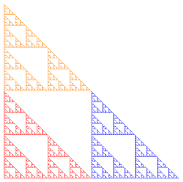
This is a very general idea which will allow you to convert from one space to another fairly easily.  And it’s definitely necessary in Processing to set up the screen for your movie.

Next week we’ll look at linear interpolation — another important concept which will help us make movies.  Until then!


Creating Fractals VII: Iterated Function Systems III

Today, we’re going to wrap up our discussion of iterated function systems by looking at an algorithm which may be used to generate fractal images.

Recall (look back at the first post if you need to!) the Sierpinski triangle.  No matter what initial shape we started with, the iterations of the function system eventually looked like the Sierpinski triangle.

Sierp4

But there’s a computational issue at play.  Since there are three different transformations, each iteration produces three times the number of objects.  So if we carried out 10 iterations, we’d have 310 = 59,049 objects to keep track of. Not too difficult for a computer.

But let’s look at the Sierpinski carpet. With eight different transformations, we’d have 810 = 1,073,741,824 objects to keep track of. Keeping track of a billion objects just isn’t practical.

Of course you could use fewer iterations — but it turns out there’s a nice way out of this predicament. We can approximate the fractal using a random algorithm in the following way.

Begin with a single point (usually (0,0) is the easiest).  Then randomly choose a function in the system, and apply it to this point.  Then iterate:  keep randomly choosing a function from the system, then apply it to the last computed point.

What the theory says (again, read the Barnsley book for all the proofs!) is that these points keep getting closer and closer to the fractal image determined by the system.  Maybe the first few are a little off — but if we just get rid of the first 10 or 100, say, and plot the rest of the points, we can get a good approximation to the fractal image.

Consider the Sierpinski triangle again.  Below is what the first 20 points look like (after (0,0)), numbered in the order in which they’re produced.

Sierp20.png

Let’s look at this in a bit more detail.  For reference, we’ll copy the function system which produces the Sierpinski triangle from the first post.

F_1\left(\begin{matrix}x\\y\end{matrix}\right)=\left[\begin{matrix}0.5&0\\0&0.5\end{matrix}\right] \left(\begin{matrix}x\\y\end{matrix}\right)

F_2\left(\begin{matrix}x\\y\end{matrix}\right)=\left[\begin{matrix}0.5&0\\0&0.5\end{matrix}\right] \left(\begin{matrix}x\\y\end{matrix}\right)+\left(\begin{matrix}1\\0\end{matrix}\right)

F_3\left(\begin{matrix}x\\y\end{matrix}\right)=\left[\begin{matrix}0.5&0\\0&0.5\end{matrix}\right] \left(\begin{matrix}x\\y\end{matrix}\right)+\left(\begin{matrix}0\\1\end{matrix}\right)

Now here’s how the color scheme works.  Any time F_1 
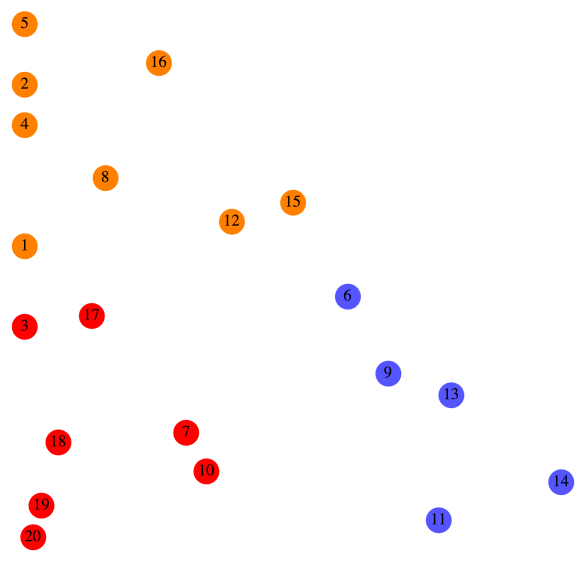
is randomly chosen, the point is colored red.  For example, you can see that after Point 6 was drawn, F_1 was chosen, so Point 7 was simply halfway between Point 6 and the origin.

Any time F_2 is chosen, the point is colored blue.  For example, after Point 8 was drawn, F_2 was randomly chosen.  You can see that if you move Point 8 halfway to the origin and then over right one unit, you land up exactly at Point 9.

Finally, any time F_3 is chosen, the point is colored orange.  So for example, it should be clear that moving Point 7 halfway toward the origin and then up one unit results in Point 8.

Of course plotting more points results in a more accurate representation of the fractal.  Below is an image produced using 5000 points.

Sierp5000.png

To get more accuracy, simply increase the number of points, but decrease the size of the points (so they don’t overlap).  The following image is the result of increasing the number of points to 50,000, but using points of half the radius.

Sierp50000

There’s just one more consideration, and then we can move on to the Python code for the algorithm.  How do we randomly choose the next affine transformation?

Of course we use a random number generator to select a transformation.  In the case of the Sierpinski triangle, each of the three transformations had the same likelihood of being selected.

Now consider one of the fractals we looked at last week.

Two4

If the algorithm chose either transformation with equal probability, this is what our image would look like:

Two450.png
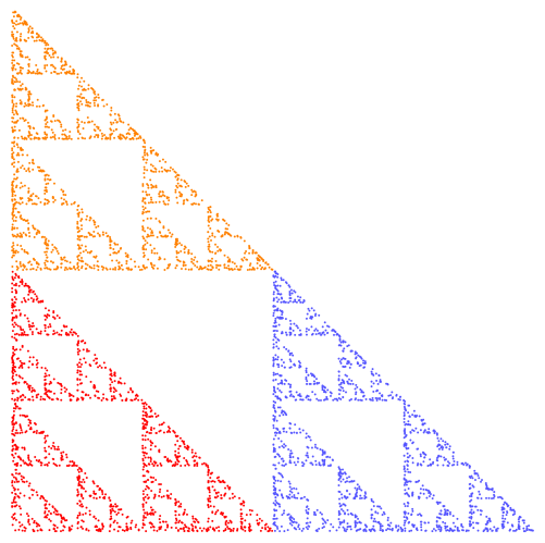
Of course there’s a huge difference!  What’s happening is that transformation F_{{\rm orange}} actually corresponds to a much smaller portion of the fractal than F_{{\rm green}} — and so to get a more realistic idea of what the fractal is really like, we need to choose it less often.  Otherwise, we overemphasize those parts of the fractal corresponding to the effect of F_{{\rm orange}}.

Again, according to the theory, it’s best to choose probabilities roughly in proportion to the portions of the fractal corresponding to the affine transformations.  So rather than a 50/50 split, I chose F_{{\rm green}} 87.5% of the time, and F_{{\rm orange}} just 12.5% of the time.  As you’ll see when you experiment, a few percentage points may really impact the appearance of a fractal image.

From a theoretical perspective, it actually doesn’t matter what the probabilities are — if you let the number of points you draw go to infinity, you’ll always get the same fractal image!  But of course we are limited to a finite number of points, and so the probabilities do in fact strongly influence the final appearance of the image.

So once you’ve chosen some transformations, that’s just the beginning.  You’ve got to decide on a color scheme, the number of points and their size, as well as the probabilities that each transformation is chosen.  All these choices impact the result.

Now it’s your turn!  Here is the Sage link to the python code which you can use to generate your own fractal images.  (Remember, you’ve got to copy it into one of your own Projects first.)  Freely experiment — I’ve also added examples of non-affine transformations, as well as affine transformations in three dimensions!

And please comment with interesting images you create.  I’m interested to see what you can come up with!