To Processing I

I made a decision last week to abandon using Sage (now called CoCalc) as a platform in my Mathematics and Digital Art class.  It was not an easy decision to make, as there are some nice features (which I’ll get to in a moment).  But now any effective use of Sage comes with a cost — the free version uses servers, and you are given this pleasant message:  “This project runs on a free server (which may be unavailable during peak hours)….”

This means that to guarantee access to CoCalc, you need a subscription.  It would not be prohibitively expensive for my class — but as I am committed to being open source, I am reluctant to continue putting sample code on my web page which requires a cost in order to use.  Yes, there is the free version — as long as the server is available….

When I asked my students last semester about moving exclusively to Processing, they responded with comments to the effect that using Sage was a gentle introduction to coding, and that I should stick with it.  I fully intended to do this, and got started preparing for the first few days of classes.  I opened my Sage worksheet, and waited for it to load.  And waited….

That’s when I began thinking — I did have experiences last year where the class virtually came to a halt because Sage was too slow.  It’s a problem I no longer wanted to have.

So now I’m going to Processing right from the beginning.  But why was I reluctant in the past?

The issue is that of user space versus screen space.  (See Making Movies with Processing I for a discussion of these concepts.)  With Sage, students could work in user space — the usual Cartesian coordinate system.  And the programming was particularly easy, since to create geometrical objects, all you needed to do was specify the vertices of a polygon.

I felt this issue was important.  Recall the success I felt students achieved by being able to alter the geometry of the rectangles in the assignment about Josef Albers and color.  (See the post on Josef Albers and Interaction of Color for a refresher on the Albers assignment.)

peyton
Peyton’s piece on Josef Albers.

Most students experimented significantly with the geometry, so I wanted to make that feature readily accessible.  It was easy in Sage, the essential code looking something like this:

Screen Shot 2017-08-26 at 11.08.35 AM

What is happening here is that the base piece is essentially an array of rectangles within unit squares, with lower-left corners of the squares at coordinates (i, j).  So it was easy for students to alter the polygons rendered by using graph paper to sketch some other polygon, approximate its coordinates, and then enter these coordinates into the nested loops.

Then Sage rendered whatever image you created on the screen, automatically sizing the image for you.

But here is the problem:  Processing doesn’t render images this way.  When you specify a polygon, the coordinates must be in screen space, whose units are pixels.  The pedagogical issue is this:  jumping into screen space right at the beginning of the semester, when we’re just learning about colors and hex codes, is just too big a leap.  I want the first assignment to focus on getting used to coding and thinking about color, not changing coordinate systems.

Moreover, creating polygons in Processing involves methods — object-oriented programming.  Another leap for students brand new to coding.

The solution?  I had to create a function in Processing which essentially mimicked the “polygon” function used in Sage.  In addition, I wanted to make the editing process easy for my students, since they needed to input more information this time.

Day108pyde1

In Processing — in addition to the number or rows and columns — students must specify the screen size and the length of the sides of the squares, both in pixels.  The margins — xoffset and yoffset — are automatically calculated.

Here is the structure of the revised nested for loops:

Day108pyde2

Of course there are many more function calls in the loops — stroke weights, additional fill colors and polygons, etc.  But it looks very similar to the loop formerly written in Sage — even a bit simpler, since I moved the translations to arguments (instead of needing to include them in each vertex coordinate) and moved all the output routines to the “myshape” function.

Again, the reason for this is that creating arbitrary shapes involves object-oriented concepts.  See this Processing documentation page for more details.

Here is what the myshape function looks like:

Day108pyde3

The structure is not complicated.  Start by invoking “createShape,” and then use the “beginShape” method.  Adding vertices to a shape involves using the “vertex” method, once for each vertex.  This seems a bit cumbersome to me; I am new to using shapes in Processing, so I’m hoping to learn more.  I had been able to get by with just creating points, lines, rectangles, and circles so far — but that doesn’t give students as much room to be creative as including arbitrary shapes does.

I should point out that shapes can have subshapes (children) and other various attributes.  There is also a “fill” method for shapes, but I have students use the fill function call in the for loop to avoid having too many arguments to myshape.  I also think it helps in understanding the logical structure of Processing — the order in which functions calls are invoked matters.  So you first set your fill color, then when you specify the vertices of your polygon, the most recently defined fill color is used.  That subtlety would get lost if I absorbed the fill into the myshape function.

As in previous semesters, I’ll let you know how it goes!  Like last semester, I’ll give updates approximately monthly, since the content was specified in detail in the first semester of the course (see Section L. of 100 Posts! for a complete listing of posts about the Mathematics and Digital Art course).

Throughout the semester, I’ll be continuously moving code from Sage to Processing.  It might not always warrant a post, but if I come across something interesting, I’ll certainly let you know!
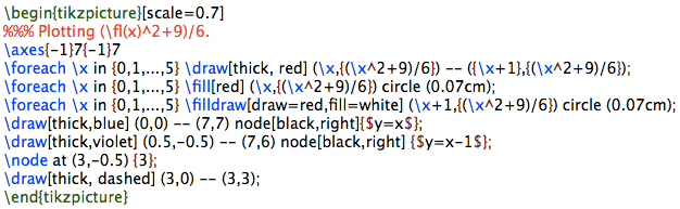
On Coding XI: Computer Graphics III, POV-Ray

It has been a while since the last installment of On Coding.  I realized there is still more to say about computer graphics; I mentioned the graphics package POV-Ray briefly in On Coding IX, but feel it deserves much more than just a mere mention.

I’d say I began using POV-Ray in the late 1990’s, though I can’t be more precise.  This is one of the first images I recall creating, and the comments in the file reveal its creation date to be 19 September 1997.

petrie

Not very sophisticated, but I was just trying to get POV-Ray to work, as I (very vaguely) remember.  Since then, I’ve created some more polished images, like the polyhedron shown below.  I’ll talk more about polyhedra in a moment….

XT-18-19-28

First, a very brief introduction.  POV-Ray stands for Persistence of Vision Raytracer.  Ray tracing is a technique used in computer graphics to create amazingly realistic images.  Essentially, the color of each pixel in the image is determined by sending an imaginary light ray from a viewing source (the camera in the image below) and seeing where it ends up in the scene.

800px-Ray_trace_diagram.svg
Image by Henrik, Wikipedia Commons.

It is possible to create various effects by using different light sources, having objects reflect light, etc.  You are welcome to read the Wikipedia page on ray tracing for more details on how ray tracing actually works; my emphasis here will be on the code (of course!) I wrote to create various three-dimensional images.  And while the images you can produce using a ray tracing program are quite stunning at times, there is a trade-off: it takes longer to generate images because the color of each pixel in the image must be individually calculated.  But I do think the results are worth the wait!

My interest in POV-Ray stemmed from wanting to render polyhedra.  The images I found online indicated that you could create images substantially more sophisticated than those created with Mathematica.  And better yet, POV-Ray was (and still is!) open source.  That means all I needed to do was download the program, and start coding….

R_3-5_Dual

POV-Ray is a procedural programming language all in itself.  So to give you an idea of what a typical program looks like, I’ll show you the code which makes the following polyhedron:

tRp_52-3-5

Here’s how it begins.

POV4

The #include directive indicates that the given file is to be imported.  POV-Ray has many predefined colors and literally hundreds of different textures:  glass, wood, stone, gold and other metals, etc.  You just include those files you actually need.  To give you an idea, here is the logo I created for Dodecahedron Day using  silver and stone textures.

logo3

Next are the global settings.  There are actually many global settings which do a lot more than I actually understand…but I just used the two which were included in the file I modeled my code after.  Of course you can play with all the different settings (there is extensive online documentation) and see what effects they have on your final image, but I didn’t feel the need to.  I was getting results I liked, so I didn’t go any further down this path.

Then you set the camera.  This is fairly self-explanatory — position the camera in space, point it, and set the viewing angle.  A fair bit of tweaking is necessary here.  Because of way the image is rendered, you can’t zoom in, rotate, or otherwise interact with the created image.  So there is a bit of trial-and-error in these settings.

Lighting comes next.  You can use point light sources in any color, or have grids of light sources.  The online documentation suggested the area lighting here (a 5-by-5 grid of lights spanning 5 units on the x-axis and 5 units on the z-axis), and it worked well for me.  Since I wanted the contrast of the colors of the faces of the polyhedra on a black background, I needed a little more light than just a single point source.  You can read all about the “adaptive” and “jitter” parameters here, but I just used the defaults suggested in the documentation and my images came out fine.

There are spotlights and cylindrical lighting sources as well, and all may be given various parameters.  Lighting in Mathematica is quite a bit simpler with fewer options, so lighting was one of the most challenging features of POV-Ray to learn how to use effectively.

So that’s the basic setup.  Now for the geometry!  I can’t go into all the details here, but I can give you the gist of how I proceeded.

POV2

The nested while loops produce the 60 yellow faces of the polyhedron.  Because of the high icosahedral symmetry of the polyhedron, once you specify one yellow face, you can use matrices to move that face around and get the 59 others.

To get the 60 matrices, you can take each of 12 matrices representing the symmetries of a tetrahedron (tetra[Count]), and multiply each by the five matrices representing the rotations around the vertices of an icosahedron (fiverot[Count2]).  There is a lot of linear algebra going on here; the matrices are defined in the file “Mico.inc”, which is included.

The vertices of the yellow faces are given in “VF[16]”, where the “VF” stands for “vertex figure.”  These vertex figures are imported from the file “VFico.inc”.  Lots of geometry going on here, but what’s important is this:  the polygon with vertices listed in VF[16] is successively transformed by two symmetry matrices, and then the result is defined to be an “object” in our scene.  So the nested loops place 60 objects (yellow triangles) in the scene.  The red pentagrams are created similarly.

POV3

Finally, the glass tabletop!  I wanted the effect to be subtle, and found that the built-in texture “T_Glass2” did the trick — I created a square (note the first and last vertices are the same; a quirk of POV-Ray) of glass for the polyhedron to sit on.

POV-Ray does the rest!  The overall idea is this:  put whatever objects you want in a scene.  Then set up your camera, adjust the lighting, and let POV-Ray render the resulting image.

petrie10

Of course this introduction is necessarily brief — I just wanted to give you the flavor of coding with POV-Ray.  There are lots of examples online and within the documentation, so it should not be too difficult to get started if you want to experiment yourself!

Still more on: What is…Inversive Geometry?

Now for the final post on inversive geometry!  I’ve been generating some fascinating images, and I’d like to share a bit about how I make them.

2017-07-19Inversion3v2.png

In order to create such images in Mathematica, you need to go beyond the geometrical definition of inversion and use coordinate geometry.  Let’s take a moment to see how to do this.

Recall that P′, the inverse point of P, is that point on a ray drawn from the origin through P such that

[OP]\cdot[OP']=1,

where [AB] denotes the distance from A to B.  Feel free to reread the previous two posts on inversive geometry for a refresher (here are links to the first post and the second post).

Now suppose that the point P has Cartesian coordinates (x,y).  Points on a ray drawn from the origin through P will then have coordinates (kx, ky), where k>0.  Thus, we just need to find the right k so that the point P'=(kx,ky) satisfies the definition of an inverse point.

This is just a matter of a little algebra; the result is

P'=\left(\dfrac{x}{x^2+y^2},\dfrac{y}{x^2+y^2}\right).

What this means is that if you have an equation of a curve in terms of x and y, if you substitute x/(x^2+y^2) everywhere you see x, and substitute y/(x^2+y^2) everywhere you see y, you’ll get an equation for the inverse curve.

Let’s illustrate with a simple example — in general, the computer will be doing all the work, so we won’t need to actually do the algebra in practice.  We’ll look at the line x=1.  
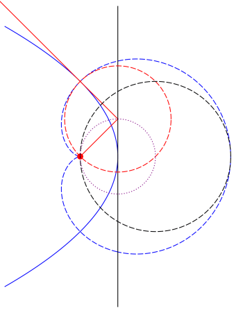
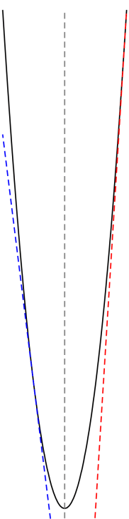
From our previous work, we know that the inverse curve must be a circle going through the origin.

Making the substitution just discussed, we get the equation

\dfrac x{x^2+y^2}=1,

which may be written (after completing the square) in the form

\left(x-\dfrac12\right)^2+y^2=\dfrac14.

It is not hard to see that this is in fact a circle which passes through the point (0,0).

Now we need to add one more step.  In the definition of an inverse point, we had the point O being the origin with coordinates (0,0).  What if O were some other point, say with coordinates (a,b)?

Let’s proceed incrementally.  Beginning with a point (x,y), translate to the point (x-a,y-b) so that the point (a,b) now acts like the origin.  Now use the previous formula to invert:

\left(\dfrac{x-a}{(x-a)^2+(y-b)^2},\dfrac{y-b}{(x-a)^2+(y-b)^2}\right).

Finally, translate back:

\left(a+\dfrac{x-a}{(x-a)^2+(y-b)^2},b+\dfrac{y-b}{(x-a)^2+(y-b)^2}\right).

This is now the inverse of the point (x,y) about the point (a,b).

So what you see in the above image is several copies of the parabola y=x^2 
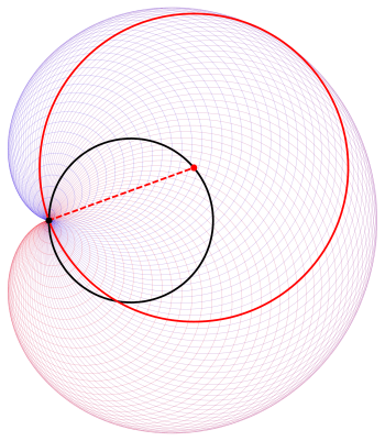
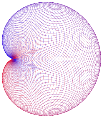
inverted about a series of equally spaced points along the line segment with endpoints (1/2,-1/2) and (3/2,1/2).  This might seem a little arbitrary, but it takes quite a bit of experimentation to find a set of points to invert about in order to create an aesthetically pleasing image.
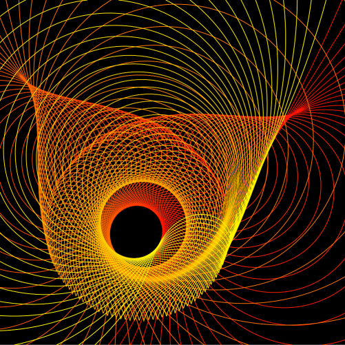
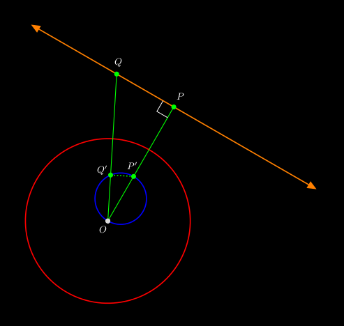
Of course there is another perspective on accomplishing the same task — just shift the parabolas first, invert about the origin, and then shift back.  This is geometrically equivalent (and the algebra is the same); it just depends on how you want to look at it.

Here is another image creating by inverting the parabola y=x^2 about points which lie on a circle.

2017-07-18Inversion1v2

And while we’re on the subject of inverting parabolas, let’s take a moment to discuss the cardioid example we looked at in our last conversation about inversion:

Cardioid2

To prove that this construction of circles actually yields a cardioid, the trick is to take the inverse of a parabola about its focus.  If you do this, the tangent lines of the parabola will then invert to circles tangent to a cardioid.  I won’t go into all the details here, but I’ll outline how the proof goes using the following diagram.

Day104ParabolaProperty

Draw a line (shown in black) tangent to the blue parabola at its vertex; the inverse curves are shown in the same color, but dashed.  Note that the black circle must be tangent to the blue cardioid since the inverse black line is tangent to the inverse parabola.

The small red disk is the focus of the parabola.  Key to the proof is the property of the parabola that if you draw a line from the focus to a point on the black line and then bounce off at a right angle (the red lines), the resulting line is tangent to the parabola.  So the inverse of this line — the red dashed circle — must be tangent to the cardioid.

Since perpendicularity is preserved and the line from the focus inverts to itself (since we’re inverting about the focus), the red circle must be perpendicular to this line — meaning that the line from the focus in fact contains a diameter, and hence the center, of the red circle.  Then using properties of circles, you can show that all centers of circles formed in this way lie on a circle (shown dotted in purple) which is half the size of the black circle.  I’ll leave the details to you….

Finally, I’d like to show a few examples of using the other conic sections.  Here is an image with 80 inversions of an ellipse around centers which lie on a line segment.

2017-07-22Inversion1v2

And here is an example of 100 hyperbolas inverted around centers which lie on a line segment.  Since the tails of the branches of a hyperbola all go to infinity, they all meet at the same point when inverted.

2017-07-22Inversion2v2

So now you know how to work with geometrical inversion from an algebraic standpoint.  I hope seeing some of the fascinating images you can create will inspire you to try creating some yourself!

More on: What is…Projective Geometry?

This week, I thought I’d go a little deeper into the subject of projective geometry (feel free to reread last week’s post for a refresher).  Why? I think this is a good opportunity to discuss the idea of an algebraic model of a geometry.  Certainly using Cartesian coordinates in the Euclidean plane makes many geometrical problems easier to approach.

So what would a coordinate system in projective geometry look like?  The most commonly used system is homogeneous coordinates.  Let’s see how they work.

The difficulty with adding the line at infinity is that we need infinitely many points in addition to those already in the plane.  Perhaps you might imagine that adding an “infinite” coordinate might do the trick, but there is an alternative — and algebraically simpler — approach.

First, think of the Euclidean plane as being the plane z = 1 in three-dimensional Cartesian coordinates, so that every Euclidean point (xy) is given homogeneous coordinates (xy, 1).  But we don’t want to make the z-coordinate special — we want all the homogeneous coordinates to have similar interpretations.  We accomplish this by giving each point infinitely many names — specifically, for any k ≠ 0, the coordinates (kxkyk) describe the same point as (xy, 1).  Geometrically, you might think of this as saying that the line through  (xy, 1) (except the origin) is, in some sense, the point (xy, 1).

So if z ≠ 0, the point (xyz) in homogeneous coordinates is another name for the Euclidean point (x/zy/z).  But why would you want to do this?

The punch line is that we can now use z = 0 to indicate that a point is on the line at infinity!  We still keep the convention that if k ≠ 0, the homogeneous coordinates (kxky, 0) describe the same point as (xy, 0), as long as x and y are not both 0.

So our system of homogenous coordinates contains all points (xyz) such that not all three coordinates are 0.  Any point with z ≠ 0 corresponds to a Euclidean point, and any point with z = 0 corresponds to a point on the line at infinity.

Is it really worth all this trouble?  There are many interesting features of such a coordinate system — and I’d like to mention a few of them here, omitting the proofs.  There are many resources online that include all the details — one example is the classic Projective Geometry by Veblen and Young available free as an ebook.

Let’s start be looking at equations of lines in projective geometry.  In the Cartesian plane, we may represent a line in the form Ax + By + C = 0, where A, B, and C are not all zero.  In the projective plane, a line has the form form Ax + By + Cz = 0, where A, B, and C are not all zero.  Nice, isn’t it?  This form is also consistent with our system of having many names for a point:  if Ax + By + Cz = 0 and k ≠ 0, then also A(kx) + B(ky) + C(kz) = 0 as well. So no problems there.

But the really neat aspect of this representation is how you can use linear algebra in three dimensions to solve many problems in projective geometry.  This isn’t a post about linear algebra — so I’ll limit myself to just one example.  But in case you do know something about linear algebra, I think you should see how it can be used in projective geometry when homogeneous coordinate are used.

We’ll consider the problem of finding the intersection of two lines, say Ax + By + Cz = 0 and Dx + Ey + Fz = 0.  The form of these expressions should remind you of taking the dot product, so that we can rewrite these expressions as

(A,B,C)\cdot(x,y,z)=(D,E,F)\cdot(x,y,z)=0.

Interpreting these coordinates and coefficients as vectors in three-dimensional space, we observe that the common point (xyz) is simultaneously perpendicular to both (A, B, C) and (D, E, F), since both dot products are zero.  So (xyz) can be found using the cross-product

(x,y,z)=(A,B,C)\times(D,E,F).

Very nice!  Again, there are many such examples, but this is not the place to discuss them….

This algebraic model also suggests another geometric model for the projective plane besides adding a line at infinity to the Euclidean plane.  Begin with the surface of a sphere centered at the origin in three-dimensional Cartesian space, and observe that opposite points on the sphere have homogeneous coordinates that are different names for the same point in the projective plane.

So, in some sense, we have exactly twice as many points as we need — so we identify opposite points on this sphere, so that they are in fact the same point.  (You might recall a similar discussion about points in the post on spherical geometry.)  Thinking about it in another way, we might just consider the top hemisphere of the sphere with only half of the equator, including just one of the endpoints of the semicircle.

And while this model is fairly simple geometrically, it is important to point out that this does not mean that the projective plane lies inside three-dimensional space.  Once we have our hemisphere and semicircle, we have to think about it without any of the surrounding space.  This is not easy to do, but this type of thinking is necessary all the time when studying differential geometry, a topic for another time….

One last benefit to using homogenous coordinates:  it can easily be abstracted to any number of dimensions.  Do you want a projective space?  Just add a plane at infinity to three-dimensional Euclidean space!  Coordinates are easy — all points (x, y, z, w), with not all coordinates equal to 0.  When w ≠ 0, the point (x, y, z, w) corresponds to the Euclidean point (x/w, y/w, z/w), and when w = 0, the point is on the plane at infinity.

And clearly, there would be no need to stop at three dimensions — it is just as easy to create a projective space of four or more dimensions.

Finding a workable system of coordinates for a particular geometry is not always a simple matter — but finding a system that allows problems to be solved easily is often a key step to studying any type of geometry.  I hope this gives you some insight to yet another aspect of the diverse universe of so many different Geometries….

What is…Projective Geometry?

The last type of geometry I discussed was inversive geometry, which is obtained by adding a point at infinity to the Euclidean plane.  Recall that as long as we had a consistent, useful model of this extended plane, it made perfect sense to define this new type of geometry.

Today, we’re going to add a line at infinity — creating what is called a projective geometry.  There are in fact many different types of projective geometries, but let’s just try to understand one at a time….

You might remember one important property of ω, the point at infinity in inversive geometry:  it was on every unbounded curve, and in particular, on every line. We need to be a bit more specific with our projective geometry, in the following sense.  Every line will intersect the line at infinity — denoted by λ — but not every line will intersect at the same point.

Consider all lines with some given slope m.  We then add one point to λ which lies on these lines, but no other lines.  In other words, each point on λ corresponds to an infinite family of parallel Euclidean lines — since now, with the addition of λ, there are no parallel lines in the projective plane.  The point at which two parallel (in the Euclidean sense) lines intersect is determined by their slope.

How does this differ from inversive geometry?  Well, in inversive geometry, if two lines had different slopes, they intersected in two points:  the usual finite point of intersection you learned about in algebra class, as well as ω.  But in projective geometry, two lines with different slopes intersect in only one point, since they intersect the line at infinity in two different points.

What this means is that any two distinct lines always intersect in exactly one point.  See the difference?  Parallel lines (in the Euclidean sense) intersect in a point on λ, and nonparallel (in the Euclidean sense) lines intersect in the same point they did in Euclidean geometry.

Now let’s look at the dual question (recall the discussion of duality, an important concept in spherical geometry):  what about a line between two points?  Two finite points generate a line, as usual.  If one point is finite and one lies on λ, the line generated is that line through the finite point with the slope corresponding to the point on λ.  And if both points are infinite, then the line through them is just λ.

Thus we have the following duality:  two distinct lines determine a unique point, and two distinct points determine a unique line.  Again, duality is an extremely powerful concept in geometry, so the fact that points and lines are dual concepts really is a legitimate justification for thinking about projective geometry.

Projective plane geometry is a broad subject — but some of my favorite objects to look at in projective geometry are the conic sections:  ellipses, parabolas, and hyperbolas.  This is because from the point of view of projective geometry, they are, in a sense which we’ll look at right now, all the same.

This sounds odd at first reading, but follow along.  The first question we need to consider is what points on λ lie on unbounded curves.  For lines, it’s easy — it’s just the point on λ corresponding to the slope of the line.

Now what about a parabola?parabola

You can see from the image that as points on the parabola move further away from its vertex, the tangents have slopes of ever-increasing magnitude.  Determining the precise slopes is an easy exercise in calculus — but what is important is that the tangent lines approach, in slope, the axis of the parabola.  In this case the axis is vertical, but of course the parabola may be rotated.

What this means is that the parabola intersects the line at infinity in the point corresponding to the slope of its axis.  Again, the tangent lines on either side approach this slope, but from two directions — from above and from below.

Now hold this thought while we look at a hyperbola.

hyperbola

Let’s see how we travel along the hyperbola.  As we move to the upper right toward the open red circle, we are moving closer to the red dashed asymptote — meaning we approach the point on λ corresponding to the slope of the red asymptote.  But here is where it becomes interesting:  as we cross the line at infinity, we come back along the asymptote toward the filled red circle on the other branch of the hyperbola!

Then we continue moving along the left branch, getting continually closer to the blue asymptote, approaching that point on λ corresponding to the slope of the blue asymptote as we pass through the blue filled circle.  Then we cross the line at infinity again, and jump to the right branch of the hyperbola toward the open blue circle.

Can you see what this means?  In projective geometry, a hyperbola does not have two separate branches.  Adding the line at infinity allows us a means to jump between the two branches.

Let’s look at these scenarios from a slightly different perspective.  Suppose that somehow, we can actually draw the line at infinity.  It’s the blue dashed line in the figure below.  Easy.

conics

Can you see where we’re going with this?  The left circle represents an ellipse, since it is a bounded curve and cannot intersect λ.  The middle circle represents a parabola — it’s a curve which intersects the line at infinity at exactly one point, and so is actually tangent to λ.  The right circle represents a hyperbola, since it intersects the line at infinity at two points.  It may look strange from this perspective, but this right circle really does represent the hyperbola illustrated above.

To summarize:  if a conic does not intersect the line at infinity, we call it a Euclidean ellipse, if it is tangent to λ, we call it a Euclidean parabola, and if it intersects λ in two points, we call it a Euclidean hyperbola.

Because you see, in projective geometry, there is no distinguished line.  Every line is just like any other.  So, in some sense, these is just one conic section in projective geometry!

What we have looked at today is what would be called an embedding of the Euclidean plane in the projective plane.  We saw how we could just add a line at infinity with certain properties, and our plane would behave “projectively.”  But from the perspective of projective geometry, you’ve just got conic sections and lines, with possibly 0, 1, or 2 intersection points as illustrated above.  A little mind-blowing, but absolutely true.

Of course we’ve only been able to scratch the surface of this really amazing geometrical world today.  Hopefully you will be inspired to learn a little bit more about it….

On Coding X: Computer Graphics II

Now that I’ve talked about what I use computer graphics for in my last installment of On Coding, I’d like to talk about the most useful graphics package I’ve come across for writing mathematics:  TikZ.

First a word about the name, TikZ.  It’s an example of a recursive acronym, like GOD used in Douglas Hofstadter’s Gödel, Escher, Bach, which stands for “GOD Over Djinn.”  (By the way, read Gödel, Escher, Bach if you haven’t already — it’s an amazing book about Gödel’s Incompleteness Theorem.)

So TikZ stands for “TikZ ist kein Zeichenprogramm,” which is German for “TikZ is not a drawing program.”  According to its creator, Till Tantau, this indicates that TikZ is not a way to draw pictures with your mouse or tablet, but is more like a computer graphics language.  It is designed for use in LaTeX, and is built with a lower-level language called PGF, which stands for “portable graphics format.”

So enough history — you can read more in the TikZ manual.  But a word of caution — it’s over 1000 pages long, so there’s a lot there!  I’ll only be able to scratch the surface today.

The two most important features of TikZ, in my opinion, are (1) you can draw very precise graphics because you’re writing in a high-level langauge, not using a WYSIWYG environment, and (2) you can use it in LaTeX, including putting any LaTeX symbols in your graphics.  This second point is extremely important, since it means when you’re labelling a diagram, the labels (usually involving mathematical symbols) look exactly the same way as the do in your text.

I use TikZ almost exclusively for two-dimensional mathematical graphics.  In a recent paper, for example, I created the following image.

tikzexamples

Note how precisely all the elements are rendered — this is because you give precise coordinates for all the individual graphics elements.

Let’s take a look at another, somewhat simpler example from this paper.

tikzexamples2

I chose this example for a few reasons.  First, it requires using a lot of the basic TikZ commands.  Second, it illustrates the practical side of drawing computer graphics.  No, I’m not going to submit this image to a Bridges art exhibition any time soon — but if I need to make an image for a paper, I want it to look good.

So I thought I’d take some time to explain various aspects of the code which creates this image.  Maybe not the most glamorous graphic — but you’re welcome to look at the 1000+ page manual for hundreds of neat examples.  Here is a diagram for a finite-state automaton from page 179, for example.


tikzpgfmanual2

Here’s what you’d need to type in LaTeX to get the simple graph I mentioned a moment ago.

tikz

Let’s look at several different excerpts from this example.  The first line opens your TikZ environment, and scales the image.  The default unit is 1 cm, so you need to set the scale to get your image the right size.

The next line is just a comment — I don’t use comments much for simple images.  But for more complex images, they’re important.  Just as important as commenting computer code.

The next line draws a set of axes.  What’s important here is that I defined my own “\axes” command — so you can include user-defined functions as well.  The advantages of being able to do this are huge.  You can use any command you define in LaTeX in a TikZ image.

Another great feature is the looping construct, “\foreach.”  The red segments above are one unit long, and so the only difference is the starting points.  Also important here is that you can use mathematical expressions inside TikZ, like the “{(\x^2+9)/6}” expression in the curly brackets.

Note the directives “[thick, red]” after the “draw” command.  You have control over every aspect of the drawing routines in TikZ — and there are lots of them.  For example, there is the “dashed” directive in line 10.  But not only can you draw a dashed line, but you can also specify the lengths of the dash marks and the spaces between them, too!  Further, you can create user-defined styles if you use the same set of directives over and over again.  This is helpful if you are creating several related images, and you want to tweak the color, for example.  You only have to change the color specification in the style, and every image which uses that style will be rendered using the new color.

Notice the “\filldraw” command in line 6.  I wanted open circles, so I drew the circles in red, and filled them with white.  If I wanted to, I could have also specified precisely how thick I wanted the circles to be drawn, but the default thickness looked just fine to me.

Notice the use of “node” and “\node” throughout.  In line 9, for example, the “3” is centered at coordinates (3, -0.5).  Also note the placement of nodes at the end of line segments, as shown in lines 7 and 8.  Again, it is significant that you can include any text you can create in LaTeX in your diagram.

I hope this is enough to give you the feel of using TikZ.  As I mentioned in the last installment, I also use TikZ to create slideshow presentations since there is so much you can do.  Remember, there are over 1000 pages of examples of things you can do in TikZ in the manual.

I would like to mention one caveat, however.  I do sometimes use Mathematica to create images with mathematically intensive equations and calculations.  TikZ is closer to a markup language in its usage, as I see it — so any image that requires significant coding to produce is a bit too cumbersome syntactically.  Here is an example of an image I used Mathematica to create.

Figure1.png

But another nice TikZ feature is that you can import images into your environment — so I can draw complex images in Mathematica, include them in my TikZ picture, and then overlay LaTeX symbols on top of the image.  With this capability, the possibilities are quite literally endless.

A final comment:  TikZ and LaTeX are both open source, so if you’re interested, you can just download them and start experimenting!  The learning curve is a little steep, admittedly, but once you’ve climbed up, you’ll be able to create astonishingly beautiful graphical images for any purpose you have in mind.  Try it!


More on: What is…Inversive Geometry?

The more I thought about it, the more I realized I just couldn’t stop at just one post on inversive geometry.  There is so much interesting geometry to discuss….

Cardioid

This image of a cardioid, made up of a collection of tangent circles, is one of my favorite geometrical constructions.  It’s created by beginning with a base circle (in black).  Choose any point on the circle (like the one in black), which we take to be the origin.

Cardioid2.png

Now for any other point on the black circle (like the point in red), draw a circle with that point as center, and the radius as the distance from the origin, as in the figure.  If you do this several times, the circles you draw will envelope a cardioid.

Why do you get a cardioid?  It’s actually not too difficult to prove using inversive geometry.  We won’t go through all the details, but you’ll see enough to get the gist of the proof.

So let’s go!  There’s actually a lot going on once you’ve added the point at infinity, ω.  If you’ve forgotten about ω, you might want to look at Day091 to refresh your memory.  One property of ω which will be important to our discussion today is that ω lies on any curve which is unbounded.  And the simplest unbounded curve is just a line.

So imagine a line, and some point P on that line.  Now chose a direction long the line, and think about moving along the line in that direction.  What happens?

Well, eventually, you’ll start moving further and further away from the origin.  And as you keep moving further from the origin, you’re actually moving “closer” to the point at infinity.  Not closer in a numerical sense of the distance from ω, since you are always infinitely far away from ω.  But closer in the sense that the line “ends” at the point at infinity.  If ω lies on the line, you’ll need to able to get there — even it takes forever….

Yeah, a bit to wrap your head around.  But it gets even better!  Think back to where you started — the point P — and then move along the other direction along the line.  Keep going…as you approach the point at infinity from the other side of the line.

Do you see what’s happening?  Both ends of the line actually meet at ω!  Yes, the line is a closed curve in inversive geometry, like a circle is in Euclidean geometry.

We’ll come back to this point in a moment, but next we want to ask the following question:  what is the inverse curve of a line?  Recall that the inverse curve of a line is that curve obtained by taking all the individual points on a line, and then taking all of their inverse points.

Interestingly, the inverse curve turns out to be a circle — and not just any circle, but a circle which goes through the origin.  As the proof isn’t all that difficult, we’ll take a few moments to work through it.

figuresinv2

So suppose the red circle centered at O has radius 1, and choose a point P.  Now draw the line through P such that the segment OP is perpendicular to the line, and consider another point Q on this line.  Thus, triangle OPQ has a right angle at P.

Since the point at infinity, ω, is on the line, its inverse point, ω′ = O, must lie on the inverse curve.  Thus, the inverse curve (shown in blue) must pass through the origin. Of course P and Q′, the inverse points of P and Q, must also lie on the inverse curve.

Then by the property of inverse points, [OP]\cdot[OP']=[OQ]\cdot[OQ']=1, and so

\dfrac{[OP]}{[OQ]}=\dfrac{[OQ']}{[OP']}.

But because inverse points lie on the same ray through the origin, then \angle POQ and \angle Q'OP' must have the same measure, making triangles \Delta POQ and \Delta Q'OP' similar triangles.

What does this mean?  This implies that \angle OQ'P' is also a right angle.  To summarize:  given any point Q on the line, its inverse point Q′  has the property that when joined to O and P′, a right triangle is formed with a right angle at Q′.

But because any triangle inscribed in a semicircle is a right triangle, this means that the set of all inverse points Q forms a circle with diameter OP′.  Neat!

Thinking back to ω being on the line, we see that as we begin at P and move either direction along the line toward the point at infinity, here’s what we’re doing on the inverse curve:  we’re starting at the point P′ and moving either direction around the circle toward the origin.  It really does make sound geometrical sense.

Will this work for any line?  If you think about it for a moment, you’ll find that it does…almost.  Our geometrical argument fails if the line actually goes through the origin.  But it shouldn’t be difficult to convince yourself that the inverse curve of a line going through the origin is actually the same line!  The two points where the line intersects the circle of inversion stay in the same place, but the other points switch in pairs.

Where are we going with all this?  It turns out that adding the point at infinity does, in some sense, make lines behave like circles — we can even imagine a line as a “circle with infinite radius.” And where is the center of this circle of infinite radius?  The point at infinity, of course….

As mentioned last week, the inverse curves of circles not passing through the origin are also circles not passing through the origin.  To summarize:

  • Inverses of circles not passing through the origin are also circles not passing through the origin;
  • Inverses of circles passing through the origin are lines not going through the origin (and vice versa);
  • Inverses of lines through the origin are also lines through the origin, and each such line is its own inverse.

Now here’s the next step.  Given the close relationship between lines and circles in inversive geometry, we define a Circle in inversive geometry (capital “C”, like we did in spherical geometry) to be either a line or circle.  Then here’s the revised summary:

  • Inverses of Circles are Circles.

Beautifully simple.  The ability to make simple statements like this with real geometrical meaning is one more reason why inversive geometry it so very interesting.

And with that, we’ll have to call it a week….  In the next (and final) post on inversive geometry, we’ll briefly look at the algebra of inverse curves, and finish the cardioid construction mentioned above.  Until then!


Mathematics and Digital Art: Final Update

It’s hard to believe yet another academic year is over!  I do think this second semester of Mathematics and Digital Art went a little more smoothly than the first.  This shouldn’t be too surprising, though — the first time implementing any new course is a little bumpy.  Though I must admit, there were surprisingly few bumps the first time around….

Like last semester, I had students create a movie in Processing.  The main tool I had them use was linear interpolation to create animation effects.  As before, I encouraged them to use linear interpolation with any numerical parameter in their movie — how much red there is in the background color, the position of objects on the screen, or the width of points and lines, just to name a few possibilities.

Colette created some interesting visual effects.  Some students (like her) took advantage of the fact that if you don’t set the background color in the draw function in Processing, successive calls to the draw function overlap the previous ones, giving a sense of movement.


Peyton was inspired when her friends invited her to go to the beach.  Here is a screen shot of her movie, where the moon reflects off the rippling waves of the sea at Ocean Beach in San Francisco.

PeytonMovie

Next, I’d like to share a few pieces from students’ Final Projects.  Recall that Final Projects are an important part of the course — during the second half of the semester, we spend one or two days a week working on them.  This is the opportunity for students to explore any aspect of the course in more detail.

While Lainey focused on making images which reminded her of her dreams, she began with this collage including  several motifs from our coursework throughout the semester.  She was one of the few to incorporate L-systems into her Final Project.

FinalPresentation-ElaineTousignant


Karina, as many students did, experimented with image processing.  She wanted to overlay multiple images at various transparencies to create a kaleidoscopic effect.  Rotating the images required that she brush up on her trigonometry….

Karina


Karla was interested in experimenting with color.  She was interested in morphing images of the Buddha.  Karla used the RGB values of the pixels in an original image, like the one shown below on the left, to determine the RGB values of the pointillistic image shown on the right.

KarlaFinal

Also like last semester, I asked students to write a final response paper about their experience with the digital course.  The responses were similar to those of last semester, so I’ll only include a few excerpts here.

I think differently about mathematics in how it relates to art. I always thought that the two would be separate entities, but this class has proved that’s not always the case.

After having taken this course this semester I really have gained an interest in art and programming that I certainly didn’t have before, even after having taken some courses in programming. I think that actually being able to see the endless things that are able to be created using programming and math is really cool….

One student made a particularly interesting remark:

I wish that I had more knowledge on how to type my own code. There were points in the semester where the art I was creating felt a bit like a coloring page where we were given a page that was already drawn and told to fill it in and try to make it our own.

Of course this is what I want to read!  I do want to inspire students to investigate programming further — but students taking this course receive a mathematics credit.  There is certainly no doubt in your mind about how passionate I am about having students learn to write code, but I do need to emphasize the mathematics of digital art.  Maybe next semester I’ll have Nick run some extra sessions on coding for those who are interested in learning more.

I also wanted to share some work from the other course I taught this semester, Linear Algebra and Probability.  I have students work with affine transformations and iterated function systems in this course as well.  Their first project is a still image using Sage, and their second project is a fractal animation using Processing.  Here is Jay’s submission.


And finally, I want to remind you that Mathematics and Digital Art is becoming a university-wide course next year.  I am working with the Fine Arts department here at USF to encourage incoming fine arts majors to earn their mathematics credit by creating digital art!  I expect the course to be quite a bit larger this Fall, and will be connecting with the Fine Arts faculty to make sure the content meets their needs as well.

In addition, I will be giving a talk at Bridges this summer (in Waterloo, (the Canadian one, that is)) about my digital art course.  I’m expecting that I’ll receive a wide range of comments and suggestions, so the course may be a little different in the fall.  That’s one nice feature of this course — it’s not a prerequisite for any other course, so there is some flexibility as far as content is concerned.

Like this semester, I’ll provide monthly updates to let you know what changes I’ve implemented, and also to showcase student work.  So stay tuned!

On Cheese: Reprise

I haven’t repeated a post yet — but as I’m getting ready for Final Exams, I thought it appropriate.  I posted this satire over a year ago, but of course it is still relevant.  The traditional system of assigning grades as a measure of, well, anything, is woefully inadequate.  Continue reading at your own peril….

On Cheese

A new semester is about to start! Finally, those students we have worked so hard to prepare are ready to learn The Calculus!  (Note: We do not teach The Calculus, but rather facilitate its learning.)

With class Roster in hand, we make for the Cheesemonger. (Mr. Hadley has been here for decades.) “Mr. Hadley, twenty-one, if you please,” I say, handing him my Roster. That is all there is to it. The next morning, twenty-one perfectly crafted cubes of Preferred Cheese (each having a mass of precisely 100g) are in my class Cupboard — one for each student, clearly labelled. We are ready!

Of course the students’ initial enthusiasm is high, until the inevitable First Exam. Surely much of the material is review — so we use the Petite grater to shave off a small bit of cheese from a student’s Block when they make the inevitable First Mistake. (There is always the exception, naturally — the Micro is used for sign errors, as well as trivial arithmetic errors.) This is done to accurately track students’ progress.

As the semester progresses, the situation becomes more dire. More egregious errors require the use of a Usual grater, while blocks of students who neglect to turn in entire assignments surely warrant being shaved by an Ultra. After years of experience, we are able to gauge precisely how much cheese must be shaved for each particular type of error. (Truly, it is all in the wrist.)

The end draws near — and although well-acquainted with the system, students still worry about the mass of their Block. They must realize that what is done is done — and No!, it is not possible to replenish the cheese! Is there no justice? They have been warned aplenty, but it is not our fault they do not heed our omens.

We are particularly meticulous with the shaving of the Final Exam — as it is an important assessment. Certain errors now warrant more grievous penalties — the Micro is no longer relevant. Beware the sign error!

But the wonders of being Complete! As a result of our experience (and training, naturally — Mr. Hadley is quite the Cheesemonger), the mass of each student’s Block represents their understanding of The Calculus entirely! Moreover, this mass may be converted to any number of convenient units — a percentage, perhaps, or one of various letters meant to convey a State of Understanding. But the work of the Facilitator is done! We rest well, and enjoy our cuppa. (Yes, some decry the fairness of such a system. No matter. Surely it is the best possible.)

On Coding IX: Computer Graphics I

It has been some time since an On Coding installment, and I thought it finally time to discuss computer graphics.  Of course I’ve done that a lot already, as far as several applications go.  For this post, I asked myself something different:  what do I use computer graphics for?

2017-05-04BinaryTreeLambdais01.png

I had never really taken a step back to look at the larger picture, but that’s one of the purposes of this thread.  I came up with seven major uses, in roughly chronological order from when I started using graphics in each way:

  1. Creating fractals.
  2. Graphic design.
  3. Rendering polyhedra in three dimensions.
  4. Mathematical illustration.
  5. Web design.
  6. Mathematical art.
  7. Research.

Today, I’ll give a brief overview, and follow up in future posts with more details about the various platforms I’ve used.

I don’t need to say a lot about the first two uses, since I’ve discussed them in some detail in my posts on Postscript and iterated function systems.  My interest in fractals has of course continued, especially given my passion for Koch curves and binary trees.  I work less with graphic design now — I used to design stationery and business cards for myself and friends, but now that communication is so largely electronic, there is less of a need.  But I do still occasionally design business cards using my art logo, print them onto cardstock, and cut them myself when I need to.

Day092c2016Vienna

I also spend quite a bit of time designing title and separator slides for presentations.  (I frankly admit to never having created a PowerPoint presentation in my entire life.  Yuck.)  I now exclusively use TikZ in LaTeX since you have complete control over the graphics environment.

Day092a

I haven’t mentioned polyhedra extensively on my blog so far, but my interest in three-dimensional geometry goes back to my undergraduate days.  When I started teaching college for the first time, I designed (and eventually wrote a textbook for) a course on polyhedra based on spherical trigonometry.

The main tool I used early on was Mathematica, and when I redid all my graphics for my textbook about five years ago, I used Mathematica.  The image you see above was rendered using POV-Ray, a ray-tracing package which allows the user to specify a wide range of parameters to create realistic effects.  You can see shadows and a reflection as if the polyhedron were sitting on a shiny, black surface.  And while the images generated by POV-Ray are quite a bit nicer than those created with Mathematica, they take more time and effort to create.

Mathematical illustration covers a wide range of uses.  Drawing figures for a mathematical paper perhaps first comes to mind.  I used a package called PSTricks for quite a while (since the “PS” stands for Postscript), but once I learned about TikZ, I changed over fairly quickly.  This means I needed to re-render many older graphics (especially in my textbook) — but since for both packages you need precise coordinates, I already had all the mathematics worked out for the PSTricks function calls.  So converting to TikZ wasn’t all that problematic.  I will be talking in more detail about TikZ in a future post.

Day092b

Of course there are also geometrical puzzles and problems, as I’ve discussed before on my blog.  Nicely formatted graphics go a long way in making a puzzle appealing to the reader.

Web design is especially important, since I rely so much on my website for everything.  I have a web page for my artwork, for my publications, talks, and anything I do professionally.  I strive for functionality and aesthetics.  I’m also a minimalist as far as design goes — “less is more.”

Also important is ease of use for me.  It’s not hard to add something to my homepage.  I don’t have the time (or interest) in redesigning my homepage every I want to add a new link.  I’m not a fan of hiding everything in dropdown menus — I want the user to glance at my site, and immediately click on the relevant link without having to pore through menus.

Mathematical art has actually been a fairly recent use of computer graphics for me — I only really started getting into it about four years ago.  I don’t feel I have to say a lot about it right here, since it is a common thread throughout so many of my posts.  You can visit my art website, or look at my Twitter, where I try to update daily (as much as I can) with new and interesting pieces of mathematical art.

Finally, I’d like to say a word about the last use of computer graphics:  research.   I think this is extremely important, especially with the exploding world of data visualization.  Really, this has been perhaps Nick’s and my most important tool when it comes to studying binary trees.

2017-02-10tree1

Without going into too much detail about this image, is consists of six scaled and rotated copies of one tree (the ones in color) and a related dual tree (in white).  Now count the number of leaves (ends of paths) in common with the colorful trees — and you’ll count 1, 5, 10, 10, 5, and 1.  These are, of course, binomial coefficients:  row 5 of Pascal’s triangle.

Why is this the case?  And is there some general result to be proved?  The point I’m making is that when Nick and I create routines to display different trees or combinations of trees, we look at lots of examples, and seek recurring themes.

We learn a lot by doing this, and the direction of our research is heavily influenced by what we observe.  This might not be so surprising, since after all, fractal trees are such geometrical objects.  I can honestly say the pace of our progress in making conjectures is directly linked to our ability to produce large numbers of trees and knowing what to look for.

So that’s what I use computer graphics for!  In future posts, I’ll discuss the various software packages I use, and try to give some idea of the advantages and disadvantages of each.  I’ll give special emphasis to those that are open-source — there is so much out there that is free to download, anyone interesting in computer graphics will have no difficulty finding something interesting to experiment with!