The Joy of Ink I

Think twice about becoming a digital artist.

While at my local print shop — again being frustrated at trying to get colors to print correctly — Xander (one of the printers who works there) casually mentioned that digital art as seen on a computer and digital art as seen in a print are two different media.  (By the way, the shop is Autumn Express in the Mission District, San Francisco.  Go there!)

I had never thought about digital art in that way before.  The idea prompted me to write a few blog posts about my experience with light and pigment.  It’s been a bumpy journey — but ultimately rewarding.  I hope that writing about my successes and challenges might make it a little easier for the next aspiring digital artist….

In the beginning, I thought it would be easy.  For my first solo exhibition (when I was teaching in Princeton, NJ), my art teacher’s friend and colleague generously printed my images for me, and frankly, they were perfect.  (Thanks, Bryan!  By the way, Bryan does some amazing work — check out his website here.)

So I thought, “Hey, Bryan got it right the first time.  No problem!”  But, as it turns out, the typical print shop printer is, well, not Bryan.  There’s an art to printing, and some printers are more artisitic than others.

For example, when I was in Florida in Fall 2014, I designed some greeting cards to sell at a gallery for local artists.  I needed to find somewhere close by where I could get them printed relatively inexpensively — I wanted to make a little money out of the adventure.  I took my designs to a local shop, printed them out, and they looked horrible.  Colors washed out and muted — bland.  There was no one who worked there who knew much about color, so I was stuck.  I gave up on this project.

I had better luck with Ron (of No Naked Walls in Port Richey, FL).  He had a real interest in printing and photography — even had a collection of some very old cameras.  And he had just bought a brand spanking new printer (not sure how many thousands of dollars it cost), and enjoyed playing around with it.

Gamut is the issue.  A color gamut is the range of colors you can produce with your device.  A computer screen uses red, green, and blue phosphors which are excited by electron beams to generate colors (see a simple explanation here).  Using light to create color sensations is referred to as additive color.  A printer, on the other hand, mixes pigments — usually cyan, magenta, yellow, and black — to create color, which is known as subtractive color.

Now this isn’t meant to be an in-depth tutorial on color (that would take far too many posts) — but the bottom line is that the gamut of colors produced by your color monitor is not the same as the gamut of colors produced by your local printer.  (And if you want to know more, just google any of the terms in this brief discussion and you’ll find lots more to read.)

And it gets more problematic when you realize that different monitors may  also have different color gamuts.  Monitors may be calibrated in many ways, each rendering coloring differently.  So what looks just right on one laptop may look slightly off on a different one.

But Ron was willing to work with me.  He’d take my jpeg, upload it into his version of Photoshop (again, differences!), and then print it out — and it wouldn’t look like it did on my computer screen.  We’d work back and forth — testing small sections of a large print, changing the colors slightly, then printing again — until we got something that looked good to me.

What you’ll find out is that not every printer knows all that much about color, and not every printer is willing to work with you.  The first printer I went to in San Francisco, Photoworks on Market St., really wasn’t all that helpful.

I was hopeful about an online printer — ProDPI — I heard about from a colleague at a conference.  He had good luck with having prints made and shipped directly to clients.  I wasn’t so lucky.  When I had samples printed and they were too yellow, I was (after many email exchanges) politely informed that because they dealt mainly with portraits, their printers were calibrated to print colors a little warmer, and no, they did not intend to modify their profile any time soon.

I did try adjusting the colors and printing a second set of samples, and they were also not quite right.  I suppose I could have continued this back-and-forth with waiting for samples to arrive in the mail, tweaking them, and repeating the cycle — but I didn’t want to do this with every image I wanted to print.  So I gave up on ProDPI.

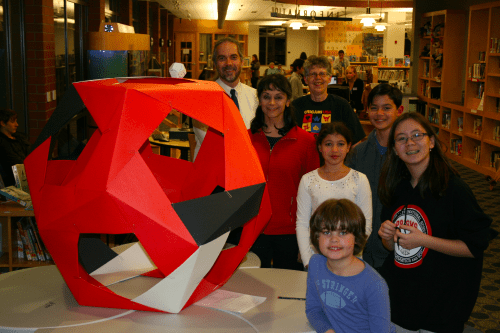
How I found Autumn Express was completely serendipitous.  I needed to get some prints made for an exhibition at a big national mathematics conference, and I wasn’t having any luck.  I was visiting friends over our winter break, and I even frantically called to see if we could visit some local print shops while I was traveling.

But some of my housemates have a video game company, and they get stuff printed all the time.  I happened to ask JJ where they got their material printed, and the rest is, well, history.

I never knew finding a good printer would be so difficult.  I needed to understand color gamuts.  But more importantly, I learned that printing is not just a matter of pushing a few buttons, but is really an art.  Bryan made it look so easy.  But it’s not.

Next week, I’ll talk about a few specifics — settings in Photoshop, for example.  And I’ll say a little more about how what you see on your computer screen might be rather deceiving.  But then you’re on your own….

International Dodecahedron Day 2016!

I have always been fascinated by geometry in three dimensions.

Day028tRp_52-3-5

I can still remember an eighth-grade project in my algebra class where we built polyhedra — mine was a white icosahedron with smaller, orange equilateral triangles connecting the midpoints of the edges.  This is what an icosahedron looks like:

Day028Fig24b

I even naively tried to build an icosahedron by trying to glue twenty regular tetrahedra (triangular pyramids) together, thinking that if you took a face of the icosahedron and connected its vertices to the center of the polyhedron, the result would be a regular tetrahedron. It’s pretty close — but not quite there. I wondered why my model didn’t close up.

Next, I remember walking down the aisles of the mathematics and science library at Carnegie Mellon, looking at mathematical “picture books.” I don’t know how many times I checked out Polyhedron Models by Magnus Wenninger, just looking at all the photos of the paper polyhedron models, flipping back and forth between them, trying to see how they were related to each other.

With each model, there was a net — a set of connected polygons you could use to create the model. The net you see here is for a polyhedron called the rhombic dodecahedron.  I wondered how you could make each net.  Day028rhdodeca
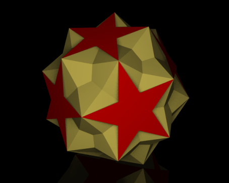
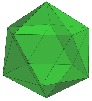
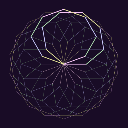
Later, I found out that there were lots of data published about various lengths and angles in different polyhedra — but those data were often numerical approximations, not exact values. What were the exact values?

These questions stimulated me to study more deeply — using tools such as coordinate geometry, linear algebra, and spherical trigonometry. I eventually answered many of the questions I asked so far, but of course generated many more questions, which were usually more difficult to answer.

Once I finished graduate school, I started writing a book on the mathematics of polyhedra, and eventually used it in a university-level geometry course. As I gained experience, I was asked to help design a senior capstone course for a local high school which used my text. A few years into this, my colleagues Todd Klauser and Sandy Spalt-Fulte helped organize a project where students in this senior course — as well as Todd’s other geometry students — went to a local middle school and taught the younger students how to make three-dimensional models of dodecahedra. And so Dodecahedron Day was born.

Dodecahedron Day is celebrated on December 5 of each year (for the 12 pentagons on a dodecahedron), and was first celebrated in 2005. Perhaps it’s a bit early in the year to talk about it — but just yesterday, I ran a booth at a fundraiser for the San Francisco Math Circle where we had students build three-dimensional models of different types of dodecahedra.

Day028ZOE_0015_1

What I love about this type of activity is how much the students love it as well.  The dodecahedron you see here was created by a young girl of about eight or nine years old — she worked painstakingly with her glue stick for close to an hour getting it together.  Her focus was intense.  No, it wasn’t perfect.  But it was hers.

Interestingly, the parents of several students also built models — and took home nets to build more!  And one of my student assistants, Simon, got very creative with decorating a net for a small stellated dodecahedron.

Day028ZOE_0019_1

Students have fun building polyhedra. Frankly, I think mathematical activities which are just fun are very useful activities — improving students’ attitudes about math is really critical to their success. Students perform better in subjects they like.

But in addition to being fun, building models requires focus and attention to detail, and also develops spatial abilities. In fact, an undergraduate in my 3D geometry course who later went on to get a Ph.D. in chemistry told me that my geometry course helped her in graduate school more than any of her chemistry courses! Just think about the geometry inherent in studying orbitals.

Over the years, I’ve developed many activities for Dodecahedron Day, and include some on the Day’s website www.dodecahedronday.org. For younger students, I’ve created activities involving pentominoes, since there are 12 pentominoes, each made up of five connected unit squares (keeping with the 12/5 theme). I’m sure others have and will continue to develop different activities — the important thing is that students take a day to truly enjoy doing geometry.

One thing I do insist upon, though, is that teachers don’t create a contest out of who makes the “best” dodecahedron. There’s too much competition in schools anyway, and it defeats the purpose of Dodecahedron Day to have a student who is genuinely proud of his model to leave the day thinking, “Mine was really nice, but hers was better. The teacher said so.”

The great thing is that once students learn basic model-making skills, they can search the internet for printable nets of almost any polyhedron they can think of. Pieces can be made from different colors, and particular color arrangmements of pieces can create really beautiful models.

Another reason for writing about Dodecahedron Day a bit early is that it really takes some planning. If a school or school district wants to set aside December 5 for activities, it’s best to make that decision before the school year starts — otherwise there may be time pressure to coordinate with course syllabi, school leadership and other teachers. Further, if teachers want to take their students to other schools so that their students can teach younger pupils how to build models, it helps to develop relationships with local schools if they don’t already exist. I can tell you from experience, the earlier you start, the better.

So if you’re a student reading this, ask your teacher to celebrate Dodecahedron Day this year! If you’re a teacher or school principal, think about it — and feel free to comment with questions, concerns, or ideas. I’m happy to help in any way I can.

And if you’re not from the US, consider introducing Dodecahedron Day into schools in your country! You’ll notice the title of today’s post — I’m hoping to make Dodecahedron Day 2016 an international event, and I can’t do it alone. Perhaps materials need to be translated, or simply reformatted for A4 paper…. By starting early, it’s possible to create an enjoyable experience for everyone involved.

So in anticipation, Happy Dodecahedron Day 2016! Let’s make this a day to introduce a passion for geometry to students all around the world!

Day028dd_ppl_pic1Web

Creating Fractals IV: Results!

It has been a while since I wrote about making fractal images — and you might recall that  I made several observations about how the images were drawn, but didn’t actually prove that these observations were valid in any general sense.

That has changed!  A few weeks ago, I decided that it was time to bite the bullet.  I had a concise way to describe what angles were chosen (see Creating Fractals, Day008, and Creating Fractals II:  Recursion vs. Iteration, Day009), I accumulated a lot of empirical evidence that validated this description, and now it was time to prove it.  I made a goal of solving the problem by the end of this semester.

It is amazing what a little determination can do!  I went back to the code I wrote last October, stared at and studied countless sequences of angles and their corresponding images, and within a few days had a working hypothesis.  Less than a week had gone by before I had a fairly complete proof.  What I thought would take me an entire semester took me about a week.

In today’s post, I’ll talk about specific cases which directly relate to my previous blog posts.  I won’t really prove anything here, but instead present the idea of the proof.  When I write up the complete proof, I’ll post a link to the paper.

The main insight came from looking at sums of angles (mod 360).  Let’s look at a specific example, using angles of 40 degrees and 60 degrees (both counterclockwise).  These angles produce the following image:

Day027fractal_40_60_1

The angle sequence follows the pattern described in Creating Fractals II:  40, 60, 40, 40, 40, 60, etc., where the “40” occurs in position k if the highest power of 2 which divides k is even, and “60” occurs if this power is odd.

The arms in this figure have eight segments each; one such arm is highlighted below.

Day027fractal_40_60_2

Now let’s write the angle sums, starting with 0 since the first segment starts at the center and moved directly to the right.  We get

Day027Table

The numbers at the top and left are for row/column reference only.  We begin with 0, and 40, then add 60 to get 100, then add 40 more to get 140, etc.  Once we hit 320 and need to add 60, we write 20 instead of 380 (since as far as angles go, 20 and 380 are equivalent).  This is essentially saying that we are adding angles mod 360 (that is, using modular arithmetic).

These angle sums are the actual directions the lines are being drawn in the plane.  You should be able to see the first two rows of this table clearly in the previous image — as you go around the first arm, your direction changes and points in the direction indicated by the appropriate sum in the table.

But notice the following interesting fact:  each sum in Row 2 is exactly 180 degrees more than the corresponding sum in Row 1!  What this means is as follows:  once the first four segments are drawn, the next four are drawn pointing in the opposite directions.  In other words, they geometrically “cancel out.”  This means that after the first two rows, you’ll return to the origin (as seen above).

You can continue to follow along in the table and view the next arm being drawn, as shown below.

Day027fractal_40_60_3

This might seem “obvious” by looking at the table — but it is only obvious after you know how to draw the table.  Then it’s easy!  Even the mathematics is not all that difficult.   I can’t emphasize enough, though, how using the computer to look at several (and more!) examples was a tremendous help in making progress towards how to arrange the table.

Now look at the “20” underlined at the beginning of Row 5.  Because of the recursive pattern of the angles, this means that the next eight segments drawn will exactly repeat the second arm.

Just when do the arms repeat?  The underlined angles (which indicate the direction the next eight segments are starting off) are the beginning of the sequence

0, 20, 20, 40, 60, 80, 80, 100, 100, 120, ….

If we look at the successive differences, we obtain the sequence

20, 0, 20, 20, 20, 0, 20, 0, 20, ….

But notice that this is the same pattern as the sequence of angles:

40, 60, 40, 40, 40, 60, 40, 60, 40, …

This means that the same pattern which indicates which angle to choose also determines which arms are redrawn.  Really amazing!

The separation of 20 degrees between arms is just 60 – 40.  In general, if d is the difference between the two angles, you need to take the greatest common divisor of d and 360, which is often abbreviated gcd(d, 360).  But in this case, since 20 is already a factor of 360, you get the difference back.

Once you know the arms are separated by 20 degrees, you know that there are 360/20 = 18 arms in the final image.

As I mentioned, it is possible to prove all this — and more.  Although we looked at a specific case, it is possible to make generalizations.  For example, there were 8 segments in each arm — and 8 is a power of 2 (namely 3).  But other powers of two are possible for the number segments in arms — 4, 32, 64, etc.

In addition, there is nothing special about degrees.  Why divide a circle into 360 equal parts?  You can divide the circle into a different number of parts, and still obtain analogous results.

The number of interesting images you can create, then, is truly astonishing.  But the question still remains:  have we found them all?  In addition to all the images obtained by looking at arms whose segments number a power of two, it is possible to obtain more regular figures.

Day027fractal_40_60_4

Such images are obtained when both angles are the same.  But other than this, I haven’t found any other types of figures.

So are there any others?  Maybe.  Maybe not.  That’s part of the fun of doing mathematics — you just never know until you try.  But I think this question will be a bit harder to answer.  Is some enthusiastic reader tempted to find out?  Perhaps all it takes is a little determination….

On Grading

A few weeks ago, I posted a short satire on how I view one of the most common ways of assigning grades — taking points off for mistakes, and determining students’ grades by how many points are left.  Today, I’d like to take a more practical look, as well as describe a system I currently use in my teaching.

I can recall two events which started  me thinking more critically about grading practices. The first was a letter to the editor written in a mathematics journal.  The university professor described a final exam in a differential equations course — ten questions, worth ten points each.  To his dismay, no student earned ten points on any problem.  They got by with partial credit.

So he thought he’d try the following grading scheme:  no partial credit.  Each question was either correct (10 points) or incorrect (0 points).  To his surprise, the course average didn’t change significantly — students actually were much more careful because they knew the stakes were high.

Second, when teaching multiple-section precalculus courses at the high school level, I would need to give the same exams as my colleagues.  We’d sit around and ask questions like “How many points off for a sign error?”  “What if they just make a minor arithmetic mistake?”  We’d try to make sure everyone graded pretty much the same.  We’d even talk at the (insane) level of half-points….

So when developing an honors-level calculus course (at the high school level), I thought I’d try something different.  First, I separated exams into two sections:  Skills and Concepts.  And second, I’d grade problems as Completely Correct (CC), Essentially Correct (EC) — meaning a student knew how to approach a problem, but had significant issues in following through, or not correct (X) — indicating lack of a viable solution strategy.

I’d then assign a letter grade based on the CC/EC distribution.  This is along the lines of the university professor’s thought — you can’t earn an A if you don’t have a certain number of problems Completely Correct.  In other words, a student must demonstrate significant mastery in solving problems, not just get by on partial credit.

I do know of professors who use a “2–1–0” scheme — and this is certainly similar.  Assigning a CC 2 points, an EC 1 point, and an X zero points can help in giving an approximate idea of where a student stands.  But I also use grades of CC- (perhaps more than a few arithmetic errors), EC+ (almost CC), and EC- (got the right idea, but just barely).  If a lot of the EC’s are in fact EC+’s, I might bump the grade up a notch.

I also differentiate between Skills and Concepts questions.  Skills questions are more-or-less textbook problems — routine, checking that a student knows the mechanics.  They are relative short, although I might sometimes assign two CC/EC/X grades if the problem is a little more involved.

I purposely avoid problems which scaffold in the Skills section.  For example, if you want to assess integration by parts through a volume problem, and the student sets up the volume integral incorrectly, then you may not be able to assess their ability to perform integration by parts.  I address this issue by writing two separate Skills questions:  first, a “set up but do not evaluate” volume problem, and an integration by parts problem.  I don’t feel anything is lost here.

The Concepts questions are intended to assess whether students really have some conceptual understanding.  They are typically open-ended, and require some argument (though a formal proof is not necessary in calculus).  As an example, here is a Concepts problem from a Calculus II exam given last semester:

For each of the following statements, either justify why it is true, or give a counterexample to show that it is false.

(1) If \displaystyle\sum_{n=0}^\infty |a_n| and \displaystyle\sum_{n=0}^\infty |b_n| converge, then \displaystyle\sum_{n=0}^\infty |a_n+b_n| converges.

(2) If \displaystyle\sum_{n=0}^\infty |a_n+b_n| converges, then both \displaystyle\sum_{n=0}^\infty |a_n| and \displaystyle\sum_{n=0}^\infty |b_n| converge.

This is certainly a non-routine question.  As such, I grade Concepts problems more leniently, assigning an EC if it seems that a student has shown some insight into the problem.

On this 65-minute exam, there were seven Skills problems and four Concepts problems.  To earn an A, a student needed 5 CC and 3 EC.  The 5 CC meant that there had to be significant Skills mastery.  But note that if an A student earned at least an EC on all the Skills problems (which they should certainly do), they only needed to make progress on one of the four Concepts problems to earn an A.

I try to design the Skills part so that it takes about 45–50 minutes to complete, leaving 15–20 minutes to think about one (or more) Concepts problem(s).  And as the grading scheme implies, some progress needs to be made on the Concepts problems to earn an A, which is as it should be — an A student should be able to demonstrate some level of conceptual understanding.

Further, I might bump up the grade if a student can make progress on more than one Concepts problem, or perhaps gets one CC (which does not occur all that often in my classes).

I’ve been using this scheme for about seven years now, and I like it.  Grading is more pleasant (no agonizing over points), students rarely argue about EC/CC (it’s not that fine a distinction), and I can count on one hand (with fingers left over) the number of students who have argued about the assignment of a letter grade.  What’s also nice about this scheme is that it’s easy to adjust for exams which are (inadvertently) too difficult — just relax the requirements needed for an A.

Now to some extent, this may seem highly subjective.  But I maintain that it is no more subjective than assigning points.  Precisely how are those assignments made?  If a quotient rule problem is worth 10 points and the student switches the order of the terms on the numerator, is it 1 point off?  2 points?  Maybe 3?  How many “tenths” of the 10-point problem is the order of the terms on the numerator worth, anyway?  It’s truly an arbitrary decision.

A point-based system does suggest that problem-solving can be broken down into separate chunks which can be assembled to make a whole — something mathematicians know to be ridiculously hard to quantify, if it is possible at all.

Now I do admit to giving point-based exams in courses like Business Statistics — a 13-section course of which I taught two sections last semester.  I had almost 50 students, and the course is essentially a skills-oriented course.  Like any other teaching strategy, a grading style may seem more appropriate in one context than another.

So I am not advocating a “one size fits all” grading practice here.  My intent is to suggest that there are successful alternatives to a strictly point-based grading system.  And while every system has its drawbacks, I believe that one of the main strengths of the system described in this post lies in the ability to meaningfully assess conceptual understanding — something I have found virtually impossible in a point-based system.


Logic Puzzles II

Last week, we looked at solving some simple logic puzzles.  This week, the logic puzzle is quite a bit more involved —  I hope you enjoy it!

Six logical friends — Arlen, Boris, Cecil, Doran, Edith, and Frank — having just finished some pretty hairy logic problems, decided to go to Wacky Jack’s Primo Ice Cream Emporium to celebrate. Each ordered their ice cream in a waffle cone or a dish, except for the one who ordered the Slurp-A-Licious Bucket-O-Yum — a delectable concoction with two scoops each of Jack’s five Specialty Flavors — in which case it came in a commemorative Wacky Jack Bucket (which you got to keep if you ate it all). From the following clues, can you decide who ordered what?  Note: All solvers made their selections from Jack’s five Specialty Flavors: Blueberry Farkle, Chocolate Smudge, Marshmallow Whoop, Pecan Passion, and Peppermint Blast. For the cones, you must specify the order of the scoops.

  1. No cone had more than three scoops of ice cream, and no dish had more than five.
  2. Except for the problem solver who got the Slurp-A-Licious Bucket-O-Yum, no one got more than one scoop of the same flavor.
  3. The number of scoops in Edith’s dish was the same as the sum of the numbers of scoops in Arlen’s and Cecil’s cones.
  4. Cecil and Edith together had the same number of scoops as Arlen and Frank together.
  5. If Frank had an even number of scoops, then there were 23 scoops among the six solvers.
  6. If Frank had an odd number of scoops, then there were 25 scoops among the six solvers.
  7. If Boris had an odd number of scoops, then Edith had an even number.
  8. Boris had fewer scoops than Doran.
  9. Exactly two solvers had exactly three scoops of ice cream.
  10. Frank ordered a dish if and only if Boris ordered a cone.
  11. Arlen had three scoops of ice cream if and only if no two cones had the same number of scoops.
  12. Exactly four solvers had Marshmallow Whoop, exactly four had Pecan Passion, and exactly two had both.
  13. Either Arlen’s flavors were a subset of Edith’s, or Frank’s were a subset of Cecil’s.
  14. Frank did not order Pecan Passion, and Cecil did not order Marshmallow Whoop.
  15. If Cecil ordered just one scoop, then Arlen ordered Pecan Passion.
  16. Boris and Doran were the only two to order Peppermint Blast.
  17. Arlen and Frank had no flavors in common if and only if Boris and Frank had exactly one flavor in common.
  18. Two cones had a scoop of Chocolate Smudge second from the top.
  19. Frank had exactly two scoops if and only if Pecan Passion was always the bottom scoop of the cone it was on.


Logic Puzzles I

Some of my favorite puzzles to create are logic puzzles.  There are many reasons for this — you can often create humorous scenarios for your puzzles (like Trolls wearing hats).  Also, there are typically multiple entry points into a solution — you can start with any clue you like!

I’ll let you do a review of simple logic; you should be familiar with truth tables, conjunctions, disjunctions, implications, and biconditionals, for example.  In this week’s post, we’ll start by solving a simple puzzle — and in doing so, discuss several tricky points in working with mathematical logic.

We begin in the Land of Pergile, where four friendly trolls — Cedric, Dillon, Elbyn, and Fenn — are wearing four different but brightly colored hats of the red, blue, green, and yellow varieties. Here’s what you know:

  1. Dillon is wearing a yellow hat if and only if Elbyn is wearing a green one.
  2. Either Dillon is wearing a red hat, or Fenn is wearing a yellow hat.
  3. If Dillon is wearing  a red hat, then Cedric is wearing a blue one.
  4. Cedric’s hat is either red or yellow.
  5. If Cedric’s hat is blue, then Elbyn’s is green.

Where to begin?  Let’s look at clues 3 and 4.  Suppose Dillon’s hat is red.  Then from clue 3, Cedric is wearing a blue hat.  But clue 4 says his hat is either red or yellow — not blue.  So our original assumption that Dillon’s had is red must be false.  Therefore, we know that Dillon is not wearing a red hat.

Now since Cedric’s hat is either red or yellow, it can’t be blue.  So from clue 5…well, nothing.  Remember that if the antecedent of an implication is false, you can’t conclude anything about the consequent.  In other words, since Cedric’s hat is not blue, you can’t conclude that Elbyn’s hat is green — but you can’t conclude that his hat is not green, either.  So we really can’t learn any more information from clue 5.

Now let’s look at clue 2.  Keep in mind that it is possible for both Dillon to be wearing a red hat and Fenn to be wearing a yellow hat.  In general, a disjunction (that is, an “or” statement) is inclusive.  (Although in clue 4, this is certainly not possible — but in general you have to consider that both clauses in a disjunction may be true.)

Now we’ve already established that Dillon is not wearing a red hat — so that means that Fenn must be wearing a yellow hat.  At least one clause in a disjunction must be true.  Then we use clue 4 to establish that Cedric must be wearing the red hat, since Fenn is wearing the yellow hat.

We haven’t used clue 1 yet.  Recall that in a biconditional statement, both clauses have the same truth value — both are true, or both are false.  In this case, they can’t both be true, since we already know that Fenn is wearing the yellow hat.  So they must both be false.

Therefore Dillon is not wearing a yellow hat, which doesn’t really help us since that fact gives us no information about the color of hat he is wearing.  But also,  Elbyn is not wearing a green hat — and since the red and yellow hats are already accounted for, he must be wearing the blue hat.  That leaves Dillon wearing the green hat.

Problem solved!  Now if you know your way around logic problems, this might have seemed simple.  But if you’re new to them, you realize you have to be very careful about the conclusions you make.

Of course maybe you just guessed the right answer and found no contradictory statements. But part of solving these problems is showing that you’ve found the only solution — and that means using the rules of logic to exclude all other possibilities.

And of course you might used the clues in a different order.  You can eliminate any help from clue 5 by looking at clue 4 first, and then consider clue 3.  Or you can take a completely different approach with clue 1.  For example, if Dillon’s hat is yellow, then neither clause in clue 2 can be true — which yields a contradiction.  So Dillon’s hat can’t be yellow.  The point is that there is not just one way to solve any of these problems — which is part of the fun!  But you’ve always got to make some tentative decision about where to begin.

Now here’s one for you to figure out.  As it happens, the four friendly young Trolls decided to skip school one Afterday morning and go shopping for new hats!  Excited — though not particularly adventurous — they each bought another hat which was either red, blue, green, or yellow.  (It is possible that a Troll bought the same color hat as he was already wearing.)  From the following clues, can you deduce what colors their new hats are?

  1. If Fenn bought a green hat, then Dillon bought a yellow hat.
  2. After all the new hats were purchased, either Cedric and Dillon did not share a hat of the same color, or Elbyn and Fenn did not share a hat of the same color.
  3. If Cedric’s new hat was blue, then Elbyn’s new hat was green.
  4. Either Dillon or Fenn bought a new blue hat.
  5. If Dillon did not buy a hew red hat, then Elbyn did.
  6. If Cedric bought a new yellow hat, then so did Fenn.

You can easily create logic puzzles of your own.  I find it easiest to start with a solution, write clues which describe the solution, and then see if you have enough clues as well as check that the solution is unique.  There’s a certain amount of back-and-forth work here — you don’t always get it right the first time….  The second problem took a little while to get the clues right — I wanted a variety of clues (sharing the same color hat, implications and disjunctions, etc.), and I wanted to make sure there was a clear solution path.  Maybe you’ll find it…..

Finally, here’s another short puzzle to test your logical prowess.  After their hat-buying excursion, Cedric decided to go to the local produce stand, where he bought a basket of his favorite fruits:  apples, bananas, and choobles.  In all, he bought ten pieces of fruit.  Given the following true statements made by Cedric, how many pieces of each fruit did he have in his basket?

  1. If I don’t have more choobles than bananas, then I have two more apples than bananas.
  2. If I have more choobles than bananas, I have three apples.
  3. If I have fewer than four apples, then I have the same number of bananas as choobles.
  4. The number of pieces of one of the fruits is the same as the sum of the number of pieces of the other two fruits.

Happy solving!

The Problem with Grades

As I get ready for the new semester and update course syllabi, I am reminded of why I do things a bit differently.  I’ll let this speak for itself.

On Cheese

A new semester is about to start! Finally, those students we have worked so hard to prepare are ready to learn The Calculus!  (Note: We do not teach The Calculus, but rather facilitate its learning.)

With class Roster in hand, we make for the Cheesemonger. (Mr. Hadley has been here for decades.) “Mr. Hadley, twenty-one, if you please,” I say, handing him my Roster. That is all there is to it. The next morning, twenty-one perfectly crafted cubes of Preferred Cheese (each having a mass of precisely 100g) are in my class Cupboard — one for each student, clearly labelled. We are ready!

Of course the students’ initial enthusiasm is high, until the inevitable First Exam. Surely much of the material is review — so we use the Petite grater to shave off a small bit of cheese from a student’s Block when they make the inevitable First Mistake. (There is always the exception, naturally — the Micro is used for sign errors, as well as trivial arithmetic errors.) This is done to accurately track students’ progress.

As the semester progresses, the situation becomes more dire. More egregious errors require the use of a Usual grater, while blocks of students who neglect to turn in entire assignments surely warrant being shaved by an Ultra. After years of experience, we are able to gauge precisely how much cheese must be shaved for each particular type of error. (Truly, it is all in the wrist.)

The end draws near — and although well-acquainted with the system, students still worry about the mass of their Block. They must realize that what is done is done — and No!, it is not possible to replenish the cheese! Is there no justice? They have been warned aplenty, but it is not our fault they do not heed our omens.

We are particularly meticulous with the shaving of the Final Exam — as it is an important assessment. Certain errors now warrant more grievous penalties — the Micro is no longer relevant. Beware the sign error!

But the wonders of being Complete! As a result of our experience (and training, naturally — Mr. Hadley is quite the Cheesemonger), the mass of each student’s Block represents their understanding of The Calculus entirely! Moreover, this mass may be converted to any number of convenient units — a percentage, perhaps, or one of various letters meant to convey a State of Understanding. But the work of the Facilitator is done! We rest well, and enjoy our cuppa. (Yes, some decry the fairness of such a system. No matter. Surely it is the best possible.)

Envelopes III: Art and Randomness

This week, I’ll discuss some of the artistic decisions made in producing the images in last week’s post, as well as explore randomly-generated envelopes.

First, let’s look at the following piece.

Day020env7

Initially, I created the image below, which is essentially a recreation of a hand-drawn sketch made in 1983.

Day022env1

Although the lines are clean and precise, the overall impression lacks a hand-drawn feel. I thought to create more texture by having the alternating envelopes go around the origin more than once, as seen here.

Day022env4

I liked this better, but I thought to adjust the angular sizes of the envelopes so that the tips were evenly spaced around a circle. I also adjusted the number of lines in each envelope, producing the final result.

The point of this discussion is to illustrate the process of creating digital art – it’s not as simple as just writing a few lines of code and executing them. There is an iterative give-and-take to the process, which is half the fun of it, anyway.

The next image I’d like to look at is the spiral, shown below.

Day020spiral3

This is a recreation of an image originally drawn in red, and I thought to create texture by introducing a color gradient. However, using a linear color gradient from the first line to the last produced the following result.

Day022spiral3old

This looked a little off to me – moving toward the green a bit too fast. Now if you remember the discussion of color gradients when we looked at the Evaporation piece (see Day012), you’ll recall that we could create nonlinear gradients which created different visual effects. I found that changing the gradient from linear (a power of 1) to a power of 0.8 produced something I liked more. Of course the difference is not drastic, but I want to illustrate the fact fine-tuning parameters can introduce subtle effects in the final image.

Now on to a discussion of randomly-generated envelopes. Today will only be an introduction – there’s lots more to explore, including envelopes in three dimensions.  But I’ve only begun working on this idea a few weeks ago, and so hope to illustrate how previous work with randomness may be incorporated into the design of envelopes.

Of course just what is random is a more subtle question here. Below is an image where the successive endpoints used to create the envelope are randomly chosen from a unit square, and a color gradient is produced from the beginning to the end to give a sense of motion.

Day022RandEnv2

You’ll immediately notice that some envelopes span the entire width or height of the image. As it happens, this makes finding nicely-balanced images difficult. I looked at a few hundred images before I found the one above – most lacked balance.

I also wanted to try bright colors against black – this produces nice results for an online blog (though not so wonderful for a printed image). Again, I didn’t like the results obtained by allowing the points determining the envelopes to be completely random. So I introduced a constraint that the endpoint of the next segment had to be “close” to the previous one – in the image below, the endpoints could be no further than one unit in either the x- or y-direction from the previous point. So there are more local effects, and none of the broader lines slicing the image in half.

Day022RandEnv1-12-26-15x

The image looked a little too square, and I thought the contrast too much for so many envelopes.  So I looked at a few hundred more images on a wider field, this time in yellow. I found one with some interesting interactions, shown below.

Day022RandEnv2-12-26-15

Now I felt I was getting somewhere. But I thought the image looked a bit too flat – I wanted to add some texture or dimensionality to the image.

The first thing I tried was slightly varying the yellows used to draw the lines. This helped to add a measure of interest to the envelope. But the background needed some work.

I wanted the background to contrast the flowing curves of the envelopes, and so I thought some overlapping squares of varying dark shades of gray might do the trick. Here is the result.

Day022RandEnv4-12-27-15

The background took a few hundred iterations as well. Now I didn’t want the squares too small, and I didn’t want too many – the sizes of the squares should compare to the sizes of the individual envelopes, and there should be roughly as many. But the problem was that randomly-generated sets of squares would often leave too many gaps in the background – and simply overlaying a background of a single shade of gray wasn’t particularly pleasing.

So I had to play with the parameters generating the overlapping squares, as well as try a few hundred iterations until I found something with a nice balance. In addition, I wanted the background to be “interesting” in the largish hole just left of center – some iterations just produced a solid gray there, which didn’t work for me.

It took a bit of time – as well as feedback from my friend Sandy (thanks, Sandy!) to whom I showed successive drafts of this image – but I finally found a combination of colors/backgrounds which I felt held together. Of course you might think otherwise – and you are welcome to give it a try and create your own image with randomly-generated envelopes….

I hope this helps to illustrate the creative process – one of the main themes of this blog. While a final image may look complex with various different aspects interacting with each other, it’s not always the case that each aspect was conceived of at the same time. This is the great thing about computer-generated art – it’s so easy to explore a multitude of ideas without leaving the comfort of your keyboard.

But this is also perhaps the greatest challenge – because you can do so much, finding the right balance between simplicity and complexity in part distinguishes computer-generated images from computer-generated art.

Finally, I cannot resist including an image I tweeted a few days ago @cre8math — a variation on the spiral theme.  I find it unusually compelling.

Day022spiral01-08-16

Envelopes II: Making Spirals

While I don’t intend to make a habit of midweek posts (though thanks for the idea, Dane!), last week’s entry was so popular that I thought I’d write a short post on how the spiral designs are created.  Here’s one of last week’s images to refresh your memory.

Day020spiral3

These are not difficult to create,  but because of all the overlap of lines, it’s not immediately obvious how they are generated.  The image below shows the first forty line segments drawn, and highlights the endpoints of these segments.

Day021spiralmethod

The first line drawn is horizontal, and the endpoints are 180 degrees apart.   More lines are generated by having the orange endpoint (starting at the right) move 4 degrees counterclockwise, while the green endpoints (starting at the left) move just 3 degrees.  As a result, the endpoints of the second segment are just 179 degrees apart on the circle.  The orange endpoints start gaining on the green endpoints, closing the gap by 1 degree with each successive segment.

So the final spiral includes exactly 180 segments, which may be expressed in a form which may be easily generalized (and which is used in the Python code).  Note that the “180” on the left side of the equation represents the number of segments drawn, and the “180” on the right indicates the angular distance that the endpoints of the initial segment are separated on the circle.

180 = \dfrac{180}{4-3}.

All 180 segments are shown below, where the endpoints are retained to illustrate the process (although note that many endpoints are written over as the algorithm progresses).

Day021spiralmethod2

The Python code is fairly short (here is the Sage link — look at some of the earlier posts about using Sage if you haven’t used it before). The only mathematics you need to understand is the standard conversion from polar to rectangular coordinates — it’s much easier to describe the endpoints first in polar coordinates since the radius of the circle is fixed and only the angles the endpoints make with the center of the circle change.

Finally, I include an image created with contrasting colors on the background as well.  Create your own version, and post as a comment!

Day021spiral3

Envelopes I

Most of us have probably created a mathematical envelope, although we likely didn’t call it that.  Below is an example which may easily be sketched on a piece of graph paper.  You can see the “move one up/down, move one left/right” method of determining the ends of the line segments.  I created this envelope of lines using Python — we’ll look at the code later so you can make some of your own.
Day020Envelope1

I first began sketching envelopes when I was an undergraduate.  Of course they were aesthetically quite interesting — but as a mathematician, you cannot help but ask exactly what curve you’re approximating by drawing an envelope of lines.

Although it seems that you might be drawing tangents to a circular arc, this is not the case.  By continuing the pattern of moving one up/down and left/right, the envelope in the first quadrant develops into the following figure.

Day020Envelope2

You can fairly easily see a parabola forming — and this parabola is in fact the curve whose tangents we drew on our graph paper.

How can we prove this?  We need a theorem about tangents to parabolas, which we state as it applies to the case at hand, as shown below.Day020Envelope3

Here is how the theorem goes.  Suppose P and Q are points on a parabola whose tangents intersect at R.  If X is a point on the parabola between P and Q, and if the tangent at X intersects PR at M and QR at N, then

[PM] / [MR] = [MX] / [XN] = [RN] / [NQ],

where we use “[AB]” to mean the length of the segment AB.  But in our case, [PR] = [QR], so this means that

[PM] = [RN]  and  [MR] = [NQ],

which validates our “one down, one right” method of creating endpoints of tangent segments.  This is because by moving down one and right one, we are preserving the relationship [PM] = [RN], and hence also [MR] = [NQ].

For the curious reader, this helpful theorem about tangents to parabolas is very nicely proved by Steven Taschuk in his Notes on tangents to parabolas on p. 5 (where the names of points in my diagram above correspond to the names of points in his proof of the theorem).

So they’re parabolas!  Not what you’d expect at first glance.

Of course back when I was beginning college, there was no easy way to create desktop graphics, and so I used the tried and true pen-and-paper method.  I took a photo of one of my favorites from that time period.

Day020byhand

Drawing these figure takes patience and concentration.  I distinctly recall the first draft of this piece.  If you look at the left square, you’ll notice that the blue lines look like they’re underneath the red lines.  This isn’t hard to do — just draw the red lines first, and then when drawing the blue lines, just stop at the red and continue after.  But I lost focus for just a second, and drew a blue line right over the red lines — and then had to start over.  There was no erasing.

For those of you who want to try creating images by hand, a word about technique.  When using an ink pen, the ink tends to blot — and if you drag the pen along a ruler, you might get end up with a smear of ink.  So keep a napkin or paper towel handy, and wipe the tip of your pen on the paper towel after drawing each line.  It’ll save you a lot of grief.

Despite the relatively simple method of drawing envelopes of lines, there is ample room for creativity.  Here is a computer-generated version of a drawing dated December 24, 1986.  It’s another of my favorites, and I love the effect of bright color against black.

Day020Twist

There’s no reason to stop at purely geometrical designs, either.  Here is an abstract half-face of a tiger, created with a simulated graph paper background.

Day020Tiger

And then there’s polar graph paper!  When you wanted a graph, well, you just drew it — there was no graphing calculator/computer to do it for you.  So you had graph paper handy.  Below is a design I created just for this post, based on some older sketches.

Day020env7

Here’s another image based on a sketch made on polar graph paper.

Day020spiral3

It’s been really interesting to experiment with the computer, since designs which might have taken hours to draw can be rendered in a few seconds (after you’ve done the programming, of course).

Envelopes are not restricted to being created by lines, however.  The figure below creates a cardioid from tangent circles.

Day020Envelope4

A base circle (in red) is given, and a point on the circle is selected (the white point at the left).  Now for every other point on the circle (like the red point), create a circle by using that point and the white point as ends of a diameter of the circle (drawn in black).  These circles are internally tangent to a cardioid.

I don’t have room for the proof of this construction here, but there is a very nice book called Envelopes by Boltyanskii (just google it) which illustrates many additional examples of envelopes as well as techniques to determine what the resulting curve is.  Some of the techniques do involve calculus, so be forewarned!  This book was my real introduction to a study of mathematical envelopes.

Now it’s time for you to create your own envelopes!  You can click on the Sage link to follow along and alter the code as you see fit.

The routines aren’t really too complex.  Note the use of vectors in Python to make working with the mathematics fairly simple.  This is so we can compute the endpoints of the segments of the envelope easily.  The mathematics involved is illustrated in the following figure.

Day020Envelope5

It looks more complicated than it is.  Since P_i is between P and R, we may write P_i as a weighted average of P and R.  
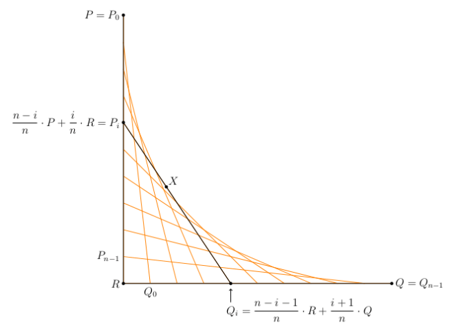
We must do so in such a way that i=0 gives the point P=P_0, and P_{n-1} is just above R.

Similarly, Q_i is a weighted average of R and Q, and must be such that Q_0 is just to the right of R, and Q_{n-1}=Q.  Take a moment to study the figure and see that it all works out.  Note that the variables in the code mimic those in the figure exactly, so at least there is visual proof that the labels are correct!

So I’ll leave you to go ahead and experiment.  Feel free to comment with images you create using the Python code.  And stay tuned for next week, when I’ll talk about creating random envelopes.  There’s some really interesting stuff going on there….